This  ).
).
If you are looking for a very specific set of dashboards, click the gear icon ( ) to the right of the Search field and select Advanced. In this mode you can create an advanced search using "AND" or "OR" for multiple search criteria. For more information, see Performing an Advanced Search.
Use the following menu options to navigate the SL1 user interface:
- To view a pop-out list of menu options, click the menu icon (
 ).
). - To view a page containing all the menu options, click the Advanced menu icon (
 ).
).
This
What is a Dashboard?
A dashboard is a page that displays one or more graphical reports, called widgets. These widgets appear in their own pane, and display charts, tables, and text.
Access to dashboards is based on your login credentials, so you can view only dashboard data for which you have access. Also, some dashboards might be private instead of public.
To define a widget, you first select from a list of pre-defined widget definitions, and then customize what will be displayed by the selected widget by supplying values in the option fields provided by that widget.
If an animated blue line appears under a widget name, the widget is in the process of updating its data. When the line disappears, the widget is done updating.
If an item name displays as a hyperlink in a dashboard, you can click that link to go to the relevant detail or Investigator page for that item. You can click dashboard links to the Investigator pages for devices, events, and services.
If an item name displays as a hyperlink in a dashboard, you can click that link to go to the relevant detail or Investigator page for that item. You can click dashboard links to the Investigator pages for devices or events.
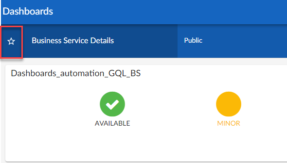
Favorite Dashboards
In SL1, this feature is called favoriting dashboards or favorite dashboard. For example, in the Business Service Details dashboard pictured below, you can select the Favorite Dashboard star icon to add/remove the dashboard from your favorites list. You can then sort your Dashboards by their favorite status.
With favorite dashboards, users can:
-
View their favorited dashboard(s) at the top of the Dashboard Inventory list by default.
-
Include favorites in the multi-sort function.
-
Filter dashboards by favorite.

Leaderboard Widgets and Driving Context
A leaderboard widget lets a dashboard user select specific items in a widget so that data about only those items displays in other widgets in the dashboard:
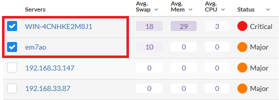
In SL1, this feature is called driving data or driving the context of a dashboard widget. For example, in the Server leaderboard widget pictured above, if you select one or more servers on the leaderboard widget, the other widgets in the dashboard will display data about just the servers you selected. The other widgets receive the context from the "driving" widget, which in this example is the leaderboard widget.
You can use the Display zeroes toggle when editing a Top-N or Bottom-N widget to enable the widget to show or hide zero results.
To use a leaderboard widget:
- On the Dashboards page, select an existing dashboard or create a new dashboard with a leaderboard.
- Select one or more items on the leaderboard widget. The other widgets in the dashboard update with data only for the selected item or items.

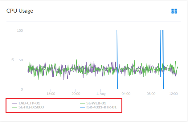
Widget Legends
The items you select in a leaderboard on the Dashboards page also appear at the bottom of each widgets that contain line charts and bar charts, arranged by line color and name:
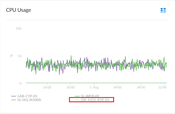
You can click an item name in the legend to toggle the display of data from that item in that widget. The line next to the item name turns gray, and the data remains hidden until you click the item name again.
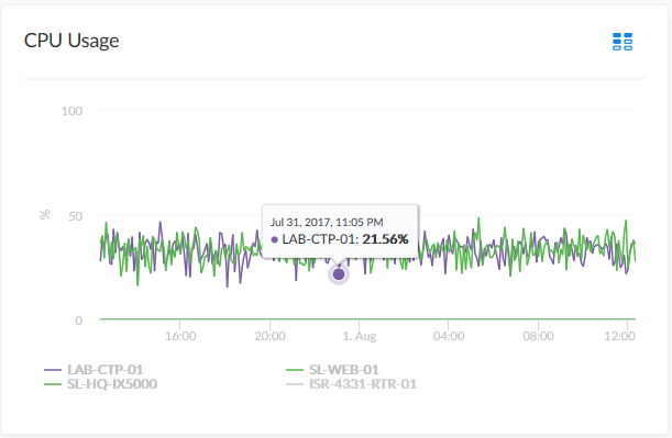
You can also view more information about a specific point in time for an item by hovering over a line in a graph:
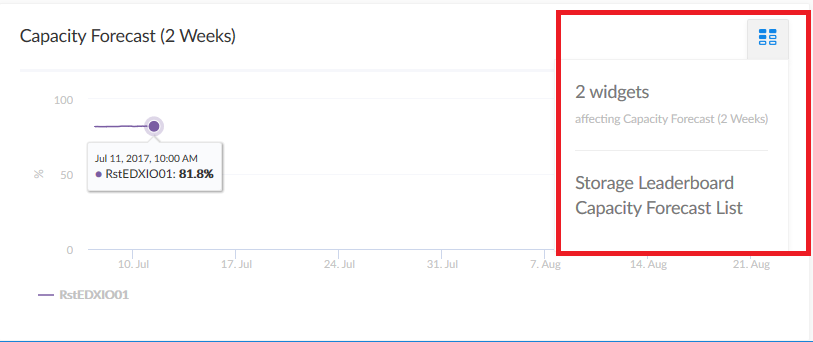
The Helper Icon
After you select one or more items in a Leaderboard widget on the Dashboards page, the widgets to the right of the Leaderboard display data relevant to your selections. The widgets also contain a small icon at the top right of each widget called a Helper icon ( ).
).
When you click the Helper icon, you can view a list of all of the widgets that drive data or provide context to that widget. In the example below, the Capacity Forecast (2 Weeks) widget receives data from both the Storage Leaderboard widget and the Capacity Forecast List widget:
Filtering Dashboard Data
On the Dashboards page, you can control the display of a widget, such as changing the time span of data displayed in all the widgets, or zooming in or out on widget data.
You can also use the button to narrow down the data displayed in all widgets.
Using the Time Span Filter
You can use the Time span filter on the Dashboards page to adjust the time span of data that appears in all the widgets on a dashboard. The default time span is Last 6 Hours to Now, but you can update the time span of data reflected in a dashboard by clicking the time span button and doing one of the following:
- Selecting an absolute time range from the list, such as Yesterday or This week so far. When you do so, SL1 automatically updates the From and To fields with the corresponding dates and times.
- Selecting a relative time span from the list, ranging from Last Hour up to Last 2 Years. When you do so, SL1 automatically updates the From and To fields with the corresponding dates and times.
- Clicking the calendar icons in the From and To fields to select the exact historical range of data that you want to display in the dashboard.
Optionally, you can also select one or both of the following options in addition to your time span selection:
- Select the Specify Time checkbox to specify the exact times (in addition to dates) that you want to display in the dashboard.
- Select the Live Data checkbox to include the most recently collected data in the dashboard. When you select Live Data, the dashboard will continually update with the most recently collected data.
After selecting a time span, click to update the dashboard.
If you select an historical time span, single-value widgets and tables will display the latest data point from the specified time span.
If you see a gap in a line on a graph, that means that SL1 did not collect any data during that time frame.
Zooming in on a Time Span
You can edit the time span of a line chart widget on the Dashboards page by clicking and dragging to "zoom in" on a specific time span.
To zoom in on the time span of a widget:
- If needed, adjust the amount of time showing on all widgets by selecting a new value from the Time Span filter. The default time frame is the last 24 hours.
- On the widget, click the start time you want to view, and then drag the cursor to the left or right to create a gray rectangle.
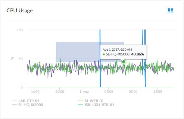
- Drag the gray rectangle to the end time you want to view, and then release the mouse button. A more detailed time span displays in the widget.
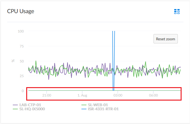
- To return to the original graph setting, click the button.
Using the All Filters Button
The button lets you filter the data in a dashboard on the Dashboards page by Organization or Device. The search process for the button works just like the Search feature works on other pages.
To filter dashboard data with the button:
- On any of the dashboards, to temporarily filter the dashboard, click the button in the top right-hand corner of the Dashboards page. If you want to save the filters you apply, click the button and then click . The Default Data window appears.
- Click in one of the fields and type your filter text. As you type, SL1 provides potential matching values in a drop-down menu. For example, if you type switches in the By Device filter field, a drop-down menu appears with a list of columns that might contain that word.
- You can select a column from the suggestions in the menu, or you can type more filter text.
- If you do not select a column from the drop-down menu, your search is labeled "ANY". Search looks through all available columns for matches to your search text.
To use an advanced filter, click the Advanced link to the right of the filter field and use custom search commands to filter the data. For more information, see Using Advanced Search.
- To clear a filter, click the button (
 ) at the end of that filter field.
 - To specify the widget that drives data (or "context") to other widgets in the dashboard, select that widget from the In Driving Widget drop-down list.
- Click the button to apply your filters and settings.
- If you are in Edit mode, click to save your filters. When the applied filters are saved, every user viewing it from that point on will view the dashboard with that filter and can adjust it temporarily.
Focusing on One Device in a Dashboard
You can use a leaderboard or table widget to focus on just one device in a dashboard on the Dashboards page. This feature is useful if you want to view charts and other widgets only for a specific device, or if you want to use the Print feature to generate a PDF of this dashboard for this device.
To focus on one device in a dashboard:
- From the Dashboards page, select a dashboard with a device leaderboard, such as Server Dashboard:

- In the leaderboard or table widget, take note of the ID for that device.
- If you don't have ID enabled as a Device Property in the table, hover over the link for the device you want to view. In the Status Bar of your browser, take note of the number at the end of the URL for that link. For example, https://em7.sciencelogic.com/inventory/devices/detail/23.
- Click the button and enter the device ID into the By Device field. When the search options appear, select id<device ID>, then click the button. When the page refreshes, only the specified device appears in the dashboard:
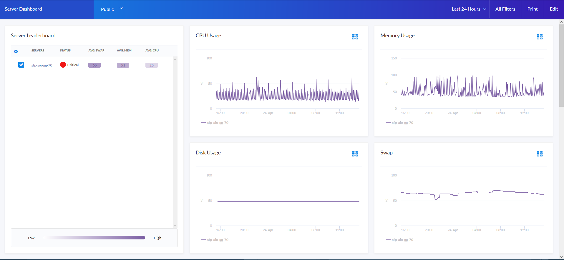
- Alternatively, you can add ?deviceId=<device ID> to the existing URL for the Server Dashboard, where <device ID> is the number you found in step 2. For example, if the original URL for the Server Dashboard is https://em7.sciencelogic.com/dashboards/server-dashboard, you would update that URL to the following: https://em7.sciencelogic.com/dashboards/server-dashboard?deviceId=23 and press . When the page refreshes, only the specified device appears in the dashboard.
- To return to the default view for the dashboard, clear the By Device field in the menu or delete the ?deviceId=<device ID> from the URL.
Printing a Dashboard
You can create a printable version of a dashboard in PDF format.
To create a PDF of a dashboard:
- Go to the Dashboards page and click the name of the dashboard you want to print. The dashboard page appears.
- Click the button on the main navigation bar. A Print dialog appears:
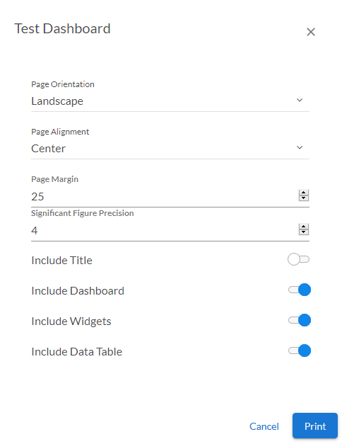
- Complete the following fields:
- Page Orientation. Select from Portrait or Landscape orientation for the output. The default is Landscape.
- Page Alignment. Select from Left, Centered, or Right justification for the output.
- Page Margin. Specify the margins in the output, in pixels. The default is 25 pixels (about .4 inches).
- Significant Figure Precision. Specify the maximum number of numerals that you want to appear after the decimal point when data is presented in the output. The default is 4.
- Include Title. Select this toggle if you want to include the title of each widget in the output.
- Include Dashboard. Select this toggle if you want to display the current view of the entire dashboard in the output.
- Include Widgets. Select this toggle if you want to display all of the individual widgets in the output.
- Include Data Table. Select this toggle if you want to display all of the current data in tables in the output.
- Click the button. SL1 generates a PDF version of the dashboard.
Creating a Dashboard for Global Manager
SL1 includes several system default dashboards, but you can also create your own dashboards that are customized to your specific data visualization needs.
In a Global Manager system:
- When the button on the Dashboards page is toggled on, you can create and view dashboards that display data from all of your monitored stacks.
- When the button on the Dashboards page is toggled off, you can create and view dashboards that display data only for devices on the Global Manager system itself.
When you create a dashboard, you are defining a container that will display widgets. You must define a name for the dashboard, specify the space for one or more widgets, and determine the settings for those widgets. Each widget displays a report about data in SL1.
To create a new dashboard for your Global Manager system in SL1:
- On the Dashboards page (), click the button to toggle it on, and then click the button. An empty dashboard page appears:
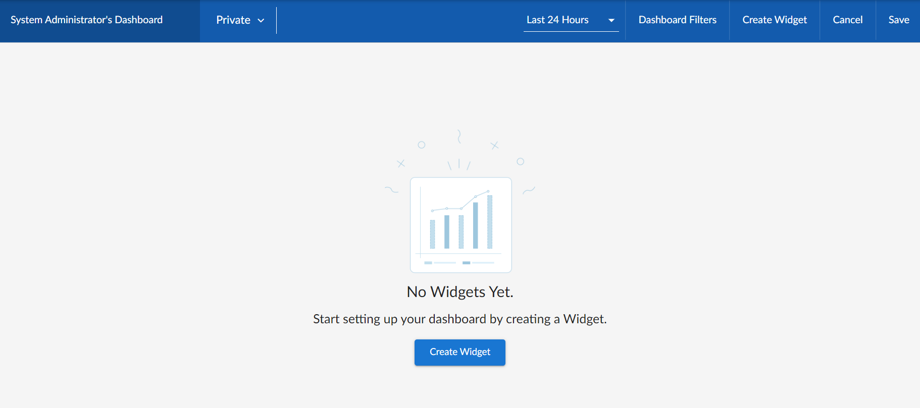
- Click the Name field at the top left corner of the page and type a name for the new dashboard. By default, the Name field displays your username and "Dashboard," such as "Jane Smith's Dashboard". Click the pencil icon (
 ) to save the name.
 - Create one or more widgets for your dashboard. For more information, see the next section, Creating Dashboard Widgets.
- Determine the dashboard's visibility settings. For more information, see the section Sharing a Dashboard.
- Click in the top right corner of the page.
Creating Dashboard Widgets
A dashboard is a container for one or more widgets that display reports about data in SL1. You can create widgets that are customized to display the specific data that you want to appear in your dashboard.
To create a dashboard widget for a Global Manager dashboard:
- On the Dashboards page, toggle on the button and then click the button to create a new dashboard or click the name of an existing dashboard that you want to edit.
- If you are creating a new dashboard, click the button. If you are editing an existing dashboard, click the button and then click the button. The Create Widget page appears:
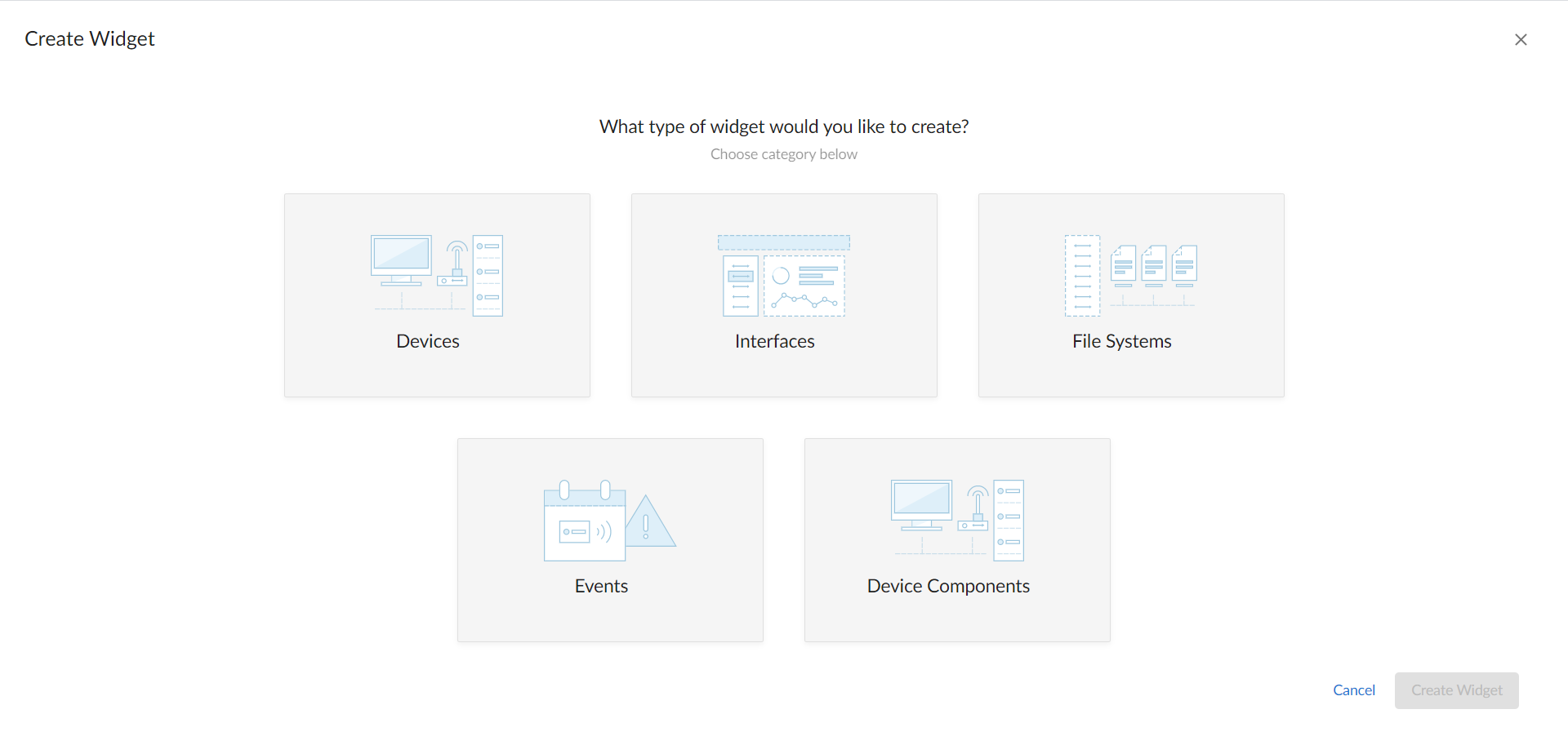
- Select a widget type by clicking the relevant box. Your options include:
NOTE: Depending on your system configuration, you might not see all widget types.
- Devices. Displays data based on devices and Dynamic Applications.
- Interfaces. Displays data about network interfaces.
- File Systems. Displays data about disk space used, in percent, for devices.
- Events. Displays data about the events that exist for devices.
- Device Components. Displays data about entities that run under the control of another device (in a parent-child relationship).
- Organizations. Displays data about selected organizations, and can drive context to Devices, Interfaces, File Systems, and Events widgets.
Because of the way data and relationships are used and presented in Device Component widgets, ScienceLogic recommends the following best practices when creating a Device Component widget:
- Using a Table visualization
- Selecting the Filter data specifically in this widget option and Filtering by parent device so that the widget returns the root level of the Device Component Map tree, based on the root level's Device Class
- Enabling the widget to drive a context of Type "Device Component" for other widgets
- Creating additional Device widgets that subscribe to that Device Component context, using additional filtering options as necessary to ensure the correct devices display in the widget
You can add Organizations widgets to dashboards only when the button is toggled off.
After you select the widget type, a new Create Widget page appears:
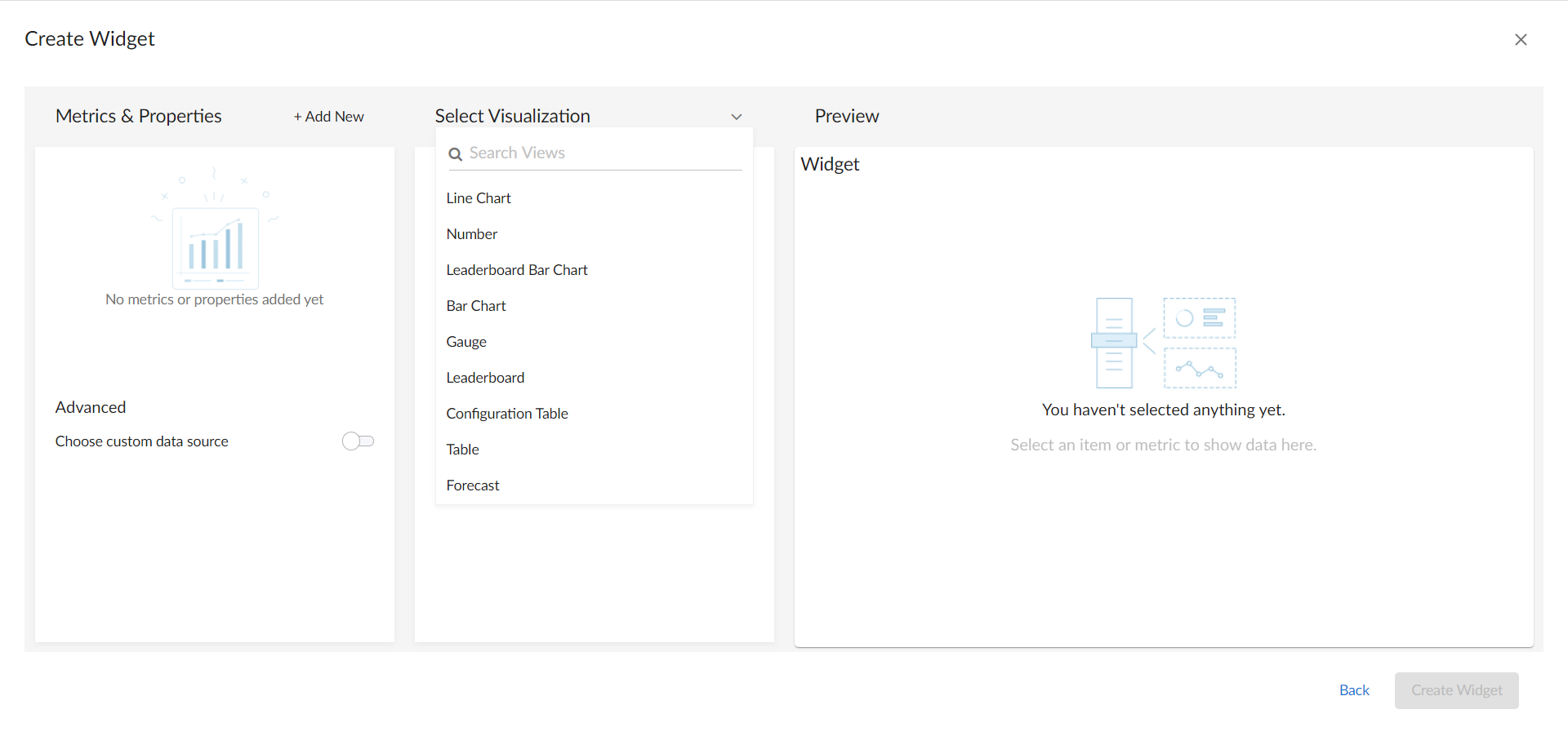
- Complete the fields on the page to customize the widget. For more information about each of the ways you can customize a widget, see the following sections:
- Selecting How the Widget Displays Data
- Adding Metrics and Properties to a Widget
- Specifying Which Items Will Appear in a Widget
As you make updates to the widget, your selections will be reflected in the Preview pane on the right side of the page.
- When you are finished customizing the widget, click the button to save the new widget. If this button is grayed out, review the settings on the page for errors or missing information in required fields.
- On the dashboard page, click .
- To add more widgets to the dashboard, click the button under the main tab bar and repeat this procedure for each new widget.
Selecting How the Widget Displays Data
On the Create Widget page, click the Select Visualization drop-down list to select how you want the widget to display data.
The visualization options that you can select vary by widget type; not all options appear for all widget types. If only one visualization option is available for the selected widget type, then that visualization option will be selected automatically.
Some widgets (such as leaderboard widgets) drive the data or "context" for other widgets in the dashboard, while other widgets receive the data or "context" from that driving widget. When a widget drives context for other widgets, that means you can select one or more items in the driving widget and it will determine the data that appears in the receiving widgets by displaying data only for the items selected. For more information, see the section on Specifying Which Items Appear in a Widget.
The available visualization options are discussed in the following sections:
Bar Chart Widgets
Bar Chart widgets display one or more metrics as a colored vertical or horizontal bar or bars. Selecting a single item can drive data or "context" to other widgets:

If you select Bar Chart, complete the following fields:
- Title. Enter a title for the widget.
- Display Horizontal Bars. Select this toggle to display bars horizontally.
- Automatically manage chart features based on widget size. Select this toggle if you want the widget to dynamically hide the chart's features (labels and legends) when the size of the widget is adjusted. For more information, see the Resizing and Moving Widgets on a Dashboard section.
- Stack Options. Specify how you want to display data in a bar chart. Your options include no-stack (show each value as its own bar), normal (show all values in one bar), and percent.
Configuration Table Widgets
Configuration Table widgets display configuration Dynamic Application data for a single device in a boxed set of rows and columns. A configuration table widget receives data or "context" from other widgets:
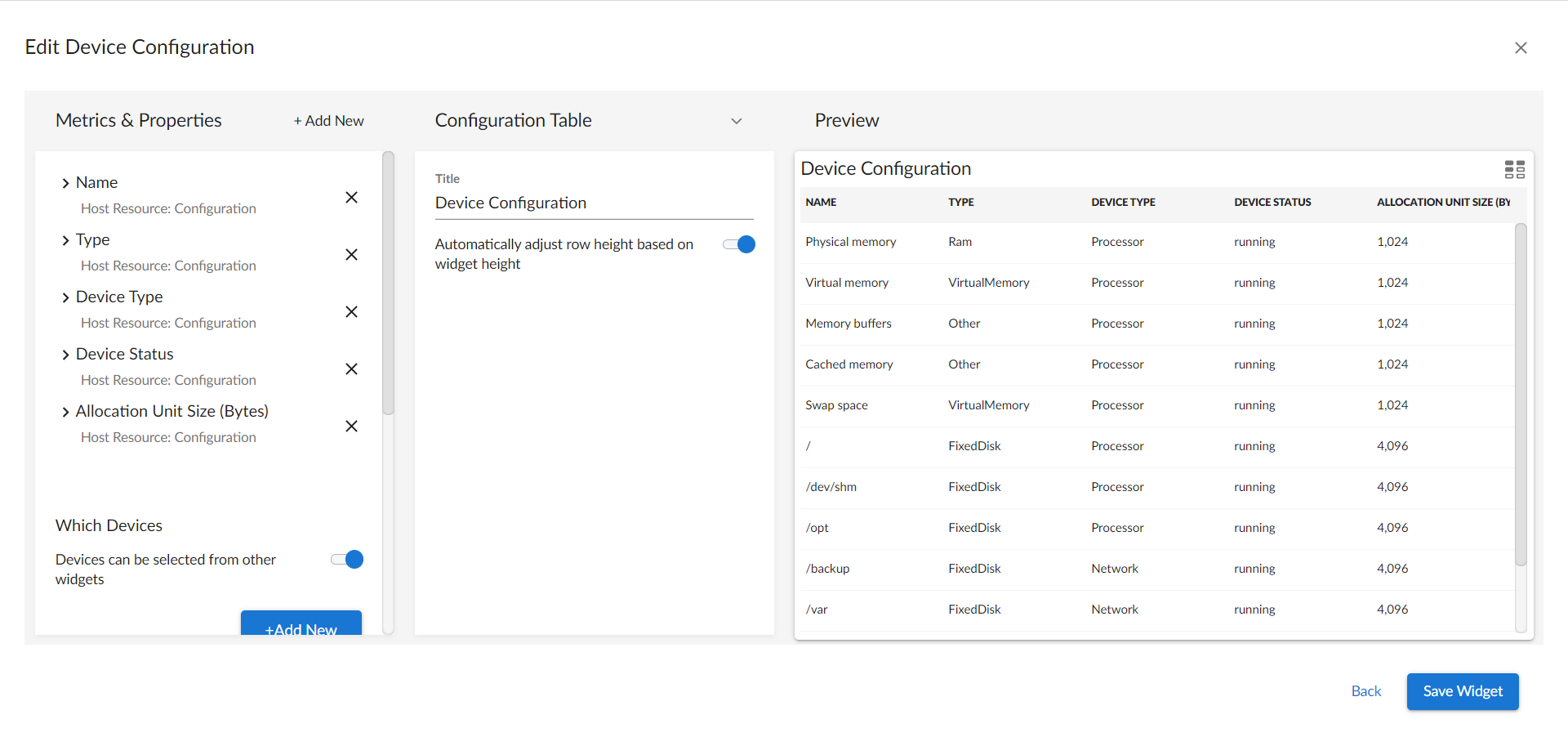
If you select Configuration Table, complete the following fields:
- Title. Enter a title for the widget.
- Automatically adjust row height based on widget height. Select this toggle if you want the widget to dynamically adjust the height of the rows in the table when the size of the widget is adjusted.
- Select Row Height. Select the relative height of the rows in the table. Choices are Small, Medium, or Large. This field appears only if the toggle is not selected in the Automatically adjust row height based on widget height field.
Forecast Widgets
Forecast widgets display projected forecast data for a specific object and collection metric using historical data and selected regression methods:
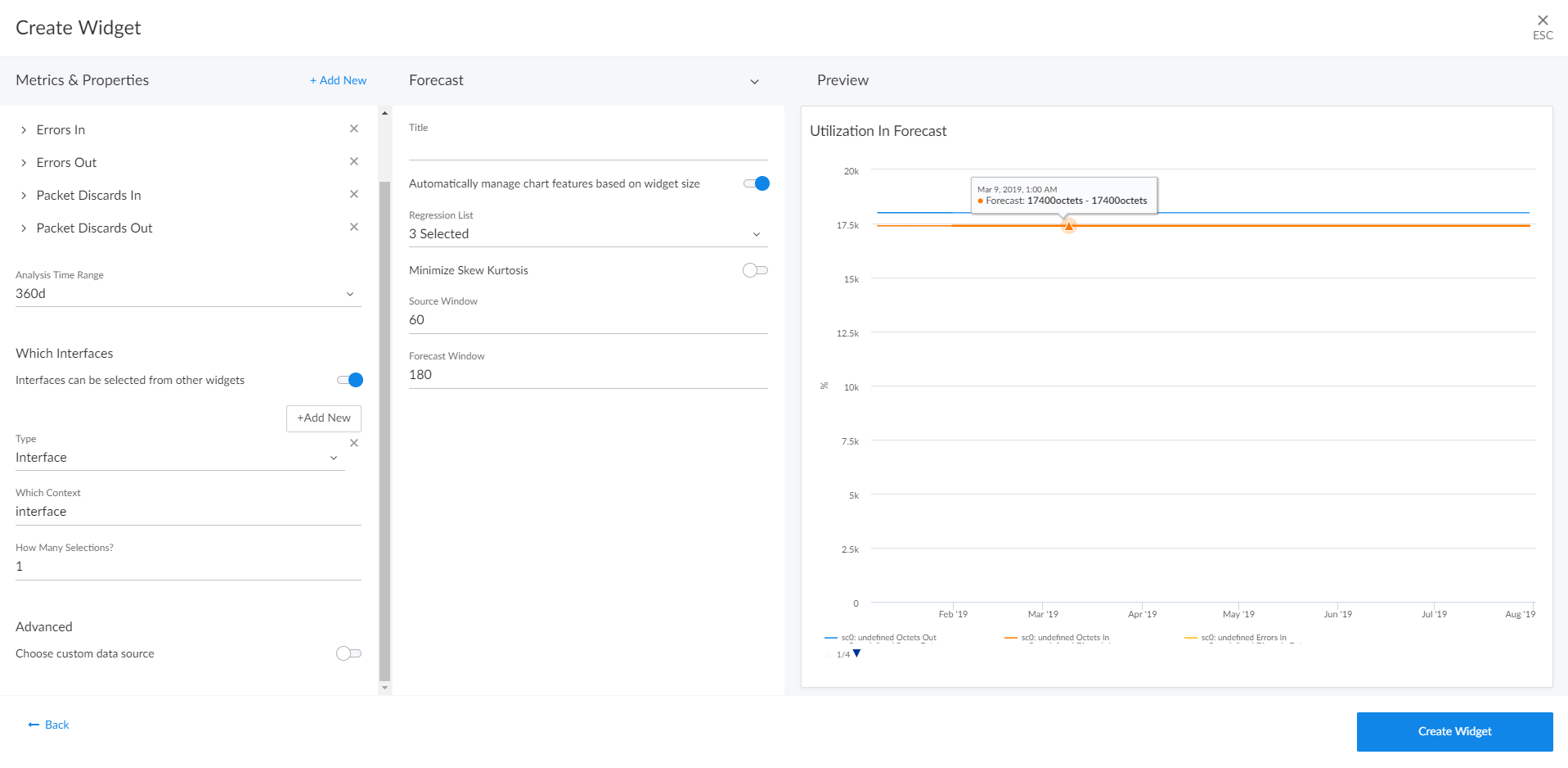
If you select Forecast, complete the following fields:
- Title. Enter a title for the widget.
- Automatically manage chart features based on widget size. Select this toggle if you want the widget to dynamically hide the chart's features (labels and legends) when the size of the widget is adjusted. For more information, see the Resizing and Moving Widgets on a Dashboard section.
- Automatically scale y-axis. Select this toggle to have the y-axis of a line chart automatically scale to fit the data. Toggling this off allows you to set a Maximum and Minimum value for the y-axis.
- Step line. Select this toggle to display the line chart in which the points are connected by horizontal and vertical line segments.
- Threshold Line. Specify a number that represents the threshold for a line chart.
- Regression List. Select the regression method or methods you want SL1 to try when calculating the forecast data in a forecast widget. You can select multiple types of regression, and SL1 will run all the regressions you selected and display the best two types of regression. ScienceLogic recommends that you select at least three regression methods to produce the most likely forecast. SL1 will then determine which regression method(s) of those you have chosen will best model the forecast data. Options include:
- Average Regression. The forecast for future values is equal to the average of the historical data.
- Drift Regression. The forecast for future values increases or decreases based on the average change observed in historical data over time.
- Exponential Least Squares Regression. The forecast for future values is an exponential curve determined by the best fit between a set of data points.
- Least Squares Regression. The forecast for future values is a straight line determined by finding the best fit between a set of data points.
- Logarithmic Least Squares Regression. The forecast for future values is a logarithmic curve determined by the best fit between a set of data points.
- Naive Regression. The forecast for future values is the same as the last collected value.
- Null Regression. The forecast for future values is generated using random samples of collected data where some elements are constant.
- Seasonal Drift Regression. The forecast for future values increases or decreases based on the average change in historical data from the same season of the year (for example, same month of the previous year).
- Seasonal Weighted Regression. The forecast for future values is determined by finding the best fit between a set of data points, which have all been weighted to increase or decrease their influence, and adjusting based on historical data collected from the same season of the year (for example, same month of the previous year).
- Seasonal Naive Regression. The forecast for future values is the same as the last collected value from the same season of the year (for example, same month of the previous year).
- Minimize Skew Kurtosis. Select this toggle button to enable transformation of the source data into a normal distribution by compensating for skewness (lack of symmetry in the data set distribution) and kurtosis (heaviness or lightness of data outliers relative to a normal distribution) in the data, which makes the data easier to read. For example, you might select this toggle if you want to normalize the distribution of a data set that is asymmetrical or has a very high or low number of outliers.
- Source Window. Specify the number of days from which the widget will gather data for the forecast. The default is 60 days.
- Forecast Window. Specify the number of days of forecast data that you want the widget to display. The default is 180 days.
Gauge Widgets
Gauge widgets display a value for a single performance metric, using a gauge that looks like a speedometer. You can also select a "solid" gauge, which displays the metric value as a colored section of a half circle:
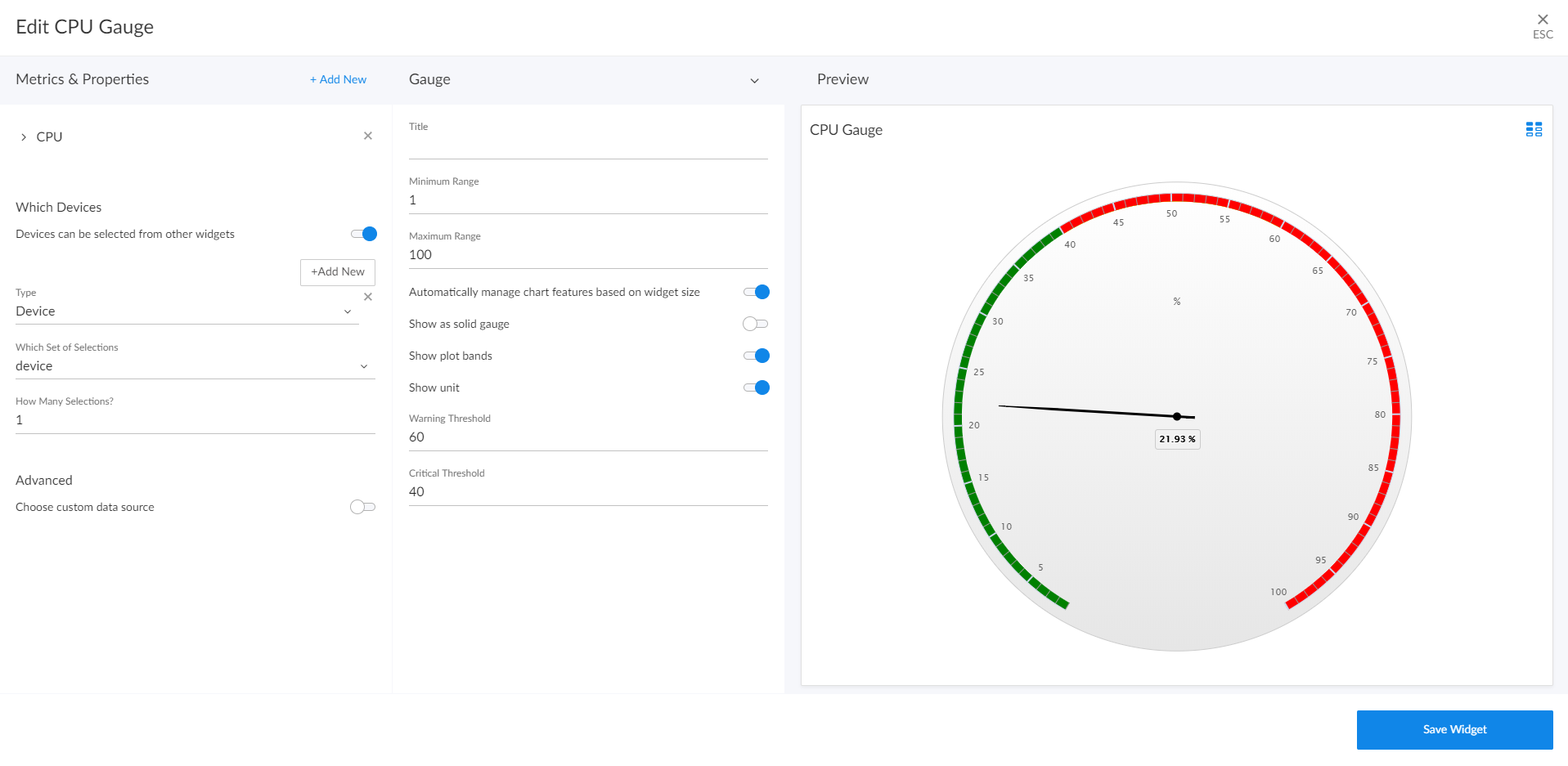
If you change the order of the Warning and Critical Thresholds, you can invert the gauge colors so that as numbers increase on the gauge, the numbers correspond with red/yellow/green instead of green/yellow/red.
NOTE: If you create a gauge widget and you select more than one item on the widget driving data or "context" to that widget, the gauge widget displays data for only the first item you selected in the driving widget.
If you select Gauge, complete the following fields:
- Title. Enter a title for the widget.
- Minimum Range. Specify the upper limit of a gauge. The default is 0.
- Maximum Range. Specify the upper limit of a gauge. The default is 100.
- Automatically manage chart features based on widget size. Select this toggle if you want the widget to dynamically hide the chart's features (labels and legends) when the size of the widget is adjusted. For more information, see the Resizing and Moving Widgets on a Dashboard section.
- Show as solid gauge. Select this toggle to display the gauge as a solid bar.
- Show plot bands. Select this toggle to show the plot bands on a gauge.
- Show unit. Select this toggle to display the current value on a gauge).
- Warning Threshold. Specify where you want the yellow warning portion of a gauge to start. The default is 60.
- Critical Threshold. Specify where you want the red critical portion of a gauge to start. The default is 80.
Leaderboard Widgets
Leaderboard widgets display the objects with the highest or lowest values for a performance metric. A leaderboard widget always drives data or "context" to other widgets, instead of receiving data or context:
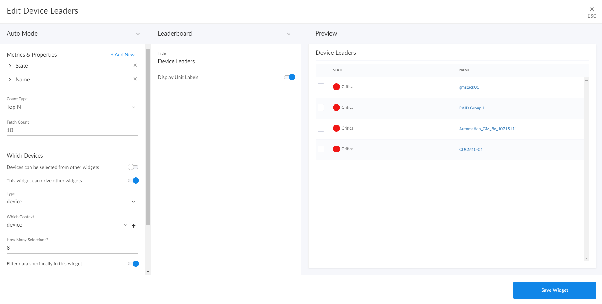
You can use the Display zeroes toggle when editing a Top-N or Bottom-N widget to enable the widget to show or hide zero results.
If you select Leaderboard, complete the following fields:
- Title. Enter a title for the widget.
- Display Unit Labels. Select this toggle to display relevant unit labels, such as "KB" or "%" along with the values in the widget.
- Display Icon. Select this toggle to display the icon associated with each item in a table.
- Automatically adjust row height based on widget height. Select this toggle if you want the widget to dynamically adjust the height of the rows in the leaderboard when the size of the widget is adjusted.
Leaderboard Bar Chart Widgets
Leaderboard Bar Chart widgets display a vertical or horizontal bar chart for the objects with the highest or lowest values for a performance metric. Selecting a single bar can drive data or "context" to other widgets:
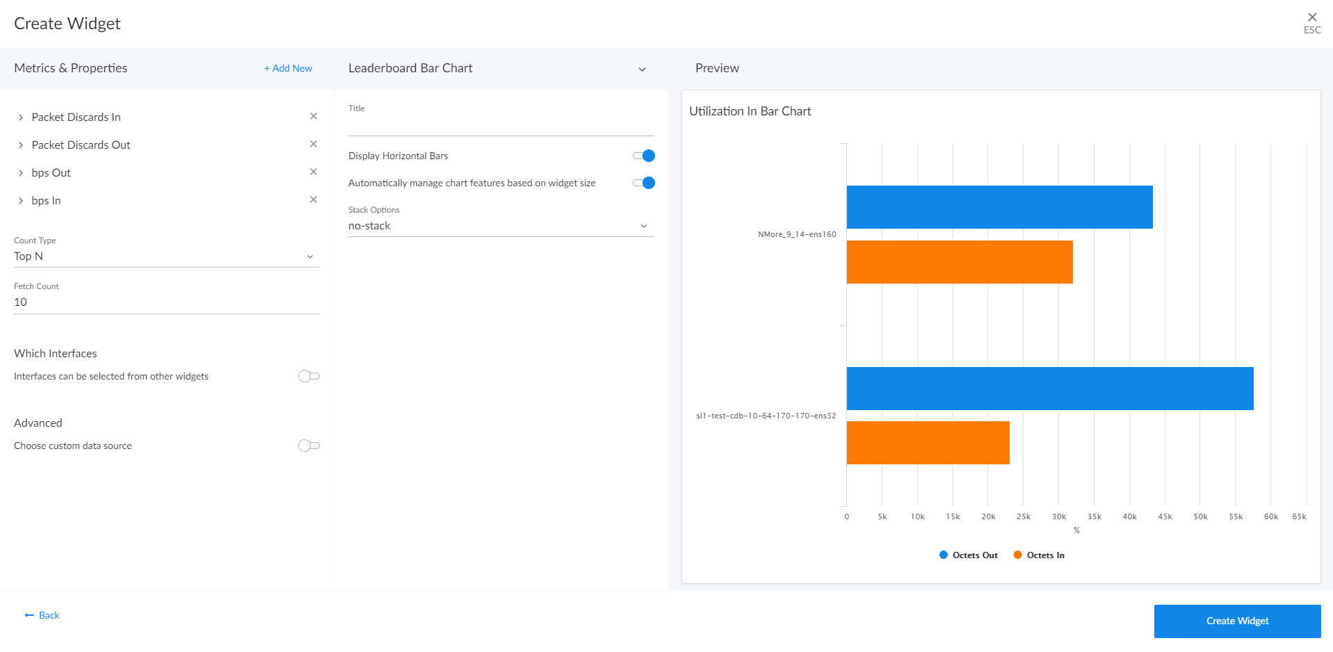
You can use the Display zeroes toggle when editing a Top-N or Bottom-N widget to enable the widget to show or hide zero results.
If you select Leaderboard Bar Chart, complete the following fields:
- Title. Enter a title for the widget.
- Display Horizontal Bars. Select this toggle to display the chart bars horizontally instead of vertically.
- Automatically manage chart features based on widget size. Select this toggle if you want the widget to dynamically hide the chart's features (labels and legends) when the size of the widget is adjusted. For more information, see the Resizing and Moving Widgets on a Dashboard section.
- Stack Options. Specify how you want to display data in a bar chart. Your options include no-stack (show each value as its own bar), normal (show all values in one bar), and percent .
- Customize Labels. For Device, File System, and Interface widgets only. Specify if you want to display only Device labels; only Device Index, File System, or Interface labels, depending on the widget type; or all labels in your bar chart.
Line Chart Widgets
Line Chart widgets display data as a series of data points over time connected by straight line segments. This enables you to view changes over time for the specific item and metric. You can click on a point in time on the line chart to display the exact metric value collected for that time. You can also zoom in on a specific time period for a better view by clicking and dragging your mouse over that time period.
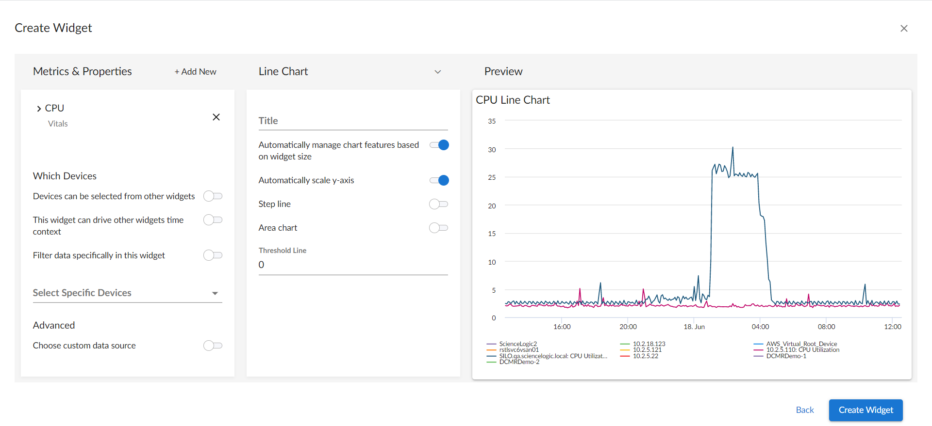
If you select Line Chart, complete the following fields:
- Title. Enter a title for the widget.
- Automatically manage chart features based on widget size. Select this toggle if you want the widget to dynamically hide the chart's features (labels and legends) when the size of the widget is adjusted. For more information, see the Resizing and Moving Widgets on a Dashboard section.
- Automatically scale y-axis. Select this toggle to have the y-axis of a Line Chart automatically scale to fit the data. Toggling this off allows you to set a Maximum and Minimum value for the y-axis.
- Step line. Select this toggle to display the line chart in which the points are connected by horizontal and vertical line segments.
- Area chart. Select this toggle to display the line chart as an area chart with the region beneath the line colored in.
- Stack Options.If Area Chart is enabled, you can specify how you want to display data in a line chart. Your options include no-stack (show each value as its own bar), normal (show all values in one bar), and percent .
- Threshold Line. Specify a number that represents the threshold for a line chart.
Number Widgets
Number widgets display data as a single number to highlight an important metric for a device or event. The size of the number and the related text that displays is based on the size of the widget, so increasing the widget size or screen size results in a larger font size. If multiple devices or events are selected, the number displays the average value for all selected items:
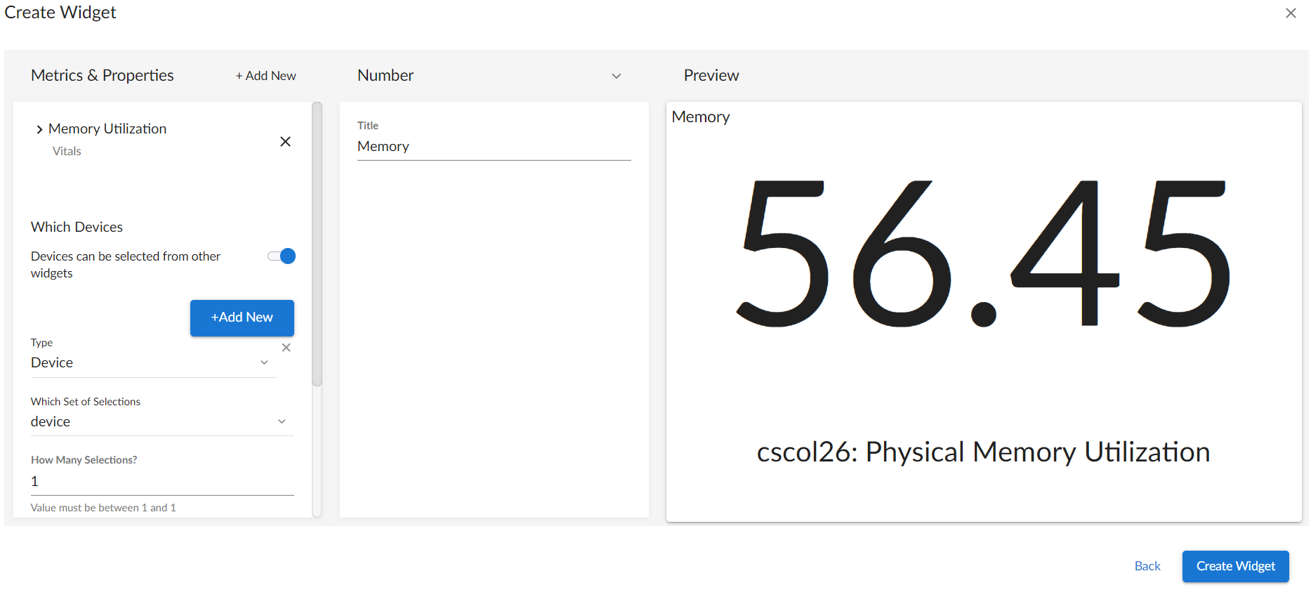
NOTE: If you create a number widget and you select more than one item on the widget driving data or "context" to that widget, the number widget displays data for only the first item you selected in the driving widget. For more information, see the section on
If you select Number, complete the following field:
- Title. Enter a title for the widget.
Pie Chart Widgets
Pie Chart widgets display data metrics as a percentage of a whole:
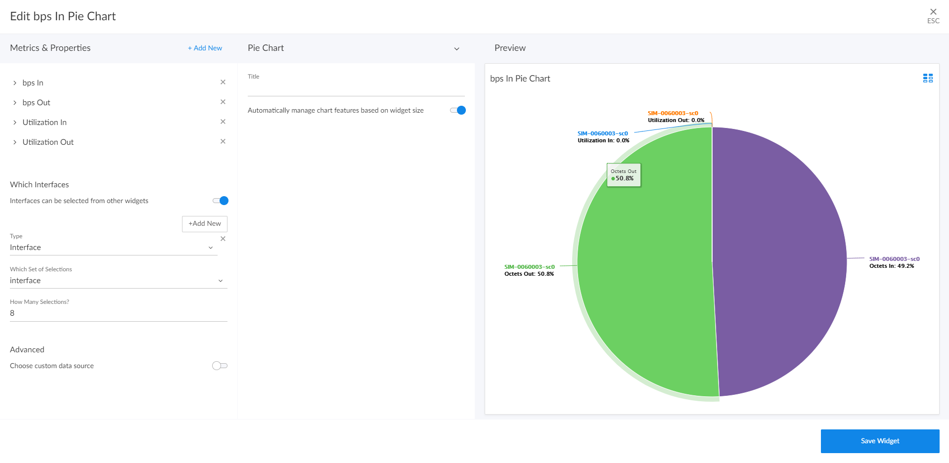
If you select Pie Chart, complete the following fields:
- Title. Enter a title for the widget.
- Automatically manage chart features based on widget size. Select this toggle if you want the widget to dynamically hide the chart's features (labels and legends) when the size of the widget is adjusted. For more information, see the Resizing and Moving Widgets on a Dashboard section.
Table Widgets
Table widgets display data in a boxed set of rows and columns. A table widget can be used to drive data or "context" to other widgets. If you have an Event, Device, or Service table, selecting its name or ID takes you to its detail page:
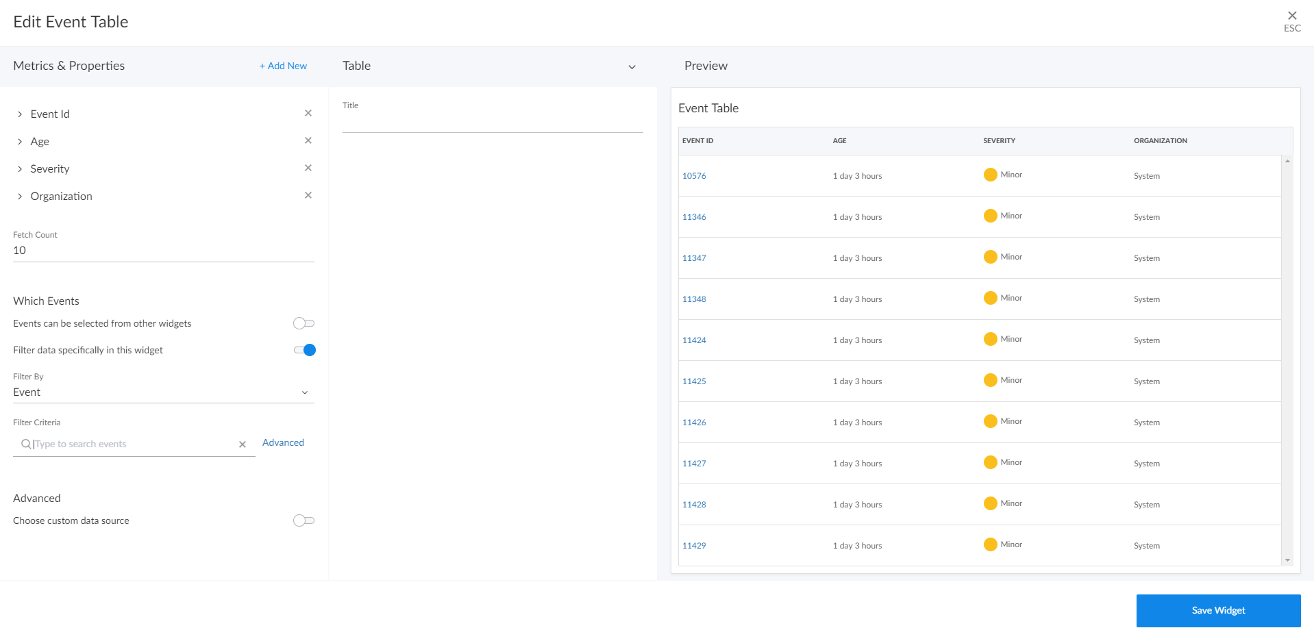
If you select Table, complete the following fields:
- Title. Enter a title for the widget.
- Display Unit Labels. Select this toggle to display relevant unit labels, such as "KB" or "%" along with the values in the widget.
- Display Icon. Select this toggle to display the icon associated with each item in a table.
- Automatically adjust row height based on widget height. Select this toggle if you want the widget to dynamically adjust the height of the rows in the table when the size of the widget is adjusted.
- Select Row Height. Select the relative height of the rows in the table. Choices are Small, Medium, or Large. This field appears only if the toggle is not selected in the Automatically adjust row height based on widget height field.
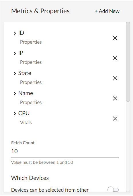
Adding Metrics and Properties to a Widget
On the Create Widget page, you can specify the metrics and properties that you want to appear in your widget.
To add a metric type or property to a widget:
- On the Create Widget page, click the Metrics & Properties label or click + Add New. A drop-down list displays a list of metric types and properties from which you can choose:
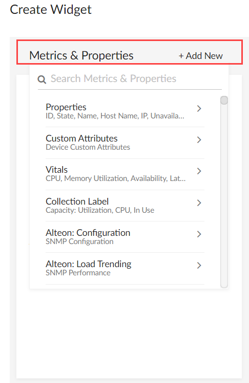
The metric types and properties that you can select are specific to the widget type you selected; not all options appear for all widget types.
- Select a metric type. Your possible options include:
- Properties. These metrics contain basic device information, including ID, State, Name, Host Name, Interface ID, IP, Index, Index Label, Collector Group, Device Class, and Unavailable. Name, Host Name, and State are commonly used for leaderboard widgets.
- Custom Attributes. These metrics contain any custom attributes you created in SL1. Custom attributes are name-value pairs that you can use to add custom descriptive fields to assets, devices, interfaces, themes, and vendors. For more information, see
- Vitals. These metrics contain the key metrics about a device, including CPU, Memory Utilization, Availability, Latency, and Swap.
- Collection Label. These metrics contain the available collection labels that you can use as metrics in the widget. Collection labels allow you to group and view data from multiple performance Dynamic Applications in a single widget.
- Dynamic Application metrics. These metrics contain the available Dynamic Applications that you can use as metrics in the widget, such as "AWS Custom Metrics" or "Cisco: BGP Peer Stats". This menu continually loads more Dynamic Applications as you scroll to the end of the list.
- Interface: These metrics contain information about discovered network interfaces on the device, including Utilization In or Out, Errors In or Out, and Packet Discards In or Out. (This option appears only for Interface widget types.)
- File System. These metrics contain information about the amount of disk space used, in percent. (This option appears only for File System widget types.)
- Polled Data. These metrics contain information about agent polled data and return with a timestamp.
To locate a specific metric, type a search term in the Search Metrics & Properties field to filter the list of categories. Once you navigate to a selected category, you can search the list of metrics within that category.
- When you select a metric type, a new menu appears with a list of metrics and properties that you can add to your widget. Select one or more metrics or properties from the menu and then click the back-arrow icon (
 ) to return to the main Metrics & Properties drop-down list.
To remove a metric from a widget, click the X next to the metric name under the Metrics & Properties drop-down list.
- When you are done selecting metrics, click the Metrics & Properties drop-down list to minimize it. The list of selected metrics appears under the Metrics & Properties field:
- To edit the settings for a specific metric, click the metric name or the forward-arrow icon (
 ) to access a menu for that metric. The forward-arrow icon will turn to a downward-arrow icon (
 ) and a list of settings will appear for that metric:

Not all metrics have these additional settings.
The possible metric settings include:
- Aggregation. Specify the method of aggregation (average, maximum, minimum) to display on the collected values for this metric.
- Analysis Time Range. Optionally, update the time frame displayed in this widget. (This option applies only to forecast widgets).
- Count Type. You can choose from Top N to display the highest values for the selected metric, or Bottom N to display the lowest values for the selected metric. (This option applies only to leaderboard and table widgets.)
- Display Name. Type a name for this metric as you want it to display in the widget.
- Display Zeroes. Use this toggle when editing a Top-N or Bottom-N widget to enable the widget to show or hide zero results.
- Fetch Count. Type the number of devices that you want to view on the widget. (This option applies only to
- Indexes. Specify the index values that you want to be returned per device for this metric. Select one of the following options:
- First Index. Returns only the first index value for this metric.
- Last Index. Returns only the last index value for this metric.
- Multiple. Specify the number of index values that you want to be returned per device for this metric. You can also select the Advanced Filters option, which enables you to search for specific indexes by index value, name, or metric presentation.
NOTE: This option applies only to device widgets.
- Maximum Value. Specify the highest possible value to be displayed in the widget.
- Minimum Value. Specify the lowest possible value to be displayed in the widget.
- Rollup Frequency. Specify a type of normalized performance data (hourly, daily, or raw) for this metric. Raw data is stored up to the system threshold, and then "rolled-up" into hourly and then daily data as it gets further into the past. Certain widgets allow for "auto", which will display the best data for the timespan being viewed.
- Type. Select a display type for this metric, such as heat for a heat map that displays the percentage of change over time, or label for a simple table. If you select heat map, you can also specify the minimum and maximum values for the table. Another example would be for an availability metric, where you can choose between label to show availability as a text label or state to show availability as a colored icon.
- Unit. Optionally, specify the unit for this widget, such as a percentage or a unit of time.
Specifying Which Items Will Appear in a Widget
On the Create Widget page, there are several ways in which you can specify how SL1 should determine the items that will appear in your widget.

In the Which <Items> section (where <Items> corresponds with the widget type you created), you can:
- Determine if the widget will drive data (or "context") to another widget or receive data (or "context") from another widget
- Filter a specific set of data in the widget
- Select specific devices or services that you want to appear in the widget
- Select the custom data source you want to use
To specify which items will appear in a widget, you can select one of the following options, more than one of the options, or none of the options in the Which <Items> section of the Create Widget page:
- <Items> can be selected from other widgets. Select this option if you want this widget to receive and display data (or "context") based on what a user selects in another widget. This option is selected by default for these visualization types: line chart, number, gauge, and forecast. If you select this option, complete the following fields to define the widgets from which you want to receive data:
- Type. Select a widget type that will drive data or "context" to this widget. The default type is based on the current widget type. For example, if you want a Device widget to drive data to this widget, select Device.
- Which Set of Selections. From the drop-down list, select the item type that the user will select to drive the data ("context") to this widget. The default selection type is based on the widget type you selected in the Type field. For example, if you want the user to select one or more devices in another Device widget to drive the data that appears in this widget, select device.
- How Many Selections? Select the maximum number of items the user can select in the driving widget. For example, if you want the user to be able to select only one device at a time, select 1.
To add another widget from which this widget can receive data (or "context"), click the button and complete the Type, Which Set of Selections, and How Many Selections fields for that additional widget.
- This widget can drive other widgets. Select this option if you want this widget to drive data (or "context") to other widgets. This option is selected by default for these visualization types: leaderboard and table. If you select this option, complete the following fields to define the type of devices to which you want to drive data:
- Type. Select the widget type that will receive data or "context" from this widget. The default type is based on the current widget type. For example, if you want a Device widget to drive data to this widget, select Device.
- Which Set of Selections. Select an existing context label or click the plus icon (
 ) to type a context label for this widget if you want this widget to drive context to other widgets. The default context type is based on the widget type. Leaderboard Bar Chart widgets for events can have multiple contexts. Also, a File System or Interface widget can publish its file system or interface context as well as a secondary context of device.
 - How Many Selections? Select the maximum number of items the user can select in the driving widget. For example, if you want the user to be able to select only one device at a time, select 1.
- Auto Selection. Select the number items that are automatically selected in the widget that drives context to other widgets.
You can see where a receiving widget gets its data by clicking the Helper icon () for that widget after you create the receiving widget.
- Filter data specifically in this widget. Select this option if you want to view a specific set of data in this widget. For example, you can create multiple leaderboard widgets in a dashboard that contain just the devices you want to view. If you select this option, complete one or both of the following fields to define the type of data you want to display in this widget:
- Filter By. Select the type of widget you want to use as a filter for this widget.
- Filter Criteria. Type a search term to filter this widget.
- Select Specific Devices. If you are creating a widget for devices, select the specific devices that you want to include in the widget. These devices will appear in addition to any devices that would appear based on context receiving/driving or filtering.
- Advanced.
- Choose custom data source. Toggling this on will display the Data Source drop-down. Select the custom data source you wish to use, if applicable. This option is for advanced users only. Options include Auto Mode or various metric types.
Sharing a Dashboard
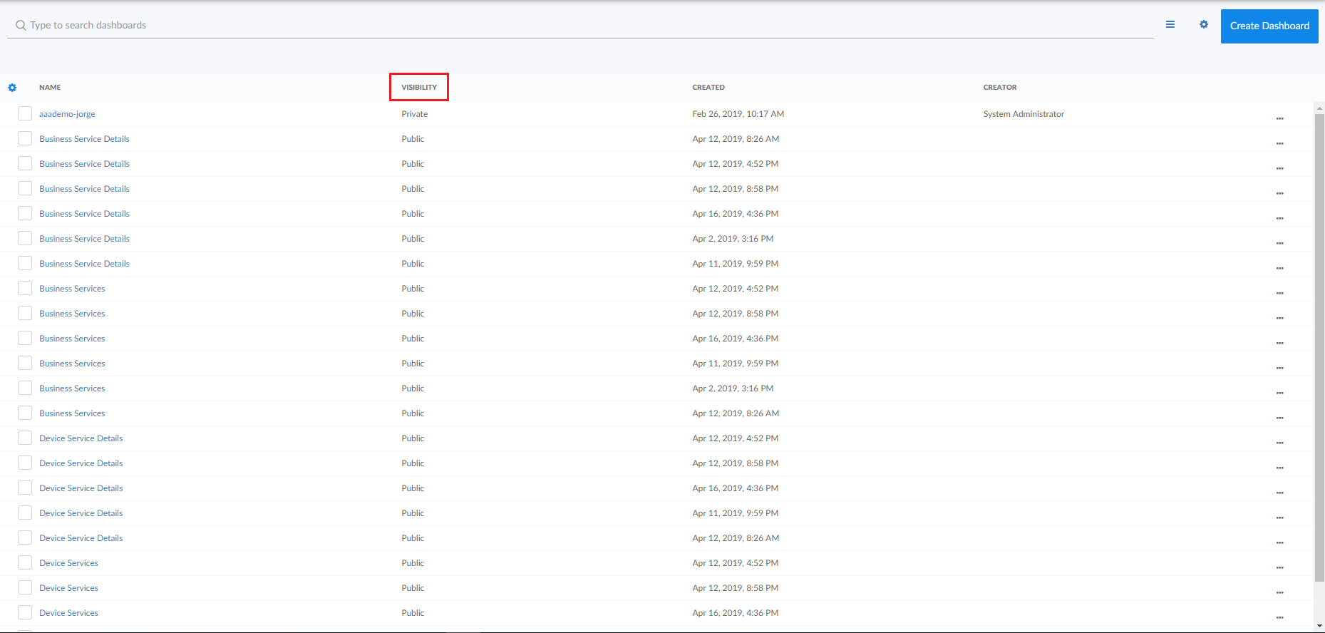
By default a dashboard is private when you create it. You can make a dashboard public, which lets you share it with other users. On the Dashboards page, the Visibility column lists whether a dashboard is public, private, or shared with only specific organizations.
The data within each dashboard is limited using multi-tenancy restrictions to allow only users with proper permissions and organization memberships to view data. There are four scenarios for dashboard visibility:
- Private. Only the creator of the dashboard can view the dashboard.
- Public. All users can view the dashboard.
- Shared to the System Organization. Only administrator users can view the dashboard.
- Shared to Specified Organizations. Members of the specified organization or organizations can view the dashboard.
To change the visibility of a dashboard:
- Go to the Dashboards page and open the dashboard. Click the button on the main navigation bar.
- Next to the title of the dashboard, click the Visibility drop-down list and select one of the following options:
- Private. The dashboard is visible to only the creator of the dashboard.
- Public. The dashboard is visible to all users.
- Specific Organizations. The dashboard will be shared only with organizations that you select. When you select Specific Organizations, a list of organizations appears. You can search for an organization, click Select All, or click None to deselect all organizations.
- If you are an Administrator user and want to share a dashboard with only the System organization, select System from the organization list.
- If you have dashboards that you want to share with users in other organizations, but not with System, select the organization(s) from the list and deselect System.
- After you set the visibility of your dashboard, click the button on the main navigation bar.
Editing a Dashboard
If you have the proper permissions, you can edit an existing dashboard by performing the following steps:
- Go to the Dashboards page and click the name of the dashboard you want to edit. The dashboard page appears.
- Click the button on the main navigation bar.
- Do one of the following:
- If you want to add a widget to the dashboard, click the button. For more information about creating widgets, see the section Creating Dashboard Widgets.
- If you want to edit an existing widget, click the button (
 ) on that widget and select Edit. The Edit page appears.
 - If you want to make a copy of an existing widget and then customize the new widget, click the button () and select Duplicate. The new widget appears at the bottom of the dashboard. You can then click the button () on that widget and select Edit to make changes to the widget.
- Make your changes to the widget, and then click the button when you are done.
- As needed, edit any other widgets on the dashboard.
- When you are done editing the dashboard, click the button on the main navigation bar.
Resizing and Moving Widgets on a Dashboard
To resize and move widgets on a dashboard:
- Go to the Dashboards page and click the name of the dashboard you want to edit. The dashboard page appears.
- Click the button on the main navigation bar.
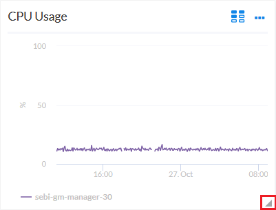
- To resize a widget, click the resizing icon (
 ) at the bottom right-hand corner of the widget and drag the widget until it is the size you want. Widgets are based on a fractional grid of the dashboard screen size. You can snap the widget to 12 columns and 8 rows, which are proportional to the total size of the browser, and scale up or down as the browser does.
- To move a widget, click the header for that widget and drag the widget to its new location on the dashboard.
- Click the button when you are done resizing or moving widgets on the dashboard.
If you selected the Automatically manage chart features based on widget size toggle when creating the widget, the widget will dynamically show or hide features of the chart, such as axis labels or the legend, depending on the effective size of the widget on the screen.
For example, if the widget is 1/2 of the height and 1/4 of the width of the dashboard, the widget might display at 500 by 400 pixels when viewed in a large browser on a 1080-pixel screen. This feature will display all the surrounding information in the widget to the user when they have this much resolution to devote to the chart. However, if the same dashboard is viewed in a smaller resolution or screen, or the widget itself is resized to be a smaller fraction of the dashboard, features of the chart may automatically be hidden to maximize the amount of data that is displayed within the smaller panel.
Certain features are associated with widget height, such as table row height or horizontal axis labels, while other features are associated with widget width, such as vertical axis labels.
If you disable the Automatically manage chart features based on widget size toggle, you are presented with options to manually enable or disable each feature of each chart and table, and the size of the user's browser or widget display will not cause those features to appear or disappear.
Deleting a Dashboard
You can delete any dashboard that you have created, as well as any other dashboard in SL1.
WARNING: If you delete a dashboard, that dashboard is deleted for all users.
To delete a dashboard:
- On the Dashboards page, click the button () for the dashboard you want to delete and select Delete.
- On the Delete Dashboard dialog, click the button to permanently remove the dashboard.