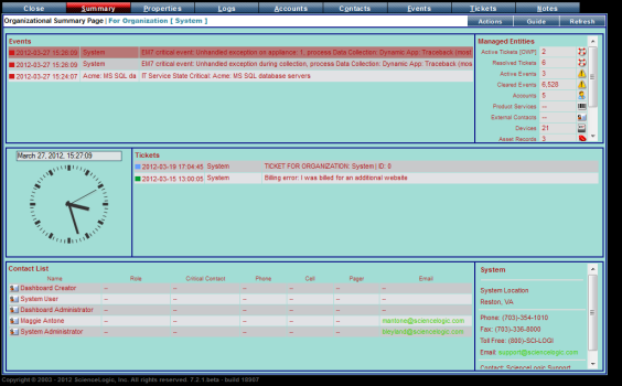
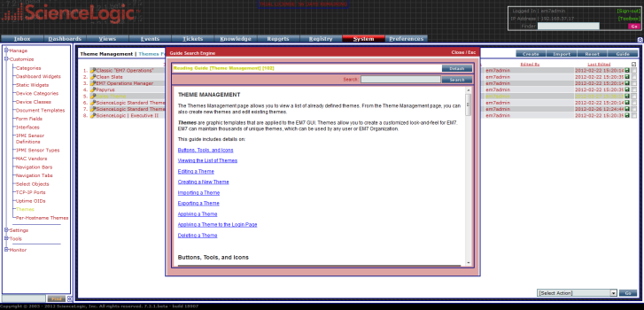
A theme is a graphic template this is applied to the user interface. SL1 is deployed with a default theme. You can use this theme or create your own theme to customize the look and feel of SL1. SL1 can maintain thousands of unique themes that can be imported or exported and can be applied by any user or user policy. When a user or user policy applies a theme, the user interface immediately uses the colors and graphics defined in the theme.
To view, create, and edit themes, accounts of type "user" must be granted one or more access keys that include the access hook SYS_CUSTOM_THEMES_REG_PAGE.
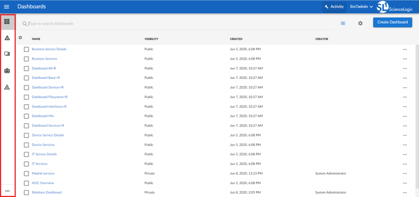
Use the following menu options to navigate the SL1 user interface:
- To view a pop-out list of menu options, click the menu icon (
 ).
). - To view a page containing all of the menu options, click the Advanced menu icon (
 ).
).
Viewing the List of Themes
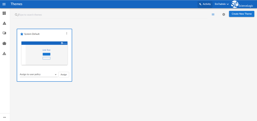
The Themes page contains a tile-view list of all the themes available to you in SL1, as well as a preview image of each theme.
SL1 includes one System Default theme that can be used or duplicated. This System Default theme cannot be edited or deleted.
You can also create your own custom themes that can be used by other users and user policies in SL1. After you create a theme, it will automatically be added to the Themes page, where the theme can be edited, deleted, duplicated, set as the default, and used by other users and user policies.
To view the list of themes in SL1 on the Themes page, click your user name in the navigation bar at the top of any SL1 page and select Settings > Themes:
Creating a New Theme
SL1 includes one System Default theme, but you can completely customize the look and feel of your SL1 system by creating new themes. For example, you could create a theme that replaces the SL1 logo with your company's logo and updates the colors used in the user interface to match those used in your company's branding. You can also choose between a light theme or a dark theme for the user interface.
To create a new theme for SL1:
- Click your user name in the navigation bar at the top of any SL1 page and select Settings > Themes. The Themes page appears.
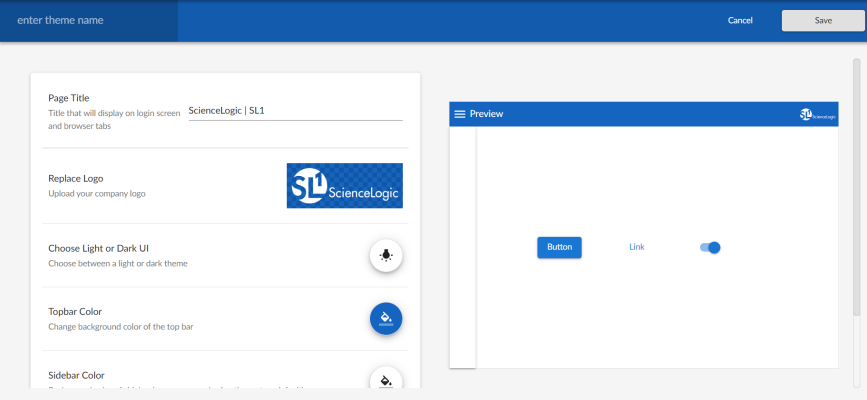
- Click . The Theme Settings page appears:
- At the top left of the blue navigation bar, type a name for the new theme in the enter theme name field.
- Update the fields on the page to customize the user interface to your preference. For more information about each of the user interface options that you can customize, see the following sections:
- Customizing the Page Title in the UI
- Customizing the Logo in the UI
- Choosing a Light or Dark UI Theme
- Customizing the Topbar Color in the UI
- Customizing the Sidebar Color in the UI
- Customizing the Color for Buttons, Links, and Other UI Elements
As you make updates to the theme, your selections will be reflected in the Preview pane on the right side of the page.
- When you are finished customizing the UI options, click .
These settings are saved in SL1 user preferences. This data is not saved to the database, and it cannot be assigned across organizations or user groups at this time.
Customizing the Page Title in the UI
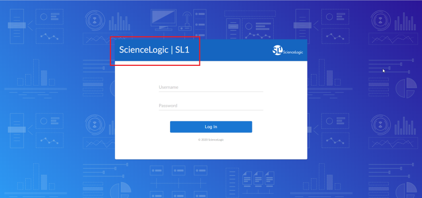
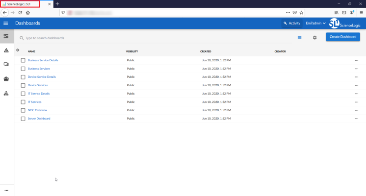
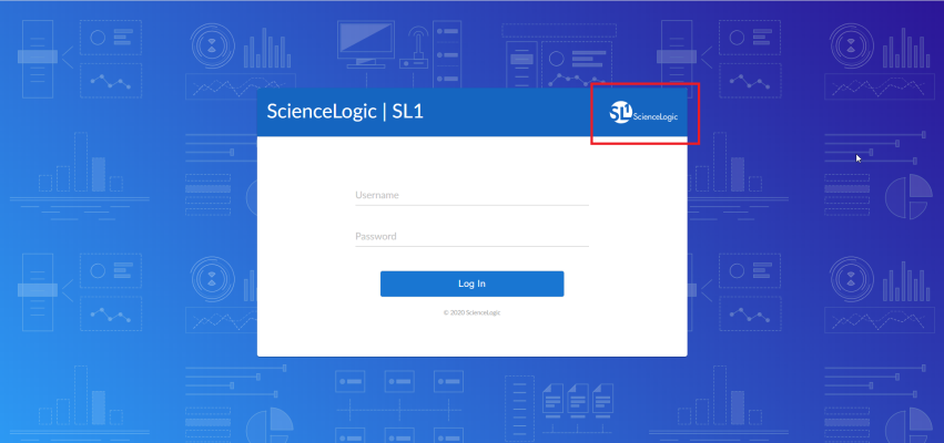
The Page Title field on the Theme Settings page enables you to customize the title that appears on the login page and in browser tabs:
To customize the page title:
- Click your username in the navigation bar at the top of any SL1 page and select Settings > Themes. The Themes page appears.
- Click to create a new theme, or click the Actions button (
 ) on an existing theme and select Edit Theme. The Theme Settings page appears.
 - In the Page Title field, add a short, descriptive title to appear on the login page and in browser tabs.
- Click .
Customizing the Logo in the UI
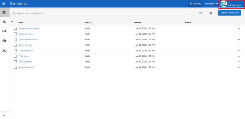
The Replace Logo field on the Theme Settings page enables you to customize the logo that appears in the topbar at the top of each page in SL1 and on the login page:
Customized logos must meet the following criteria:
- The image file must be in .SVG format.
- The file must not be larger than 40 KB.
- The file cannot be animated.
- The file cannot contain bitmaps.
To customize the logo:
- Click your user name in the navigation bar at the top of any SL1 page and select Settings > Themes. The Themes page appears.
- Click to create a new theme, or click the Actions button (
 ) on an existing theme and select Edit Theme. The Theme Settings page appears.
 - In the Replace Logo field, click the current logo. The Upload Logo window opens.
- Drag and drop the .SVG image that you want to use into the Browse or Drop box, or click the Browse or Drop box to browse for and select an image from your computer.
- When you are finished, click . The Upload Logo window closes, and the new logo appears in the Replace Logo field.
- Click .
Choosing a Light or Dark UI Theme
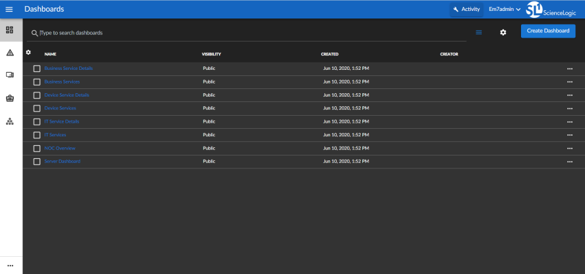
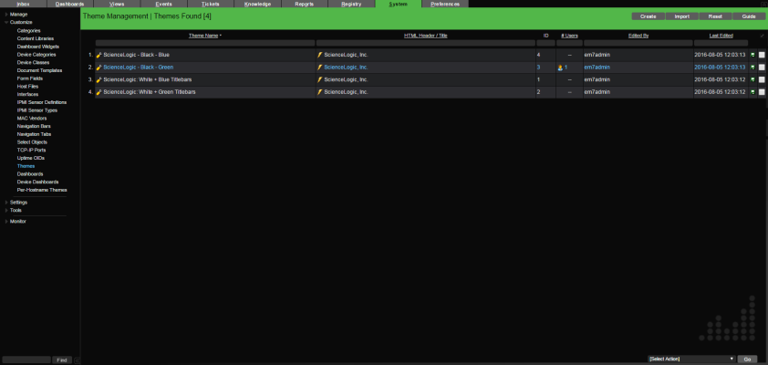
The Choose Light or Dark UI field on the Theme Settings page enables you to switch between a light user interface background or a dark user interface background. The following images demonstrate what the same page looks like in both light and dark modes:
To choose a light or dark UI background:
- Click your user name in the navigation bar at the top of any SL1 page and select Settings > Themes. The Themes page appears.
- Click to create a new theme, or click the Actions button (
 ) on an existing theme and select Edit Theme. The Theme Settings page appears.
 - In the Choose Light or Dark UI field, click the lightbulb button to choose either a light or a dark theme for the UI.
- Click .
Customizing the Topbar Color in the UI
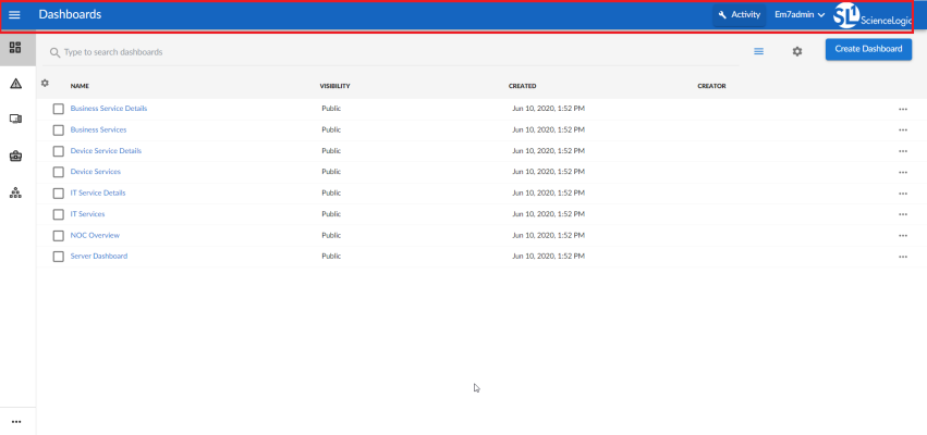
The Topbar Color field on the Theme Settings page enables you to customize the color that appears in the topbar at the top of each page in SL1:
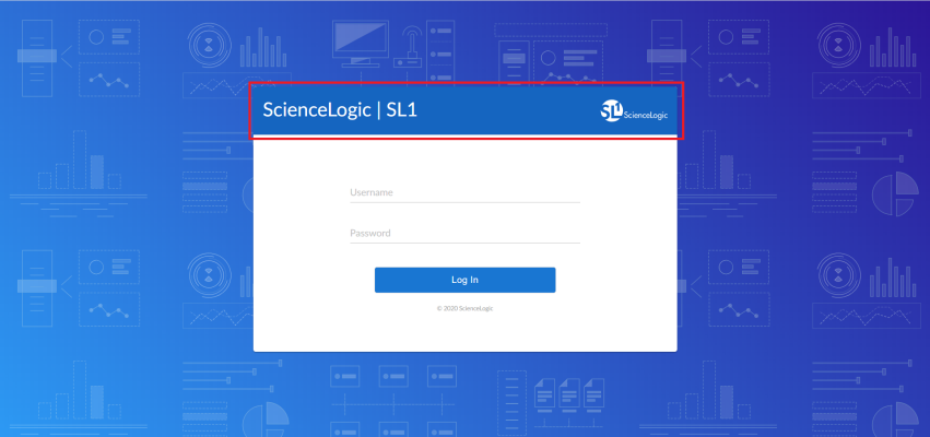
If the theme is set as the default theme, then the color selected in the Topbar Color field will also appear at the top of the window on the login page:
To customize the topbar color:
- Click your user name in the navigation bar at the top of any SL1 page and select Settings > Themes. The Themes page appears.
- Click to create a new theme, or click the Actions button (
 ) on an existing theme and select Edit Theme. The Theme Settings page appears.
 - In the Topbar Color field, click the paint bucket button. A color selection window opens.
- Select a new color in one of the following ways:
- Click the color spectrum bar to select a color within the spectrum and then click the specific shade that you want in the color picker box above.
- Type the hex value of the color you want in the Hex field.
- Type the red, green, and blue values of the color you want in the R, G, and B fields.
- Click one of the default color options provided.
- When you are finished, click . The color selection window closes, and the new color appears in the Topbar Color field.
- Click .
Customizing the Sidebar Color in the UI
The Sidebar Color field on the Theme Settings page enables you to customize the color that appears in the sidebar menu on the left side of each page in SL1:
To customize the sidebar color:
- Click your user name in the navigation bar at the top of any SL1 page and select Settings > Themes. The Themes page appears.
- Click to create a new theme, or click the Actions button (
 ) on an existing theme and select Edit Theme. The Theme Settings page appears.
 - In the Sidebar Color field, click the paint bucket button. A color selection window opens.
- Select a new color in one of the following ways:
- Click the color spectrum bar to select a color within the spectrum and then click the specific shade that you want in the color picker box above.
- Type the hex value of the color you want in the Hex field.
- Type the red, green, and blue values of the color you want in the R, G, and B fields.
- Click one of the default color options provided.
- When you are finished, click . The color selection window closes, and the new color appears in the Sidebar Color field.
- Click .
Customizing the Color for Buttons, Links, and Other UI Elements
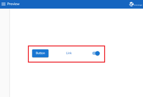
The Highlight Color field on the Theme Settings page enables you to customize the color that appears for buttons, links, and other action items in SL1:
To customize the color for buttons, links, and other UI elements:
- Click your username in the navigation bar at the top of any SL1 page and select Settings > Themes. The Themes page appears.
- Click to create a new theme, or click the Actions button (
 ) on an existing theme and select Edit Theme. The Theme Settings page appears.
 - In the Highlight Color field, click the paint bucket button. A color selection window opens.
- Select a new color in one of the following ways:
- Click the color spectrum bar to select a color within the spectrum and then click the specific shade that you want in the color picker box above.
- Type the hex value of the color you want in the Hex field.
- Type the red, green, and blue values of the color you want in the R, G, and B fields.
- Click one of the default color options provided.
- When you are finished, click . The color selection window closes, and the new color appears in the Highlight Color field.
- Click .
Assigning Themes to Users
SL1 comes with a System Default theme already installed. As its name implies, this theme will initially be the default theme used by all users in your SL1 system.
However, as you create new themes, you can override the default by setting a new default for all SL1 users, or by assigning a theme to yourself or to a user policy.
The following hierarchy determines which theme is assigned to a user:
- User Policy. If the user belongs to a user policy that has a defined theme, then that user policy theme is used.
- User Account. If the user does not belong to a user policy that has a defined theme, but does have a theme assigned to their user account, then that user account theme is used.
- Default. If the user does not belong to a user policy that has a defined theme and does not have a theme assigned to their user account, but a theme other than System Default is set as the default theme, then that default theme is used.
- System Default. If none of the above scenarios apply, then the System Default theme is used.
The following sections describe how to assign themes other than the System Default theme to users.
Assigning a Theme to a User Policy
When you assign a theme to a specific user policy, then that theme becomes the theme for every user assigned to that user policy.
To assign a theme to a user policy:
- Click your user name in the navigation bar at the top of any SL1 page and select Settings > Themes. The Themes page appears.
- Find the theme that you want to assign, then click the drop-down menu in the Assign to user policy field for that theme.
- Select the check box next to each user policy that you want to assign to that theme.
You can use the search field to help locate the user policy or user policies that you want to assign to that theme.
- When you are finished, click outside of the drop-down menu. The user policy or policies that you selected now appear in the Assign to user policy field.
- Click .
Assigning a Theme to Yourself
You can assign an existing theme to yourself. When you do so, that theme will be applied to the SL1 user interface rather than the current default theme any time you log in.
To assign a theme to yourself:
- Click your user name in the navigation bar at the top of any SL1 page and select Settings > Themes. The Themes page appears.
- Click the Actions button (
 ) on an existing theme and select Assign theme to me.
 - The selected theme is immediately applied to your SL1 system.
Setting a New Default Theme
SL1 comes with a System Default theme already installed. As you create new themes, you can set one of those as the default theme instead. When you do so, it makes that theme the default theme for all users who do not otherwise have another theme assigned to their user account or belong to a user policy that has a defined theme.
The default theme is reflected on the login page as well as the main SL1 user interface.
To set a default theme:
- Click your username in the navigation bar at the top of any SL1 page and select Settings > Themes. The Themes page appears.
- Click the Actions button (
 ) on an existing theme and select Set as default.
 - A star icon now appears next to the theme name on The Themes page, designating it as the default theme for the SL1 system.
To restore the System Default theme as the default theme for the SL1 system, click the Actions button (![]() ) on the current default theme and select Remove as default.
) on the current default theme and select Remove as default.
Editing a Theme
You can edit an existing theme to customize it as needed.
You cannot edit the System Default theme.
To edit an existing theme for SL1:
- Click your username in the navigation bar at the top of any SL1 page and select Settings > Themes. The Themes page appears.
- Click the Actions button (
 ) on an existing theme and select Edit Theme. The Theme Settings page appears.
Alternatively, if you want to edit the theme currently assigned to you, you can save a few clicks by simply clicking your user name in the navigation bar at the top of any SL1 page and then selecting Settings > Edit Current Theme.
- Optionally, you can type a new name for the theme in the enter theme name field at the top left of the blue navigation bar.
- Update the fields on the page to customize the user interface to your preference. For more information about each of the user interface options that you can customize, see the following sections:
- Customizing the Page Title in the UI
- Customizing the Logo in the UI
- Choosing a Light or Dark UI Theme
- Customizing the Topbar Color in the UI
- Customizing the Sidebar Color in the UI
- Customizing the Color for Buttons, Links, and Other UI Elements
As you make updates to the theme, your selections will be reflected in the Preview pane on the right side of the page.
- When you are finished customizing the UI options, click .
Duplicating a Theme
Duplicating an existing theme creates a copy of that theme that you can then edit to create a new theme, keeping certain elements that you want to maintain but changing others.
To duplicate an existing theme for SL1:
- Click your username in the navigation bar at the top of any SL1 page and select Settings > Themes. The Themes page appears.
- Click the Actions button (
 ) on an existing theme and select Duplicate Theme. A copy of the theme appears on the Themes page.
 - Edit the copied theme as needed to create a new theme. For more information, see the section Editing a Theme.
Deleting a Theme
Deleting a theme permanently removes it from SL1.
You cannot delete a theme that is currently assigned to one or more user accounts. You also cannot delete the System Default theme.
To delete an existing theme for SL1:
- Click your username in the navigation bar at the top of any SL1 page and select Settings > Themes. The Themes page appears.
- Click the Actions button (
 ) on an existing theme and select Delete Theme. A confirmation window opens.
 - Click to confirm that you want to delete the theme. The theme is deleted from the Themes page.
Customizing Themes in the Classic SL1 User Interface
This section describes how to customize themes in the classic SL1 user interface.
If you are able to view, create, and manage themes in the new SL1 user interface, you will not be able to view, create, or manage themes in the classic SL1 user interface.
Viewing the List of Themes in the Classic SL1 User Interface
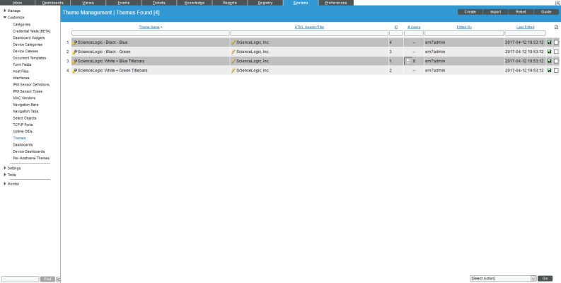
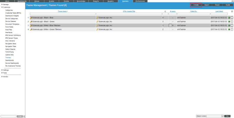
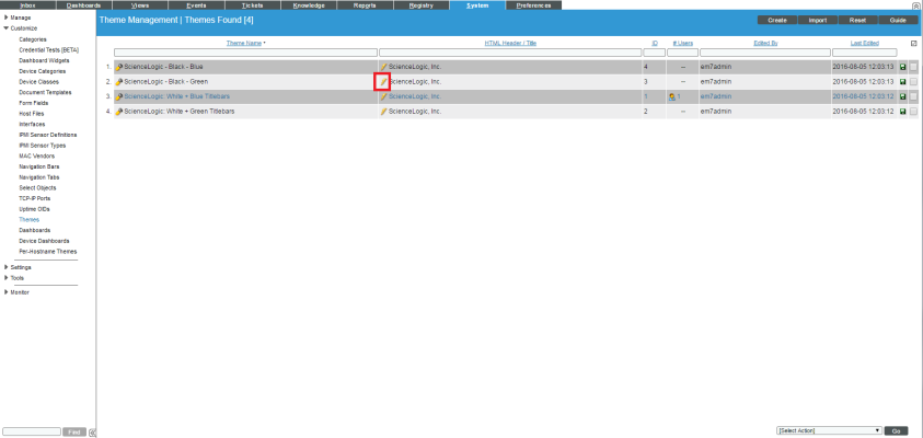
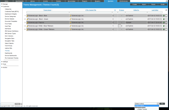
The Theme Management page contains a list of all the themes in SL1. By default, SL1 includes three themes that can be used, edited, or deleted. You can also create your own custom themes that can be used by other users and user policies in SL1. After you create a theme, it will automatically be added to the Theme Management page, where the theme can be edited, deleted, exported, and used by other users and user policies. To view the list of themes in SL1:
- Go to the Theme Management page (System > Customize > Themes).
- The Theme Management page displays the following information about each theme in SL1:
- Theme Name. Name of the theme.
- HTML Header / Title. Text that appears in the HTML header.
- ID. Unique numeric ID for the theme automatically created and assigned by SL1.
- # Users. The number of users currently using the theme. You cannot delete a theme if it is in use by one or more users.
- Edited By. User who created or last edited the theme.
- Last Edited. Date and time the theme was created or last edited.
NOTE: By default, the cursor is placed in the first Filter-While-You-Type field. You can use the <Tab> key or your mouse to move your cursor through the fields.
Creating a Theme in the Classic SL1 User Interface
You can create a new custom theme in the Theme Management page. You and other users can apply this new theme, and can also export the new theme for installation on another SL1 system. To create a new theme:
- Go to the Theme Management page (System > Customize > Themes).
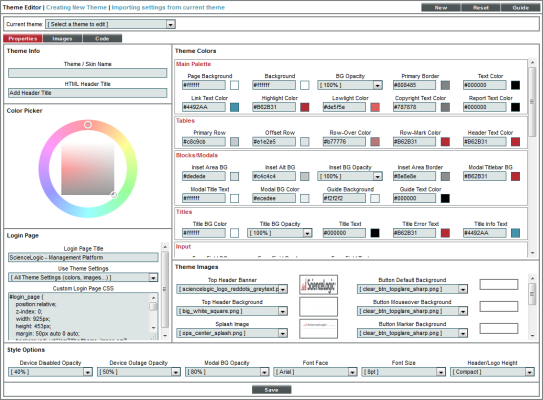
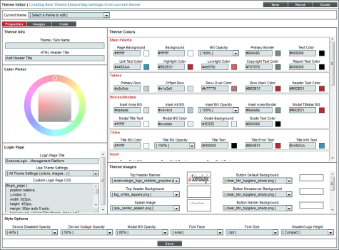
- In the Theme Management page, click the button in the upper right of the page. The Theme Editor page appears, where you can supply values to the following fields:
NOTE: The fields in the Theme Editor page are automatically populated with the values from the current theme. For details on the viewing or changing the current theme, see the section on applying a theme.
Theme Info
This pane appears in the upper left of the Theme Editor page and displays basic information about the theme.
- Theme / Skin Name. Name for the theme. This value can be up to 32 characters in length.
- HTML Header Title. Text that appears in the top left of the browser's frame.
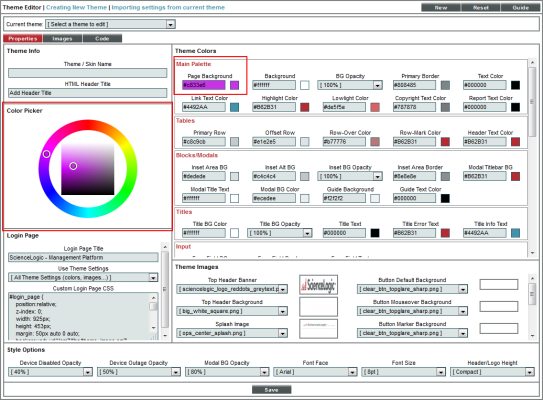
Assigning Colors with the Color Picker
In the Theme Colors pane, you can define colors for text, backgrounds, and highlighting.
To assign a color to a field in the Theme Colors pane:
- Select the field you want to edit. The Color Picker will become available.
- In the Color Picker, slide the pointer along the circle to select a color family. Notice that the hexadecimal value in the selected Theme Colors field matches the hexadecimal value for the selected color in the Color Picker.
- Optionally, after selecting a color family in the circle, notice that the inner square displays a gradient of the color family. You can slide the pointer within the inner square to select a specific gradient of the color. Notice that the hexadecimal value in the selected Theme Colors field matches the hexadecimal value for the selected color in the square.
- You can also manually enter a color's hexadecimal string in a Theme Colors field:
Theme Colors
The Theme Colors pane allows you to define the colors and opacity values for user-interface elements. For fields that define colors, a thumbnail of the selected color is displayed to the right of the field. For information on using the Color Picker, see the previous section. You can define colors and opacity values for the following user-interface elements:
NOTE: SL1 automatically adjusts luminance to ensure that selected entries in the user interface contrast with non-selected entries.
Main Palette
- Page Background. Background color for the browser window. This color is visible only if the Background color is transparent (BG Opacity) or a Page Background image does not fill the entire pane.
- Background. Default background color in all panes in the user interface.
- BG Opacity. Increases or decreases the transparency/opacity of the Background. 100% is most opaque. 0% is most transparent.
- Primary Border. Border around page, menu bar, panes, and some fields.
- Text Color. The default text color for the user interface. All text not otherwise specified in the Theme Editor will use this color. This color should contrast with the Background color, to ensure text is visible.
- Link Text Color. The default text color for hyperlinks in SL1, for example, links to documents in the [Knowledge] tab.
- Highlight Color. Default color for text of selected items, titles in mouseover boxes, and titles within sub-panes.
- Lowlight Color. Default secondary color for text in reports and default secondary color for offset rows in reports.
- Copyright Text Color. Default color for the copyright text in the lower-left of the interface.
- Report Text Color. Default text color for embedded reports.
Tables
- Primary Row. In pages that display rows of data, this is the color of the first row and alternating rows. This includes the two-toned mouse-over boxes. In tables, this color alternates with the Offset Row.
- Offset Row. In pages that display rows of data, this is the color of the second row and alternating rows. This includes the two-toned mouseover boxes. In tables, this color alternates with the Primary Row.
- Row-Over Color. In pages that display rows of data, when you mouseover a row, SL1 displays that row in the Row-Over Color.
- Row-Mark Color. In pages that display rows of data, when you select a row, SL1 displays that row in the Row-Mark Color. The row continues to have the Row-Mark Color until you click on it again or until the page is refreshed.
- Header Text Color. The default color for text in the header-rows of tables and as labels in the read-only information in the pages in the Device Reports panel and Device Administration panel.
Blocks/Modals
- Inset Area BG. The default color for fields that display read-only information with a modal page, like in the Event Information page or in the read-only portions of pages in the Device Reports panel and Device Administration panel.
- Inset Alt BG. In pages that display rows of read-only data in a table in a modal page, this is the color of the second row and alternating row.
- Inset BG Opacity. Increases or decreases the transparency/opacity of the Inset Area BG. 100% is most opaque. 0% is most transparent.
- Inset Area Border. In pages that display rows of read-only data in a table in a modal page, this is the default color for the border around the table.
- Modal Titlebar BG. Default background color for the title bar on modal pages.
- Modal Title Text. Default text color for the title text of modal pages. This color should contrast with the Modal Titlebar BG color, to ensure text is visible.
- Modal BG Color. Default background color for the main pane of a modal page. Note that panes within the modal page will use the Background color for their backgrounds.
- Guide Background. Default background color for the modal page for all guides.
- Guide Text Color. Default text color for text in all guides.
Titles
- Title BG Color. Default background color of all title bars except those specified in another field in the Theme Editor page.
- Title BG Opacity. Increases or decreases the transparency/opacity of the Title BG Color. 100% is most opaque. 0% is most transparent.
- Title Text. Text color for the title of all pages except those specified in another field in the Theme Editor page. This color should contrast with the Title BG Color, to ensure text is visible.
- Title Error Text Default text color for error messages that appear at the top of pages when a user enters incorrect values in fields or don't supply a value in a required field. This message appears in the upper left of the page, next to the title of the page.
- Title Info Text. Text color for the additional information that can appear in the title bar of all pages except those specified in another field in the Theme Editor page. For example, in the Theme Editor page, the additional text could be "Editing Theme". This color should contrast with the Title BG Color, to ensure text is visible.
Input
- Form Field BG. Background color for all fields that require user input.
- Form Field Border. The border around each field that requires user input.
- Form Field Text. Text color for the text that the user enters into a form field. This color should contrast with the Form Field BG color, to ensure text is visible.
Buttons
- Button Text Color. Text color for the text that appears in buttons. This color should contrast with the Button BG color, to ensure text is visible.
- Button BG. Background color for buttons. This color is used only if No Image is selected in the Button Default Background field.
- Button Over Text. Text color for the text that appears in buttons during mouseover. This color should contrast with the Button Over BG color, to ensure text is visible.
- Button Over BG. Background color for buttons that appears during mouseover. This color is used only if No Image is selected in the Button Mouseover Background field.
- Button Active Text. Text color for the text that appears in buttons when they are selected. This color should contrast with the Button Active BG color, to ensure text is visible.
- Button Active BG. Background color for buttons that appears when the button is selected. This color is used only if No Image is selected in the Button Marker Background field.
States
- Healthy State. Color used to represent a healthy state, usually green. This color displays the status of events, devices, and tickets.
- Notice State. Color used to represent a notice state, usually blue. This color displays the status of events, devices, and tickets.
- Minor State. Color used to represent a minor state, usually yellow. This color displays the status of events, devices, and tickets.
- Major State. Color used to represent a major state, usually orange. This color displays the status of events, devices, and tickets.
- Critical State. Color used to represent a critical state, usually red. This color displays the status of events, devices, and tickets.
- Prepending State. Color used to represent events in the Device Logs page that have not yet met the thresholds for Occurrence Count and Occurrence Time. Usually a neutral color, to avoid confusion with active events.
Dashboards
- Dashboard BG Color. Background color for dashboards in the [Dashboards] tab.
- Dashboard BG Opacity. Increases or decreases the transparency/opacity of the Dashboard BG Color. 100% is most opaque. 0% is most transparent.
- Dashboard Grid Color. Default color for grid lines in a dashboard.
- Widget BG Color. Background color for each widget in a dashboard.
- Widget BG Opacity. Increases or decreases the transparency/opacity of the Widget BG Color. 100% is most opaque. 0% is most transparent.
- Widget Title BG Color. Color of the title bar in each widget in a dashboard.
- Widget Title Opacity. Increases or decreases the transparency/opacity of the Widget Title BG Color. 100% is most opaque. 0% is most transparent.
- Widget Title Text. Color of the title text in each widget in a dashboard
- Map Background. Background color of Device Map pages in the tab.
Graphs
- Chart Color 1. For graphs and charts that track multiple parameters, specifies the first color to use.
- Chart Color 2. For graphs and charts that track multiple parameters, specifies the second color to use.
- Chart Color 3. For graphs and charts that track multiple parameters, specifies the third color to use.
- Chart Color 4. For graphs and charts that track multiple parameters, specifies the fourth color to use.
- Chart Color 5. For graphs and charts that track multiple parameters, specifies the fifth color to use.
- Chart Color 6. For graphs and charts that track multiple parameters, specifies the sixth color to use.
- Chart Plot BG. Background color for device graphs and charts in the [Performance] tab.
- Chart Plot Offset. Secondary color used in the background for device graphs and reports in the [Performance] tab.
- Chart Plot Text. Text color used in device graphs and reports.
- Dev Plot BG. For reports in the Device Reports > [Performance] tab, this is the default color of the first row and alternating rows.
- Dev Plot Offset. For reports in the Device Reports > [Performance] tab, this is the default color of the second row and alternating rows.
- Dev Plot Text. For reports in the Device Reports > [Performance] tab, this is the default color of axis labels.
- Chart Guide Line. Color of the cursor in device graphs and reports in the [Performance] tab.
- Chart Highlight. For device graphs and charts that allow you to drill down, this field defines the mouseover color for each area that can be drilled down.
- Themed Chart Offset. In charts and reports that include elements that are not specifically assigned colors in the Theme Editor page, this is the secondary color and/or color of the second row and alternating rows.
UI Misc
- Session Border. Color of the border around the session information in the upper right corner of the user interface.
- Session BG Color. Background color behind the session information in the upper right corner of the user interface.
- Session BG Opacity. Increases or decreases the transparency/opacity of the Session BG Color. 100% is most opaque. 0% is most transparent.
- Login Text Color. Text color in the session box in the upper right corner of the interface.
NOTE: For older themes that do not include the Login Text Color field, SL1 will use the value in the Copyright Text Color field.
- Flyout Menu BG. Background color in flyout menus, typically the menu and menu.
- Flyout Menu Text. Text color in flyout menus, typically entries in the menu and menu.
- Flyout Mouseover Txt. Highlight color when you mouseover an entry in a flyout menu, typically entries in the menu.
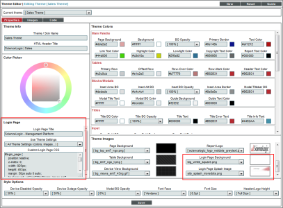
Login Page
The fields in this pane allow you to customize the appearance of the login page. To see these customizations, you must associate this theme with a DNS-Based theme rule.
- Login Page Title. Name of the customized login page associated with this theme.
- Use Theme Settings. SL1 includes default fonts, colors, sizes, and images that are applied to the login page. These defaults are defined for all SL1 systems and do not correspond to the fonts, colors, sizes, and images that are defined in a theme. In this field, you specify which theme elements you want to use in the login page. Choices are:
- Login Images Only. The login page will use the Login Page Background and Login Page Splash Image defined for this theme. The login page will use the default values for fonts, colors, and sizes.
- All Theme Settings. If you select this option, the login page will use the Login Page Background, Login Page Splash Image and the following elements from the current theme:
- Theme Colors > Main Palette > Page Background
- Theme Colors > Main Palette > Text Color
- Theme Colors > Main Palette > Link Text Color
- Theme Colors > Main Palette > Highlight Color
- Theme Colors > Main Palette > Copyright Text Color
- Theme Colors > Input > Form Field BG
- Theme Colors > Input > Form Field Border
- Theme Colors > Input > Form Field Text
- Style Options > Font Face
- Style Options > Font Size
- all settings in Theme Colors > Buttons
- all button images in the Theme Images pane
- Custom Login Page CSS. In this field, you can enter custom CSS styles to use in SL1 login page. The custom CSS styles will be added to the stylesheet for the login page. You can include all CSS classes and IDs in this field. To determine how to best customize the CSS for SL1 login page, you can view the HTML source for the login page.
Theme Images
This pane allows you to define graphics that can be included in a theme.
NOTE: To import a custom image to use in the image fields, select the [Images] tab. See the section on the Images Catalog page for details on the [Images] tab.
- Top Header Banner. Image that appears at the top of full-screen pages in SL1. You can select from the list of Top Banner images from the Images Catalog page. A thumbnail of the selected image is displayed to the right of this field. Click on the thumbnail image to see it in the Image Viewer modal page. For more information on the Image Viewer page, see the Image Viewer section.
- Top Header Background. Background color or pattern behind banner or logo that appears in the top of full-screen pages in SL1. You can select from the list of Background images from the Images Catalog page. A thumbnail of the selected image is displayed to the right of this field. Click on the thumbnail image to see it in the Image Viewer modal page. For more information on the Image Viewer page, see the Image Viewer section.
- Splash Image. Default image displayed in pane area before a menu selection has been made. Typically this image will be displayed when a user logs in. You can select from the list of Splash Images from the Images Catalog page. A thumbnail of the selected image is displayed to the right of this field. Click on the thumbnail image to see it in the Image Viewer modal page. For more information on the Image Viewer page, see the Image Viewer section.
- Page Background. Background color or pattern that appears outside of menus and panes. You can select from the list of Background images from the Images Catalog page. A thumbnail of the selected image is displayed to the right of this field. Click on the thumbnail image to see it in the Image Viewer modal page. For more information on the Image Viewer page, see the Image Viewer section.
- Table Background. Background color or pattern for a pane that contains a table. You can select from the list of Background images from the Images Catalog page. A thumbnail of the selected image is displayed to the right of this field. Click on the thumbnail image to see it in the Image Viewer modal page. For more information on the Image Viewer page, see the Image Viewer section.
- Device View Background. Background for all views. You can select from the list of Background images from the Images Catalog page. A thumbnail of the selected image is displayed to the right of this field. Click on the thumbnail image to see it in the Image Viewer modal page. For more information on the Image Viewer page, see the Image Viewer section.
- Button Default Background. Default background for buttons. You can select from the list of Button Background images from the Images Catalog page. A thumbnail of the selected image is displayed to the right of this field. Click on the thumbnail image to see it in the Image Viewer modal page. For more information on the Image Viewer page, see the Image Viewer section.
- Button Mouseover Background. Background for button during mouseover. You can select from the list of Button Background images from the Images Catalog page. A thumbnail of the selected image is displayed to the right of this field. Click on the thumbnail image to see it in the Image Viewer modal page. For more information on the Image Viewer page, see the Image Viewer section.
- Button Marker Background. Background used to show that a button has been selected. You can select from the list of Button Background images from the Images Catalog page. A thumbnail of the selected image is displayed to the right of this field. Click on the thumbnail image to see it in the Image Viewer modal page. For more information on the Image Viewer page, see the Image Viewer section.
- Report Logo. Image to be used at the top of Quick Reports (Reports > Create Reports > Quick Report). You can select from the list of Top Banner images from the Images Catalog page. A thumbnail of the selected image is displayed to the right of this field. Click on the thumbnail image to see it in theImage Viewer modal page. For more information on the Image Viewer modal page, see the Image Viewer section.
- Login Page Background. If this theme is applied to the login page, this field specifies the background image to be used in the Login page. You can select from the list of Background images from the Images Catalog page. A thumbnail of the selected image is displayed to the right of this field. Click on the thumbnail image to see it in the Image Viewer modal page. For more information on the Image Viewer page, see the Image Viewer section.
- Login Page Splash Image. If this theme is applied to the login page, this field specifies the image to be used in the Login page. You can select from the list of Splash Images from the Images Catalog page. A thumbnail of the selected image is displayed to the right of this field. Click on the thumbnail image to see it in the Image Viewer modal page. For more information on the Image Viewer page, see the Image Viewer section.
Style Options
The Style Options pane allows you to edit the following styles for the theme:
- Device Disabled Opacity. Transparency of device icons when a device is disabled. 100% is most opaque. 0% is most transparent.
- Device Outage Opacity. Transparency of device icon when a device is experiencing an outage. 100% is most opaque. 0% is most transparent.
- Modal BG Opacity. Specifies opacity of modal pages. This parameter determines whether or not you will be able to see the main page behind the modal page. 100% is most opaque. 0% is most transparent.
- Font Face. Default font used throughout SL1.
- Font Size. Default font size used throughout SL1.
- Header/Logo Height. Specifies the height of the header bar in the main user interface (top pane). Choices are:
- Full Size. The header bar allows enough space for a standard size Top Header Banner image (84 pixels high).
- Compact. The header bar is reduced in size, with the user's IP address excluded from the session information in the upper right corner of the user interface. If you select this option, the header bar allows enough space for a Top Header Banner image that is 53 pixels high.
Buttons and Tabs in the Classic SL1 Theme Editor
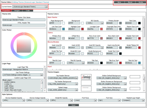
The Theme Editor page has additional features to help you create and edit your theme. You can seamlessly switch between created themes to edit, reset your values, and view a legend of the various fields in the Theme Editor page. These features, and their uses, are:
- Current Theme. This drop-down list contains an entry for each already defined theme. The values in the Theme Editor page reflect the selected theme. To edit another theme, select the appropriate entry from the drop-down list, and the Theme Editor page will be populated with the values of that theme.
- New. Prepares the page for a new theme definition. Clears pre-existing settings from another theme from each field, resets the values to default, and clears the Theme/ Skin Name field.
- Reset. Returns the page to the default values and does not save any values you have entered without saving.
- Save. Saves a new theme or saves changes made to an existing theme. If you save a new theme, it will be added to the Theme Management page.
The Image Viewer Page
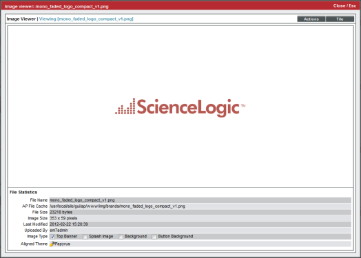
Clicking on an image thumbnail in the Theme Images pane in the Theme Editor page launches the Image Viewer page. The Image Viewer page displays the selected image in its full size, as well as specific information on the selected image. You can view the following information in the Image Viewer page:
- File Name. Name of the image file on the Database Server.
- AP File Cache. Name of the cached image file that is stored on the Administration Portal, the All-In-One Appliance, or the combination Database Server and Administration Portal.
- File Size. Size of the image, in bytes.
- Image Size. Width and height of the image, in pixels.
- Last Modified. Date the image was last imported.
- Uploaded By. User who uploaded the image. Default images will display "em7admin" in this field.
- Image Type. Specifies where in SL1 you can use this image. Choices are:
- Top Banner
- Splash Image
- Background
- Button Background
- Align Theme. Specifies one or more themes that use the image. You can click on the wrench icon (
 ) for a theme to view its properties.
If you accessed the Image Viewer page by clicking on an image in the Theme Editor page (that is, clicking on an image that is already assigned to the theme), you can take the following actions in the Image Viewer page:
- To assign an image for use in the current theme, go to the Image Type field and select the area of SL1 where you want the current image to appear.
- To create a tiled page (the image repeated in rows to fill the page), select the button.
If you accessed the Image Viewer page by clicking on an image in the Images Catalog page (by selecting the [Images] tab) and that image is not yet assigned to the current theme, you can take the following actions in the Image Viewer page:
NOTE: The menu appears only if you select an image from the Images Catalog page. The menu appears only when you edit an existing theme. The menu does not appear when you create a new theme.
-
To assign an image for use in the current theme, go to the Image Type field and select the area of SL1 where you want the current image to appear.
-
When you select the menu for a Top Banner image, you can:
- Assign the image as the Top Header Banner.
- Set the image as the Report Logo in Quick Reports (Reports > Create Reports > Quick Report).
- Delete Image from the Images Catalog page. If the image is in use in a theme, the Delete Image option does not appear in the menu.
- When you select the menu for a Splash Image, you can:
- Assign the image as the default Splash Image.
- Set the image as Login Page Splash Image.
- Delete Image from the Images Catalog page. If the image is in use in a theme, the Delete Image option does not appear in the menu.
- When you select the menu for a Backgrounds image, you can:
- Assign the image as the Top Header Background.
- Assign the image as the Page Background.
- Assign the image as the Table Background.
- Assign the image as the Device View Background.
- Set the image as the Login Page Background.
- Delete Image from the Images Catalog page. If the image is in use in a theme, the Delete Image option does not appear in the menu.
- When you select the menu for a Button Backgrounds image, you can :
- Assign the image as the Button Default Background.
- Assign the image as the Button Mouseover Background.
- Assign the image as the Button Marker Background.
- Delete Image from the Images Catalog page. If the image is in use in a theme, the Delete Image option does not appear in the menu.
- To create a tiled page (the image repeated in rows to fill the page), select the button.
If you accessed the Image Viewer page by clicking on an image in the Images Catalog page and that image is already assigned to the current theme, you can take the following actions in the Image Viewer page:
-
To assign an image for use in the current theme, go to the Image Type field and select the area of SL1 where you want the current image to appear.
-
When you select the menu for an image that has already been assigned as a Top Banner image, you can:
- Assign the image as the Top Header Banner.
- Set the image as the Report Logo in Quick Reports (Reports > Create Reports > Quick Report).
- When you select the menu for an image that has already been assigned as the Splash Image, you can:
- Assign the image as the default Splash Image.
- Set the image as Login Page Splash Image.
- When you select the menu for an image that has already been assigned as a Background image, you can:
- Assign the image as the Top Header Background.
- Assign the image as the Page Background.
- Assign the image as the Table Background.
- Assign the image as the Device View Background.
- Set the image as the Login Page Background.
- When you select the menu for an image that has already been assigned as a Button Background image, you can :
- Assign the image as the Button Default Background.
- Assign the image as the Button Mouseover Background.
- Assign the image as the Button Marker Background.
- If a single image has been assigned multiple values in the Image Type field, the menu will display the options for each value. For example, if the Image Type field has Top Banner and Splash Image selected, the menu will include these options:
- Assign the image as the Top Header Banner.
- Set the image as the Report Logo in Quick Reports (Reports > Create Reports > Quick Report).
- Assign the image as the default Splash Image.
- Set the image as Login Page Splash Image.
- To create a tiled page (the image repeated in rows to fill the page), select the button.
The Images Catalog Page
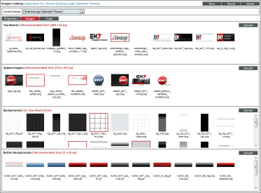
The Images Catalog page allows you to view default logos, images, and backgrounds, as well as import your own custom logos, images, and backgrounds. After these images have been uploaded, they will appear in the drop-down list in the Theme Images pane in the Theme Editor page.
SL1 prevents you from uploading images with file names containing spaces.
To view the Images Catalog page, select the tab in the upper left corner of the Theme Editor page. The Images Catalog page contains the following information:
- Top Banner. Displays images that you can use as your Top Banner. You can import an image from your local computer by selecting the button. ScienceLogic recommends a 300 x 60 pixel (px) size image. The image you upload will be added to the list of images that can be used as Top Banner images. Select the image to bring up the Image Viewer page for that image.
- Splash Images. Displays images that you can use as your Splash Image. You can import an image from your local computer by selecting the button. ScienceLogic recommends a 941 x 591 pixel (px) size image. The image you upload will be added to the list of images that can be used as Splash Images. Select the image to bring up the Image Viewer page for that image.
- Backgrounds. Displays available images and/or colors that you can use as your Background. You can import an image from your local computer by selecting the button. There are no size restrictions for this image. The image you upload will be added to the list of images that can be used as Backgrounds. Select the image to bring up the Image Viewer page for that image.
- Button Backgrounds. Displays available images and/or colors that you can use as your Button Default Background, Button Mouseover Background, and/or Button Marker Background. You can import an image from your local computer by selecting the button. ScienceLogic recommends a 1 x 35 pixel (px) size image. The image you upload will be added to the list of images that can be used as Button Backgrounds. Select the image to bring up the Image Viewer page for that image.
The Code Tab
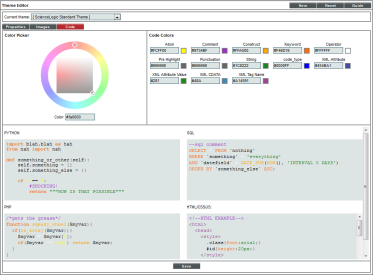
The Theme Editor page includes a tab. When you select the [Code] tab, the Code Highlighting page appears. The Code Highlighting page allows you to view and edit syntax highlighting. Syntax highlighting is a way to color-code blocks for easier scanning and reading. Syntax highlighting also eases debugging. Syntax highlighting is available in the following areas of SL1:
- The Snippet Code Editor pane in the Snippet Editor & Registry page for Dynamic Applications of type "snippet" (System > Manage > Applications > create/edit > Snippets).
- The Display Definition pane in the Dashboard Widget Editor page (System > Customize > Dashboards > Widgets > create/edit).
- The SQL Query pane in the Database Tool page (System > Tools > DB Tool).
- The Snippet Code pane in the Action Policy Editor page for actions of type "Snippet" (Registry > Run Book > Actions > create/edit).
- The SQL Query pane in the Action Policy Editor page for actions of type "SQL Query" (Registry > Run Book > Actions > create/edit).
- The Query/Template Binding Code pane in the Report Template Editor page (Reports > Management > Report Manager > create/edit).
Syntax highlighting is applied to code written in the following language: Python, SQL, PHP, and HTML/CSS/JS.
The Code Highlighting page includes the following fields:
NOTE: The Code Highlighting checkbox in the Account Preferences page ([Preferences] tab) is selected by default. If this checkbox is unselected, you will not be able to make changes to the syntax highlighting from the Code Highlighting page .
- Atom. Highlighting color for null, true, false, etc.
- Comment. Color used for unsuppressed notes within the code.
- Construct. Color for constructs, functions, classes, etc.
- Keyword. Font color for predefined keywords within the language.
- Operator. Font color for operators within the language.
- Pre Highlight. Font color for the code before it is processed and highlighted.
- Punctuation. Font color for punctuation within the language.
- String. Font color for strings within the language.
- XML Attribute. Font color for highlighting XML attributes.
- XML Attribute Value. Font color for highlighting XML attribute values.
- XML CDATA. Font color for highlighting XML CDATA.
- XML Tag Name. Font color for highlighting XML Tag Names.
To change a code color, select the field you want to edit. The color wheel for that field will become available. You can also manually enter a hexadecimal value for each field. To learn more about using the Color Picker, see the section Theme Colors in this chapter.
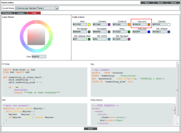
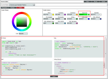
When you have made a change in the Code Colors pane, it will automatically be reflected in the preview pane for each type of code.
After you have made a change to the Keyword field, it will immediately be made to the preview code panes:
Select the button to save your changes.
Example: Theme Creation in the Classic SL1 User Interface
In this example we will create a new theme. We will select different background images, text and border colors, and other features to create the theme.
In this example, our current theme is set to "ScienceLogic Standard Theme", a default theme that is included with SL1. Therefore, when we create a new theme, the values in the Theme Editor page will be populated with the information from the "ScienceLogic Standard Theme".
To create a new theme:
- Go to the Theme Management page (System > Customize > Themes). Select the button in the upper right of the page.
- The Theme Editor page appears, populated with the values from the currently selected theme, "ScienceLogic Standard Theme".
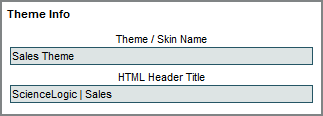
- First we must define values in the Theme Info pane. We want to give our theme a name and HTML header title. In this example, we can assume that a sales team will use our theme. In the Theme Info pane, enter the following information:
- Theme / Skin Name. We entered "Sales Theme".
- HTML Header Title. We entered "ScienceLogic | Sales".
- The Theme / Skin Name appears in the Theme Management page. The HTML Header Title appears to the top left of the browser frame.
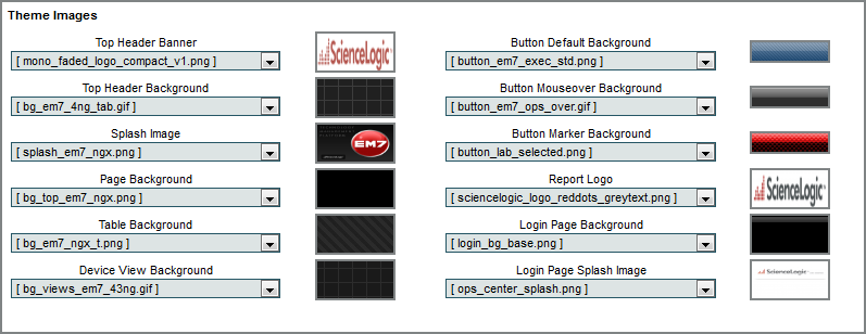
- Next, we go to the Theme Images pane and select the images to include in our theme. There are already numerous default options to choose from. We chose the following default images and colors for these fields. Select these images and colors:
- The values are reflected in SL1 in the following way:
- After we select images in the Theme Images pane, we must select colors in the Theme Colors pane. When selecting colors, make sure to use colors that will not make it difficult to read the text in SL1.
- In this example, we'll accept the default values for many of the colors. We will set custom colors for fields in Theme Colors > Main Palette and Theme Colors > Buttons, so you can see some examples of how the color fields affect the user interface.
- In the Theme Colors > Main Palette pane, we selected the following values:
- The values are reflected in SL1 in the following way:
- In the Theme Colors > Buttons pane, we selected the following values:
- The values are reflected in SL1 in the following ways:
- Button Text Color.
- Button Bg.
- Button Over Text.
- Button Over Bg.
- Button Active Text.
- Button Active Bg.
- The Style Options pane allows you to set the opacity of various items in SL1, and select font size and style options. Select the following values in the Style Options pane:
- After we save the values, disabled devices or devices experiencing an outage will display a low transparency:
- We also set the Modal BG Opacity to 0 (zero) percent. You will not be able to view the main page behind the modal page. The modal page will not be transparent. We also changed the font to reflect our selections in the Style Options pane.
- To save the theme, select the button. The theme will now appear in the Theme Management page, where it can be applied to SL1.
Applying a Theme in the Classic SL1 User Interface
After you have created a custom theme, or if you want to use a theme other than the default theme, you must apply the selected theme to your account. There are multiple ways to apply a theme, either for your own account, or for other users.
There are five pages in SL1 from where you can apply a theme:
- The Theme Management page
- The Account Preferences page
- The User Policy Properties Editor page
- The Account Permissions page
- The User Accounts page
This section will describe how to apply a theme from each page.
The Theme Management Page
The Theme Management page displays list of current themes that you can apply to your account.
NOTE: If one or more users are currently using a theme, you cannot delete that theme until it has been unaligned from those user accounts.
To apply a theme from the Theme Management page:
- Go to the Theme Management page (System > Customize > Themes).
- In the Theme Management page, the theme you are currently using will be highlighted. To choose another theme, select its lightning bolt icon (
 ) in the HTML Header / Title field.
- The page will be refreshed and SL1 will apply the new theme you have selected.
The Account Preferences Page
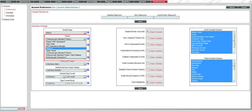
The Account Preferences page allows you to customize some of the appearances and behavior of your account, including your theme.
NOTE: If one or more users are currently using a theme, you cannot delete that theme until it has been unaligned from those user accounts.
To apply a theme from the Account Preferences page:
- Go to the Account Preferences page (Preferences > Account > Preferences).
- In the Account Preferences page, select a new theme from the Theme drop-down list.
- To immediately apply a theme, select the button.
- From the Account Preferences page, you can change your theme as many times as necessary.
User Policy Properties Editor Page
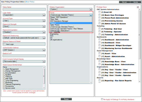
A user policy allows you to define a custom set of account properties and Access Keys, and save them as a policy for reuse. When you create a new user account, you can use the user policy to quickly apply settings to the new account. When creating a user policy, you can select a theme to apply to each user account created with that user policy.
To apply a theme from the User Policy Properties Editor page:
- Go to the User Policies page (Registry > Accounts > User Policies) page.
- To create a new user policy, select the button in the upper right of the page.
- The User Policy Properties Editor page appears. The User Policy Properties Editor page allows you set the default theme for users created with the user policy. Select the theme to set in the Theme field.
- To save the user policy, select the button. Each user created with the user policy will use the theme designated in that user policy.
The Account Permissions Page
The User Accounts page allows you to create and edit user accounts. If you are an administrator or have the appropriate privileges, you can access the User Accounts page and edit a user account other than your own.
To change the theme aligned with an account from the User Accounts page:
- Go to the User Accounts page (Registry > Accounts > User Accounts).
- In the Username field, find the username of the account you want to edit. Select its wrench icon (
 ).
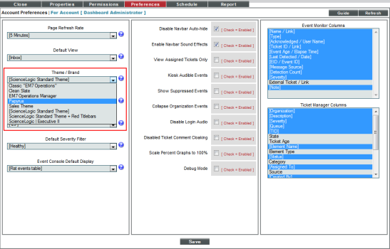
). - The Account Permissions page appears. In the Account Permissions page, select the [Preferences] tab.
- In the Account Preferences page, the Theme / Brand drop-down list contains a list of available themes. Select a theme to apply to the account.
- Click the button to save the changes to the account. The theme will be applied the next time the user logs in to SL1.
Editing Multiple Accounts from the User Accounts Page
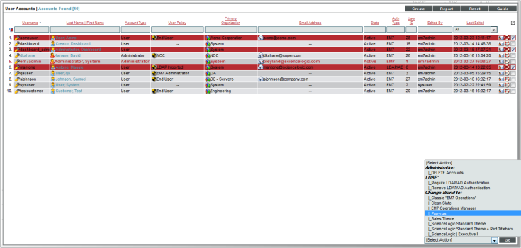
If you are an administrator or have the necessary access keys, you can change the theme for one or more users from the User Accounts page.
You can change the theme for multiple users simultaneously from the User Accounts page. To change the themes for multiple user accounts:
- Go to the User Accounts page (Registry > Accounts > User Accounts).
- In the User Accounts page, select the checkbox for each user account you want to change. To select all users, select the checkmark (
 ) in the top right of the page.
 - In the Select Action drop-down at the bottom right of the page, go to Change Brand To and select a theme from the list of all existing themes.
- Select the button to save your changes. When each affected user next logs in, SL1 will load the changed theme.
Applying a Theme to the Login Page in the Classic SL1 User Interface
SL1 allows users and administrators to apply themes by user. SL1 can associate one or more users with a theme. When that user logs in to the user interface, SL1 recognizes that the username is associated with a theme and applies that theme to the user interface.
However, to apply a theme to the login page, SL1 must apply the theme before a user has entered his/her username. The DNS-Based Theme Selectors page allows you to define theme rules. These theme rules allow you to apply themes to the login pages before a user enters a username.
The Theme Editor page includes options that allow you to customize the appearance of the login page. To use these customizations, you must create a theme rule in the DNS-Based Theme Selectors page . A theme rule specifies match criteria and a theme. If the URL or IP address that a user enters in a browser to connect to an Administration Portal, Database Server, or All-In-One Appliance matches the criteria specified in a theme rule, SL1 will automatically apply the specified theme to the login page.
Customizing the Login Page
To define one or more themes that can be applied to the login page:
- Go to the Theme Management page (System > Customize > Themes).
- The Theme Management page displays a list of existing themes you can edit. Find the theme you want to edit and select its wrench icon (
 ).
). - When the Theme Editor page appears, you can edit the following fields that affect the login page. These fields allow you to customize the appearance of the login page. To see these customizations, you must associate this theme with a DNS-Based theme rule.
- Login Page Title. Title to appear on the customized login page associated with this theme.
- Use Theme Settings. SL1 includes default fonts, colors, sizes, and images that are applied to the login page. These defaults are defined for all SL1 systems and do not correspond to the fonts, colors, sizes, and images that are defined in a theme. In this field, you specify which theme elements you want to use in the login page. Choices are:
- Login Images Only. The login page will use the Login Page Background and Login Page Splash Image defined for this theme. The login page will use the default values for fonts, colors, and sizes.
- All Theme Settings. If you select this option, the login page will use the Login Page Background, Login Page Splash Image and the following elements from the current theme:
- Theme Colors > Main Palette > Page Background
- Theme Colors > Main Palette > Text Color
- Theme Colors > Main Palette > Link Text Color
- Theme Colors > Main Palette > Highlight Color
- Theme Colors > Main Palette > Copyright Text Color
- Theme Colors > Input > Form Field BG
- Theme Colors > Input > Form Field Border
- Theme Colors > Input > Form Field Text
- Style Options > Font Face
- Style Options > Font Size
- all settings in Theme Colors > Buttons
- all button images in the Theme Images pane
- Custom Login Page CSS. In this field, you can enter custom CSS styles to use in the login page. The custom CSS styles will be added to the stylesheet for the login page. You can include all CSS classes and IDs in this field. To determine how to best customize the CSS for the login page, you can view the HTML source for the login page.
- Login Page Background. If this theme is applied to the login page, this field specifies the background image to be used in the login page. You can select from the list of Background images from the Images Catalog page. A thumbnail of the selected image is displayed to the right of this field. Click on the thumbnail image to see it in the Image Viewer modal page. For more information on the Image Viewer page, see the Image Viewer section.
- Login Page Splash Image. If this theme is applied to the login page, this field specifies the image to be used in the login page. You can select from the list of Splash Images from the Images Catalog page. A thumbnail of the selected image is displayed to the right of this field. Click on the thumbnail image to see it in the Image Viewer modal page. For more information on the Image Viewer page, see the Image Viewer section.
- Select the button to save your changes to the theme. If you are currently using the theme, your changes will be applied immediately after you select the button. Other users will see the changes the next time they log in to SL1.
Viewing the List of Theme Rules
The DNS-Based Theme Selectors page (System > Customize > Per-Hostname Themes) displays a list of all existing theme rules in SL1. For each theme rule, the DNS-Based Theme Selectors page displays the following:
To sort the list of theme rules, click on a column heading. The list will be sorted by the column value, in ascending order. To sort by descending order, click the column heading again. The Last Edited column sorts by descending order on the first click; to sort by ascending order, click the column heading again.
- AP Hostname Pattern. Pattern that SL1 will search for when examining the URL or IP address that the user entered in the browser to connect to the Administration Portal, Database Server, or All-In-One Appliance.
- Type. Specifies how SL1 will evaluate the value in the AP Hostname Pattern field. Choices are:
- Wildcard. SL1 will perform a text match, with wildcard characters.
- Regex. SL1 will use regular expressions to compare the AP Hostname Pattern to the current session information.
- Order. If your SL1 system includes multiple DNS-based theme rules, SL1 evaluates the rules in priority order, ascending. This column displays the priority order value for the theme rule.
- ID. Unique numeric ID for the theme rule, automatically assigned by SL1.
- Theme Name. Name of the theme that will be applied to the login page with the theme rule.
- Edited By. The user who created or last edited the theme rule.
- Last Edited. Date and time the theme rule was created or last edited.
Defining a Theme Rule
A theme rule allows you to apply themes to the login pages before a user enters a username. A theme rule specifies match criteria and a theme. If the URL or IP address that a user enters in a browser to connect to an Administration Portal, Database Server, or All-In-One Appliance matches the criteria specified in a theme rule, SL1 will automatically apply the specified theme to the login page.
From the DNS-Based Theme Selectors page, you can define a new theme rule. To do this:
- Go to the DNS-Based Theme Selectors page (System > Customize > Per-Hostname Themes).
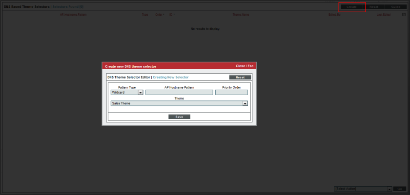
- In the DNS-Based Theme Selectors page, select the button.
- The DNS Theme Selector Editor page appears. In this page, supply a value in each field:
- Pattern Type. Specifies how SL1 will evaluate the value in the AP Hostname Pattern field. Choices are:
- Wildcard. SL1 will perform a text match, with wildcard characters.
- Regex. SL1 will use regular expressions to compare the AP Hostname Pattern to the current session information.
- AP Hostname Pattern. This field is used to match the URL or IP address that a user enters in a browser to connect to an Administration Portal, Database Server, or All-In-One Appliance. If the URL or IP address matches the value in this field, SL1 applies the theme from the Theme field to the login page for the current session.
- For example, if you specify "*" (asterisk), any IP address or URL will match. SL1 will then apply the theme from the Theme field to the login page for every session on an Administration Portal, Database Server, or All-In-One Appliance.
- If you enter "192.168.38.235", SL1 will apply the theme from the Theme field to the login page for each session on an Administration Portal, Database Server, or All-In-One Appliance where the user enters "192.168.38.235" into the browser.
- If you enter ".sciencelogic.local", SL1 will apply the theme from the Theme field to the login page for each session on an Administration Portal, Database Server, or All-In-One Appliance where the user enters ".sciencelogic.local" into the browser.
- Priority Order. If your SL1 system includes multiple DNS-based theme rules, SL1 evaluates the rules in priority order, ascending. SL1 will apply the theme rule that matches the current session on an Administration Portal, Database Server, or All-In-One Appliance and has the lowest value in the Priority Order field.
- Theme. Select a theme from the list of all existing themes in SL1. SL1 will apply the theme to the login page for each browser session that matches the AP Hostname Pattern.
- Select the button to save your new theme rule.
Editing and Deleting a Theme in the Classic SL1 User Interface
The Theme Management page displays a list of existing themes, and allows you to manage and create themes. You can edit an existing theme from the Theme Management page.
To edit an existing theme from the Theme Management page:
- Go to the Theme Management page (System > Customize > Themes).
- The Theme Management page displays a list of existing themes you can edit. To edit a theme, select its wrench icon (
 ).
). - When the Theme Editor page appears, you can edit the value of one or more fields. For details on each field, see the section on Creating a Theme.
- Select the button to save any changes to the theme. If you are currently using the theme, your changes will be applied immediately after you select the button. Other users who use the theme will see the changes the next time they log in to SL1.
Deleting a Theme
NOTE: If one or more users are currently using a theme, you cannot delete that theme until it has been unaligned from those user accounts.
To delete a theme from the Theme Management page:
- Go to theTheme Management page (System > Customize > Themes).
- In the Theme Management page, find the theme you want to delete. The # Users field displays the number of users currently using the theme. If no users are using the theme, it can be deleted.
- To delete a theme, select its checkbox. In the Select Action drop-down list, select Delete Themes.
- Select the button to delete the theme.
Exporting and Importing a Theme in the Classic SL1 User Interface
You can export and import a theme from the Theme Management page. This can be helpful if you have multiple SL1 systems and want to have a consistent, customized theme for each. To import a theme you must first have an exported theme on your local computer.
To export a theme:
- Go to the Theme Management page (System > Customize > Themes).
- In the Theme Management page, find the theme you want to export. Select its diskette icon (
 ).
). - You will be prompted to save the theme to your local computer as a .tar file.
After you have exported a theme, you can import the theme for use on another SL1 system. After a theme has been imported, it will be added to the Theme Management page and can be applied to user accounts or user policies in that SL1 system. To import a theme:
- Go to the Theme Management page (System > Customize > Themes).
- In the Theme Management page, select the button in the top right of the page.
- In theTheme Import page, select the .tar file to import. Select the button.

- The imported theme will now appear in the Theme Management page, and can be applied to your user accounts and user policies in SL1.
