In addition to the base widgets, the following PowerPacks are included with SL1 and contain additional widgets on the Classic Dashboard Widgets page (System > Customize > Classic Dashboard Widgets):
- AskEM7 Query Widgets
- EM7 Dashboard Widgets
- Cisco CM PowerPack
- IT Service Dashboards Pack
- Microsoft Exchange
- Service Proxy Widget
- VMware Dashboards
NOTE: ScienceLogic also offers many other application-specific PowerPacks.
This
Use the following menu options to navigate the SL1 user interface:
- To view a pop-out list of menu options, click the menu icon (
 ).
). - To view a page containing all of the menu options, click the Advanced menu icon (
 ).
).
Common Fields
The following fields appear in all widget configuration panes:
- Widget Name. Enter a title for the widget. This title is displayed in the header that appears at the top of the widget. If you leave the default value of "{auto}" in this field, SL1 will automatically generate a title for the widget based on what is currently being displayed in the widget.
- Widget Refresh Rate. Specify how frequently the widget will be automatically updated with new data. The choices are:
- Widget Default. The widget will refresh at its default refresh rate, as defined by the widget developer. You can view and edit the default refresh rate in the Dashboard Widgets page (System > Customize > Classic Dashboard Widgets) by selecting the wrench icon (
 ) for a widget.
 - Auto-refresh disabled. The widget will not automatically refresh.
- 1 minute. The widget will automatically refresh every minute.
- 5 minutes. The widget will automatically refresh every 5 minutes.
- 10 minutes. The widget will automatically refresh every 10 minutes.
- 15 minutes. The widget will automatically refresh every 15 minutes.
- 30 minutes. The widget will automatically refresh every 30 minutes.
- 45 minutes. The widget will automatically refresh every 45 minutes.
- 1 hour. The widget will automatically refresh once an hour.
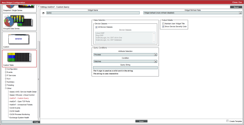
Custom Table > Other > AskEM7 - Custom Query
Displays a list of devices that are running a specified process, service, or software title.
Configuring the AskEM7 - Custom Query Widget
To configure an AskEM7 - Custom Query dashboard widget, supply values in the following fields:
- Device Classes. Allows you to limit the devices displayed in the widget to devices that are associated with the selected device class(es).
- All Device Classes. All device classes are included in the query.
- Device Classes. Select one or more device classes to include in the query.
- Attribute Selection. Select the attribute that will filter the devices displayed in the widget. Choices are:
- Process. Search for devices based on running processes.
- Service. Search for devices based on available services.
- Software. Search for devices based on installed software.
- Condition. Specify how the Query String will be evaluated. Choices are:
- Matches. The query will look for running processes, available services, or installed software titles that match the Query String.
- Does Not Match. The query will look for running processes, available services, or installed software titles that don't match the Query String.
- Contains. The query will look for running processes, available services, or installed software titles that contain the Query String.
- Does Not Contain. The query will look for running processes, available services, or installed software titles that do not contain the Query String.
- Query String. The text to compare to a running process, available service, or installed software title. You can use the percent symbol (%) as a wildcard in the query string. The query string is not case-sensitive.
- Maintain User Widget Title. If you do not select this checkbox, the title of the widget will always specify the query conditions.
- Show Device Severity Color. If you uncheck this checkbox the widget will not colorize devices by severity.
Viewing the AskEM7 - Custom Query Widget
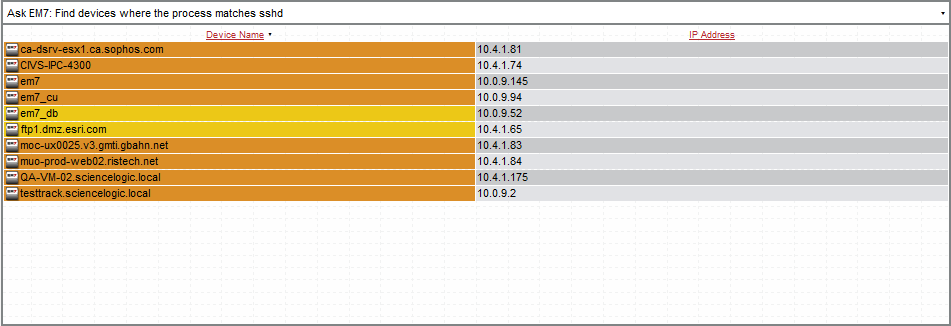
The AskEM7 - Custom Query widget displays a list of devices that match the criteria (query) specified in the Widget Configuration page.
For each device that matches the query, the AskEM7 - Custom Query widget displays the device name and IP address.
This description covers the latest version of this widget as shipped by ScienceLogic. This widget might have been modified on your SL1 system.
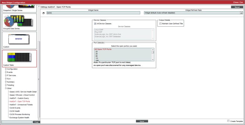
Custom Table > Other > AskEM7 - Open TCP Ports
Displays a list of devices on which selected TCP ports are open.
Configuring the AskEM7 - Open TCP Ports Widget
To configure an AskEM7 - Open TCP Ports dashboard widget, supply values in the following fields:
- Device Classes. Allows you to limit the devices displayed in the widget to devices that are associated with the selected device class(es).
- All Device Classes. All device classes are included in the query.
- Device Classes. Select one or more device classes to include in the query.
- Port Selection. Specify the TCP ports that must be open for a device to be included in the widget.
- Maintain User Widget Title. If you do not select this checkbox, the title of the widget will always specify the query conditions.
Viewing the AskEM7 - Open TCP Ports Widget
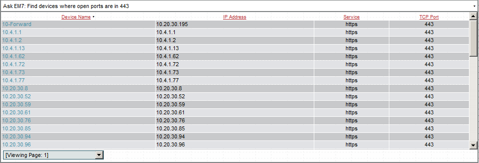
The AskEM7 - Open TCP Ports widget displays a list of devices that match the criteria specified in the Widget Configuration page.
For each device that matches the device class and open TCP port(2), the AskEM7 - Custom Query widget displays the device name, IP address, port Service, and TCP Port number.
This description covers the latest version of this widget as shipped by ScienceLogic. This widget might have been modified on your SL1 system.
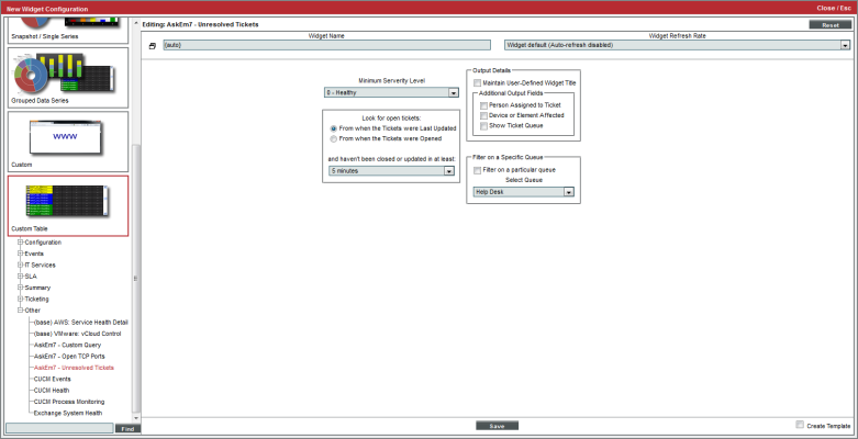
Custom Table > Other > AskEM7 - Unresolved Tickets
Displays a list of open tickets that have not been updated for a specified amount of time. The list of tickets can be filtered to include only tickets with a specified severity or ticket queue.
Configuring the AskEM7 - Unresolved Tickets Widget
To configure an AskEM7 - Unresolved Tickets dashboard widget, supply values in the following fields:
- Minimum Severity Level. Specify the severity level a ticket must meet or exceed to be included in the widget. Choices are 0 - Healthy, 1 - Notice, 2 - Minor, 3 - Major, and 4 - Critical.
- Look for Open Tickets. Specify the additional criteria a ticket must meet to be included in the widget. Choices are:
- From when the Tickets were Last Updated. The value in and haven't been closed or updated in at least applies to the time the ticket was last updated.
- From when the Tickets were Opened. The value in and haven't been closed or updated in at least applies to the time the ticket was assigned the status of Open.
- and haven't been closed or updated in at least . Span of time that the ticket has remained either unchanged or with a status of Open. The choices range from five minutes to six months.
- Maintain User Widget Title. If you select this checkbox, the widget will display the title specified in the Widget Name field. If you do not select this checkbox, the widget will display a description of the query conditions as the title of the widget.
- Additional Output Fields. Select the checkbox for each optional column you want to include in the widget. Choices are:
- Person Assigned to Ticket. The widget will display the column Assigned To.
- Device or Element Affected. The widget will display the column Element Name.
- Show Ticket Queue. The widget will display the column Queue.
- Filter on a Specific Queue. These fields allow you to filter the list of tickets included in the widget by ticket queue.
- Filter on a particular queue. If you select this checkbox, you can limit the list of tickets to include only tickets in a selected ticket queue.
- Select Queue. Select the ticket queue from the drop-down list. Only tickets that meet the criteria in this page and that are members of the selected ticket queue will be included in the display.
Viewing the AskEM7 - Unresolved Tickets Widget
For each ticket that meets the criteria in the Widget Configuration page, the AskEM7 - Unresolved Tickets widget displays the time the ticket was opened or the time it was last updated, the ticket description, and the ticket severity. The widget can also display optional columns for Element Name, Assigned To, and Queue.
This description covers the latest version of this widget as shipped by ScienceLogic. This widget might have been modified on your SL1 system.
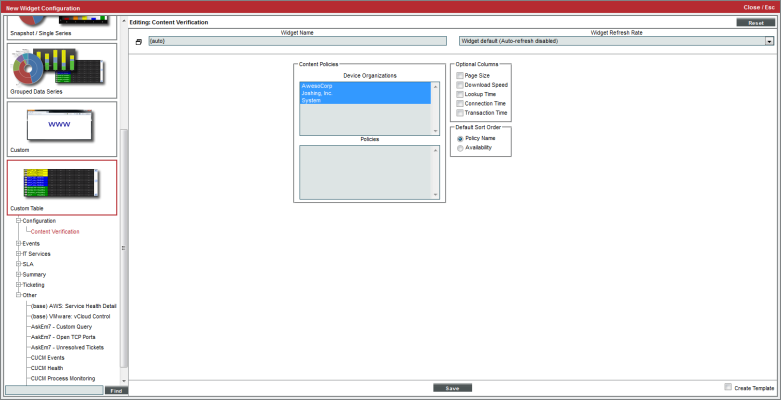
Custom Table > Configuration > Content Verification
Displays data for one or more selected web-content verification policies. For each policy, the widget can display Availability, Page-Size, Download Speed, Lookup Speed, and Transaction Speed.
Configuring the Content Verification Widget
To configure a Content Verification dashboard widget, supply values in the following fields:
- Device Organizations. Displays all organizations that include devices. Allows you to select single, multiple, or all organizations. If an organization includes one or more web-content verification policies, the Policies field will be populated with a list of those web-content verification policies
- Policies. Displays a list of all web-content verification policies associated with the organization(s) (selected in the Device Organizations field). You can select one, multiple, or all of the web-content verification policies.
- Optional Columns. By default, the widget displays the Policy Name and Availability (in percent) for each content verification policy. You can select additional columns to include in the widget. To select a column, click its checkbox. Choices are:
- Page Size
- Download Speed
- Lookup Time
- Connection Time
- Transaction Time
- Default Sort Order. Select the sort-order for the widget. Web-content policies will be sorted by the selected column. Choices are:
- Policy Name
- Availability
- Page Size (appears only if you selected Page Size in the Optional Columns field)
- Download Speed (appears only if you selected Download Speed in the Optional Columns field)
- Lookup Time (appears only if you selected Lookup Time in the Optional Columns field)
- Connection Time(appears only if you selected Connection Time in the Optional Columns field)
- Transaction Time(appears only if you selected Transaction Time in the Optional Columns field)
Viewing the Content Verification Widget
By selecting all of the Optional Columns and sorting the widget by Policy Name, your widget might look like this:
- Clicking on the policy name leads to the Web Content Verification report for that policy.
- Clicking on the pagesize value leads to the pagesize report for that policy.
- Clicking on the download-speed value leads to the download-speed report for that policy.
- Clicking on the lookup-speed value leads to the lookup speed report for that policy.
- Clicking on the connection-speed value leads to the connection speed report for that policy.
- Clicking on the transaction-speed value leads to the transaction speed report for that policy.
This description covers the latest version of this widget as shipped by ScienceLogic. This widget might have been modified on your SL1 system.
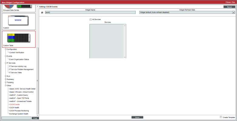
Custom Table > Other > CUCM Events
Displays events associated with Cisco Call Manager devices in your system. For each selected Cisco Call Manager device, you can view the device state and a list of event messages.
Configuring the CUCM Events Widget
You have the following options when configuring a CUCM Events widget:
- All Devices. Select this checkbox to include all Cisco Call Manager devices in the report.
- Devices. This field becomes active only if the All Devices checkbox is not selected. Select one or more CUCM devices to include in the report.
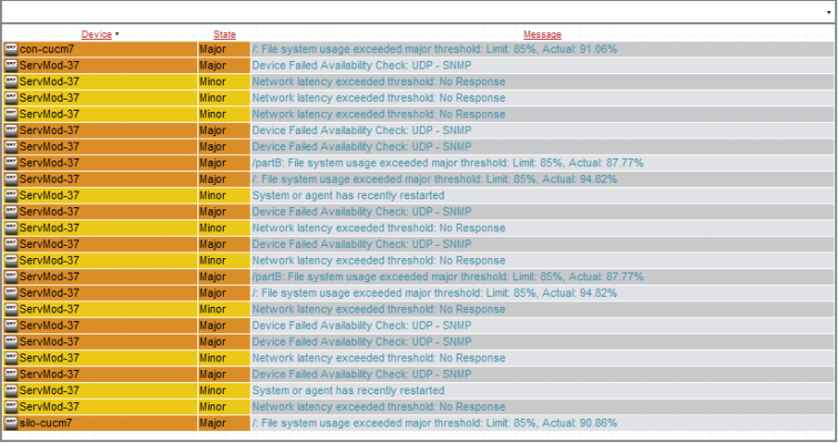
Viewing the CUCM Events Widget
For each CUCM event that matches the criteria in the Widget Configuration page, the widget displays the device name, event state, and event message.
Your CUCM Events widget might look like this:
This description covers the latest version of this widget as shipped by ScienceLogic. This widget might have been modified on your SL1 system.
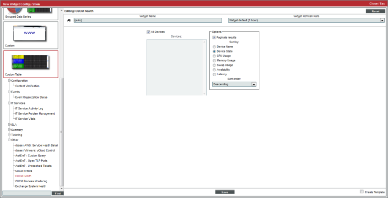
Custom Table > Other > CUCM Health
Displays the health of Cisco Call Manager devices in your system. For each selected device, the widget displays device state, CPU usage, Memory usage, Swap usage, Availability, and latency.
Configuring the CUCM Health Widget
To configure a CUCM Health widget, supply values in the following fields:
- All Devices. Select this checkbox to include all Cisco Call Manager devices in the report.
- Devices. This field becomes active only if the All Devices checkbox is not selected. Select one or more CUCM devices to include in the report.
- Paginate Results. If selected, the widget includes a drop-down list in the lower left that allows you to select a page of data to view; this drop-down replaces a scroll bar.
- Sort By. Specifies the parameter for sorting the list of devices. Choices are:
- Device Name
- Device State
- CPU Usage
- Memory Usage
- Swap Usage
- Availability
- Latency
- Sort Order. Specifies whether you want to sort from lowest to highest (ascending) or highest to lowest (descending).
Viewing the CUCM Health Widget
For each CUCM device, the CUCM Health widget displays device name, device state, CPU usage, memory usage, swap usage, availability, and latency.
Depending on your selections, your CUCM Health widget might look like this:
This description covers the latest version of this widget as shipped by ScienceLogic. This widget might have been modified on your SL1 system.
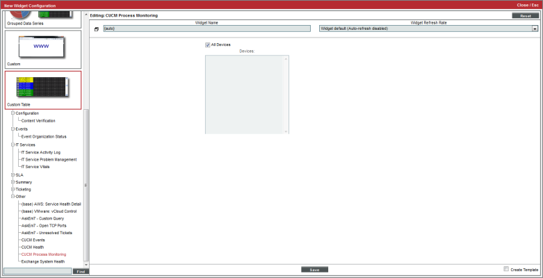
Custom Table > Other > CUCM Process Monitoring
Displays system processes associated with Cisco Call Manager devices in your system. For each selected Cisco Call Manager device, you can view each process and the availability of that process.
Configuring the CUCM Process Monitoring Widget
You have the following options when configuring a CUCM Process Monitoring widget:
- All Devices. Select this checkbox to include all Cisco Call Manager devices in the report.
- Devices. This field becomes active only if the All Devices checkbox is not selected. Select one or more CUCM devices to include in the report.
Viewing the CUCM Process Monitoring Widget
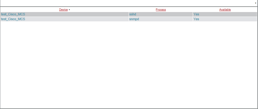
For each CUCM device, the CUCM Process Monitoring widget displays the device name, the process name, and the whether or not the process is available.
Your CUCM Process Monitoring widget might look like this:
This description covers the latest version of this widget as shipped by ScienceLogic. This widget might have been modified on your SL1 system.
Custom > Summary > Device Tear Sheet
Displays overview information about a device, much like the Summary page in the Device Management tools.
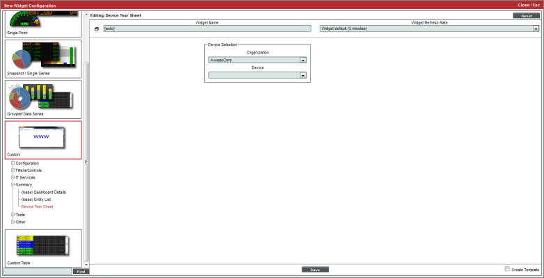
Configuring the Device Tear Sheet Widget
To configure a Device Tear Sheet widget, supply values in the following fields:
- Organization. Select an organization from a list of all organizations in SL1. The Device field will be populated with a list of devices from this organization.
- Device. Displays a list of all devices in the organization (selected in the Organization field). Select the device to include in the report.
Viewing the Device Tear Sheet Widget
Depending on your selection, your Device Tear Sheet widget might look like this:
Users can click on values to view links with more details.
- Device Name [ID]. Displays the device ID of the device. Clicking on the value leads to the Device Properties page.
- IP Address. Displays the IP address of the device. Clicking on the IP address leads to the Device Toolbox page.
- Availability. Availability means the device's ability to accept connections and data from the network. Possible values are "okay" or "critical". Clicking on the value leads to the System Availability report for the device.
- Latency. Latency for the device. Latency means the amount of time it takes SL1 to communicate with the device. The value in this field specifies the number of milliseconds it takes to communicate with the device. Clicking on the value leads to the System Latency report for the device.
- CPU Usage. Specifies the total combined CPU usage, in percent. Clicking on the value leads to the CPU Usage report for the device.
- Memory Usage. Displays total memory usage, in percent. Clicking on the value leads to the Physical Memory Usage report for the device.
- File systems. For each monitored file system, specifies the percentage used. Clicking on a value displays the File System Usage report.
- Ports. For each monitored port, specifies if port is currently available. Clicking on a value displays the Port Availability report.
- Website content. For each content verification policy, specifies if content is currently available. Clicking on a value displays the Web Content Verification report.
- Processes. Specifies status of each monitored process. Clicking on a value displays the Process Availability report.
- Events. Displays a list of active events associated with the device.
- Message. The event message. The message is color-coded for severity. Events are sorted from highest severity (critical) to lowest severity (notice).
Clicking on an event leads to the Viewing Active Events page, where the users can view more details about the event.
This description covers the latest version of this widget as shipped by ScienceLogic. This widget might have been modified on your SL1 system.
Snapshot/Single Series > Events > Event Count
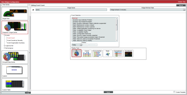
Allows you to trend occurrence of up to ten historical events by their event type.
Configuring the Event Count Widget
To configure an Event Count by Severity widget, supply values in the following fields:
- Event Selection. Select up to ten events from a list of all events in SL1. To select multiple events, hold down the <Ctrl> key. To select a grouping or all events, hold down the <Shift> key.
- Timeline. Select the number of days to trend historical events. The widget will display events from the selected time to the current time. Choices are:
- Today. The widget will display all selected events that occurred today.
- Yesterday. The widget will display all selected events that occurred yesterday.
- Last. Specify the amount of days, weeks, or months to begin the report. The maximum amount is 30 months.
- Display Type. Specifies how the widget will be displayed. Choices are:
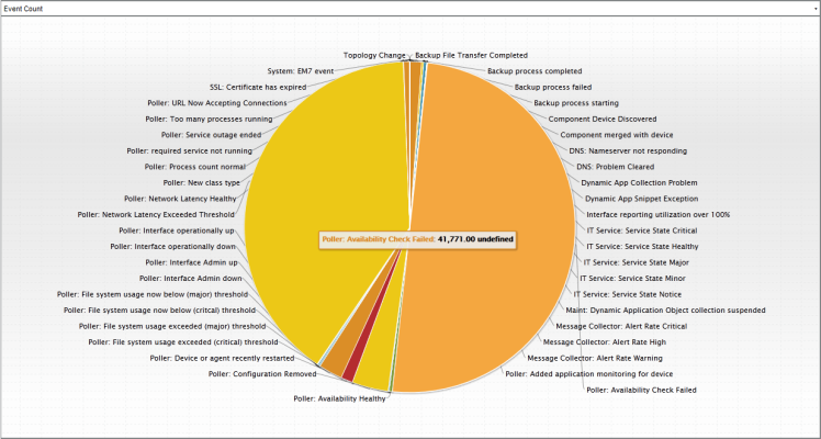
- Pie. Widget will be displayed in a pie graph. Displays each event as percentage of total events. Slice color represents the severity of the event.
- Columns. Widget will be displayed in a bar graph. Displays number of occurrences on the y-axis. On the x-axis, displays each event in its own colored vertical bar. Bar color represents the severity of the event.
- Horizontal Bar. Widget will be displayed in a horizontal bar graph. Displays number of occurrences on the x-axis. On the y-axis, displays each event in its own colored horizontal bar. Bar color represents the severity of the event.
- Radar. Displays a multi-pointed, color-coded polygon or circle. Users determine if the radar is a polygon or circle by selecting Arc or Line in the Grid Lines field. Each point on the polygon or circle represents an event. The number of event instances is measured by the concentric rings. The number value of each concentric ring increases from center to perimeter.
- Spreadsheet. Widget will be displayed as a spreadsheet. Displays each event in its own row. Each event has its own column, with number of occurrences. Clicking on the event name displays the Event Console page, with only the occurrences of the selected event displayed.
- Scoreboard. For the selected events, displays each event name and the number of occurrences for each event. Events are ordered by severity, with critical first. Display is tally-style, in large format for easy viewing.
- Options. If you selected Column or Horizontal Bar in the Display Type field, you can further define the display in these fields.
- Chart minimum. You can accept the minimum value that SL1 determines, usually the lowest collected value or lowest calculated value (Automatic), or you can specify a minimum value (Fixed Value).
- Chart maximum. You can accept the maximum value that SL1 determines, usually the highest collected value or highest calculated value (Automatic), or you can specify a maximum value (Fixed Value).
- Threshold marker X. You can select Enabled and then enter a threshold value in this field. SL1 will then include a heavy line in the graph that indicates the threshold.
- Severity ranges. Select whether a low value (Increasing) or a high value (Decreasing) indicates a healthy state.
- Severity Slider. Use the sliders and/or supply values in the slider fields to define the range of values at which the metric is in a healthy, normal, minor, major, and critical state.
Viewing the Event Count Widget
The Event Count widget displays the name of the event policy and the number of occurrences.
If you selected Pie in the Display Type field, your Event Count widget might look like this:
This description covers the latest version of this widget as shipped by ScienceLogic. This widget might have been modified on your SL1 system.
Snapshot/Single Series > Events > Event Counts by Severity
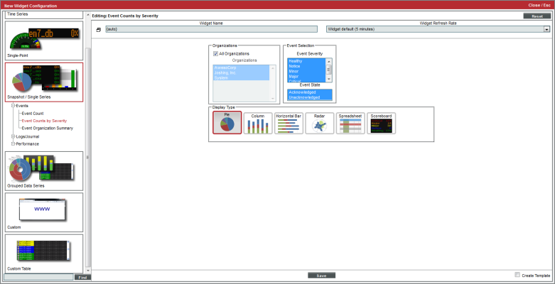
Allows you to view the number of active events for each severity level.
Configuring the Event Counts by Severity Widget
To configure an Event Count by Severity widget, supply values in the following fields:
- All Organizations. Select this checkbox to include all organizations in the report. This option is selected by default.
- Organizations. This field becomes active only if All Organizations is not selected. This field displays a list of all organizations in SL1. Hold the <Ctrl> key to select multiple organizations. Hold the <Shift> key to select a grouping of organizations.
- Event Severity. Specifies the event severity status to show in the widget. You can select from Healthy, Notice, Minor, Major, and Critical events. Hold the <Ctrl> key to select multiple event severities.
- Event State. Specifies if the widget will display Acknowledged events, Unacknowledged events, or both.
- Display Type. Specifies how the widget will be displayed. Choices are:
- Pie. Widget will be displayed in a pie graph. Displays each event as a percentage of total events. Slice color represents the severity of the event.
- Columns. Widget will be displayed in a bar graph. Displays number of occurrences on the y-axis. On the x-axis, displays each event in its own colored vertical bar. Bar color represents the severity of the event.
- Horizontal Bar. Widget will be displayed in a horizontal bar graph. Displays number of occurrences on the x-axis. On the y-axis, displays each event in its own colored horizontal bar. Bar color represents the severity of the event.
- Radar. Displays a multi-pointed, color-coded polygon or circle. Users determine if the radar is a polygon or circle by selecting Arc or Line in the Grid Lines field. Each point on the polygon or circle represents an event. The number of event instances is measured by the concentric rings. The number value of each concentric ring increases from center to perimeter.
- Spreadsheet. Widget will be displayed as a spreadsheet. Displays each event in its own row. Each event has its own column, with number of occurrences. Clicking on the event name displays the Event Console page, with only the occurrences of the selected event displayed.
- Scoreboard. For the selected events, displays each event name and the number of occurrences for each event. Events are ordered by severity, with critical first. Display is tally-style, in large format for easy viewing.
- Options. If you selected Column or Horizontal Bar in the Display Type field, you can further define the display in these fields.
- Chart minimum. You can accept the minimum value that SL1 determines, usually the lowest collected value or lowest calculated value (Automatic), or you can specify a minimum value (Fixed Value).
- Chart maximum. You can accept the maximum value that SL1 determines, usually the highest collected value or highest calculated value (Automatic), or you can specify a maximum value (Fixed Value).
- Threshold marker X. You can select Enabled and then enter a threshold value in this field. SL1 will then include a heavy line in the graph that indicates the threshold.
- Severity ranges. Select whether a low value (Increasing) or a high value (Decreasing) indicates a healthy state.
- Severity Slider. Use the sliders and/or supply values in the slider fields to define the range of values at which the metric is in a healthy, normal, minor, major, and critical state.
Viewing the Event Counts by Severity Widget
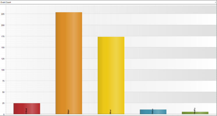
The Event Counts by Severity widget displays the color-coded event severity and the number of events of each severity.
If you selected Columns in the Display Type field, your widget might look like this:
NOTE: Each event selected in the Event Severity field is represented by a bar in the graph. To view the event count for a single event, mouse over the bar for that event.
This description covers the latest version of this widget as shipped by ScienceLogic. This widget might have been modified on your SL1 system.
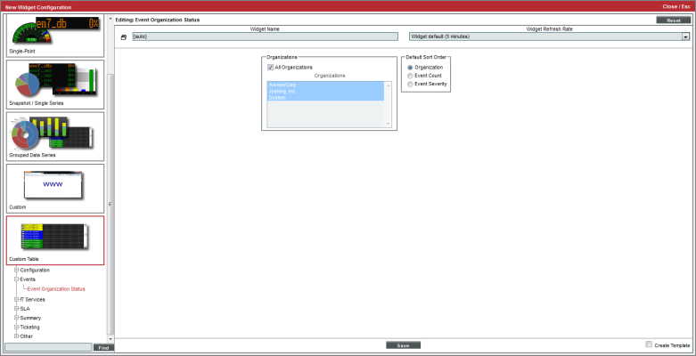
Custom Table > Events > Event Organization Status
For each selected organization, displays the total number of active events and the status of the most severe event(s), in scoreboard format.
Configuring the Event Organization Status Widget
To configure an Event Organization Status widget, supply values in the following fields:
- All Organizations. Select this checkbox to include all organizations in the report. This option is selected by default.
- Organizations. This field becomes active only if All Organizations is not selected. This field displays a list of all organizations in SL1. Hold the <Ctrl> key to select multiple organizations. Hold the <Shift> key to select a grouping of organizations.
- Default Sort Order. Specifies the parameter for sorting the report. Choices are:
- Organization. The widget will be sorted by organization name.
- Event Count. The widget will be sorted by event count, with highest first.
- Event Severity. The widget will be sorted by severity, with the highest first.
Viewing the Event Organization Status Widget
The Event Organization Status widget displays the organizations selected in the Widget Configuration page. For each organization, the Event Organization Status widget displays the event count for the organization and the event with the highest severity for the organization.
Depending on your selections, your Event Organization Status widget might look like this:
This description covers the latest version of this widget as shipped by ScienceLogic. This widget might have been modified on your SL1 system.
Snapshot/Single Series > Events > Event Organization Summary
For each selected organization, displays the number of events of each severity.
Configuring the Event Organization Summary Widget
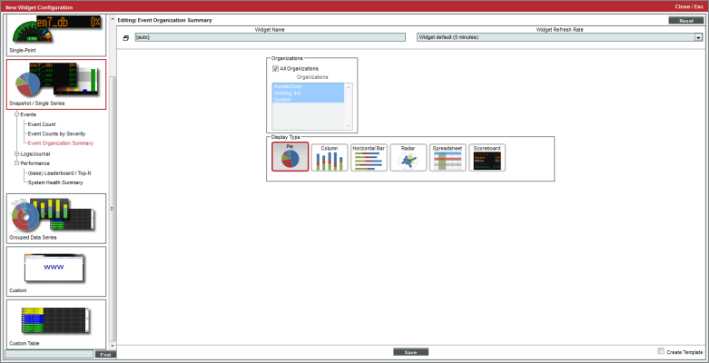
To configure an Events Organization Summary widget, supply values in the following fields:
- All Organizations. Select this checkbox to include all organizations in the report. This option is selected by default.
- Organizations. This field becomes active only if All Organizations is not selected. This field displays a list of all organizations in SL1. Hold the <Ctrl> key to select multiple organizations. Hold the <Shift> key to select a grouping of organizations.
- Display Type. Specifies how the widget will be displayed. Choices are:
- Pie. Widget will be displayed in a pie graph. Displays each event severity as percentage of total events for all selected organizations. Uses color to indicate severity.
- Columns. Widget will be displayed in a bar graph. Displays number of occurrences for all selected organizations on the y-axis. On the x-axis, displays each event severity in its own colored vertical bar.
- Horizontal Bar. Widget will be displayed in a horizontal bar graph. Displays number of occurrences for all selected organizations on the x-axis. On the y-axis, displays each event severity in its own colored horizontal bar.
- Radar. Displays a multi-pointed, color-coded polygon or circle. Users determine if the radar is a polygon or circle by selecting Arc or Line in the Grid Lines field. Each point on the polygon or circle represents an event. The number of event instances is measured by the concentric rings. The number value of each concentric ring increases from center to perimeter.
- Spreadsheet. Widget will be displayed as a spreadsheet. Displays each event severity in its own row. Each severity has its own column, with total number of occurrences.
- Scoreboard. For the selected organizations, displays a tally of active events, grouped by severity. Lists Healthy first, Critical last, with a number of occurrences for each severity. Display is tally-style, in a large format for easy viewing.
- Options. If you selected Column or Horizontal Bar in the Display Type field, you can further define the display in these fields.
- Chart minimum. You can accept the minimum value that SL1 determines, usually the lowest collected value or lowest calculated value (Automatic), or you can specify a minimum value (Fixed Value).
- Chart maximum. You can accept the maximum value that SL1 determines, usually the highest collected value or highest calculated value (Automatic), or you can specify a maximum value (Fixed Value).
- Threshold Value. You can select Enabled and then enter a threshold value in this field. SL1 will then include a heavy line in the graph that indicates the threshold.
- Severity ranges. Select whether a low value (Increasing) or a high value (Decreasing) indicates a healthy state.
- Severity Slider. Use the sliders and/or supply values in the slider fields to define the range of values at which the metric is in a healthy, normal, minor, major, and critical state.
Viewing the Event Organization Summary Widget
The Event Organization Summary widget displays the number of events of each severity that occurred for the organization or group of organizations selected in the Widget Configuration page.
If you selected Spreadsheet in the Display Type field, your widget might look like this:
If you selected Columns in the Display Type field, your widget might look like this:
NOTE: Each event that occurred for the selected organizations is represented by a bar in the graph. To view the event count for an event severity, mouseover the bar for that event severity.
NOTE: Clicking on a colored bar, pie section, or severity link in the widget opens the Event Kiosk where you can view all related events.
This description covers the latest version of this widget as shipped by ScienceLogic. This widget might have been modified on your SL1 system.
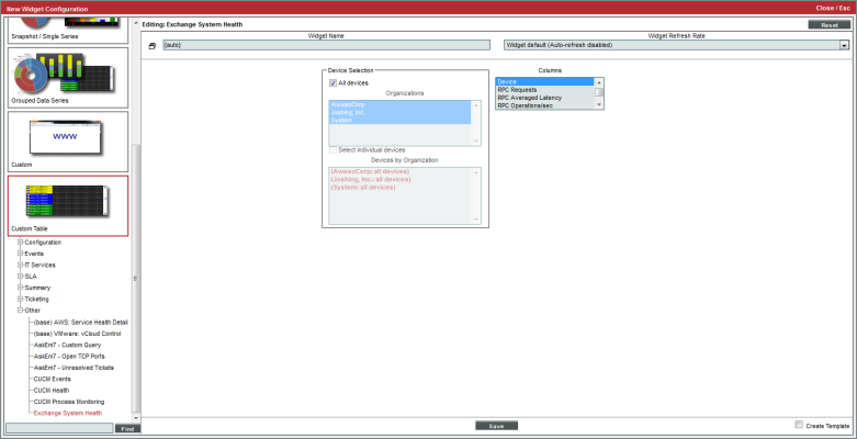
Custom Table > Other > Exchange System Health
Displays performance data collected by the Microsoft Exchange Dynamic Application from multiple devices, in tabular format.
Configuring the Exchange System Health Widget
To configure an Exchange System Health widget, supply values in the following fields:
- Device Selection. Select the devices that will appear in the widget. The following input elements appear in this component:
- All devices. Select this checkbox if you want all devices with which the Microsoft Exchange Dynamic Application is aligned to be included in this widget.
- Organizations. If the All devices checkbox is unselected, select one or more Organizations. The widget will contain only the devices with which the Microsoft Exchange Dynamic Application is aligned in the organizations you select. You can further filter the list of devices to include in the report by selecting devices in the Devices by Organization field.
- Select individual devices. If the All devices checkbox is unselected, the Select individual devices checkbox is available. Select this checkbox if you would like to select the individual devices to include in the widget.
- Devices by Organization. This field displays a list of all devices in the organizations selected in the Organizations field. If the Select individual devices checkbox is selected, you can select one or more devices to include in the widget.
- Columns. Select the columns that you want to include in the widget.
Viewing the Exchange System Health Widget
For each device that you selected in the Widget Configuration page and that includes an Exchange server, the Exchange System Health widget will display a table with the columns you selected in the Widget Configuration page.
Depending on your selection, your Exchange System Health widget might look like this:
This description covers the latest version of this widget as shipped by ScienceLogic. This widget might have been modified on your SL1 system.
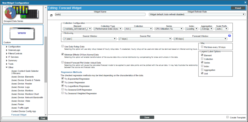
Custom > Other > Forecast
Displays projected forecast data for a specific device and collection metric using historical data and selected regression methods.
Configuring the Forecast Widget
To configure the Forecast Widget, supply values in the following fields:
- Element. Select the device or IT Service for which you want to display forecast metrics.
- Collection Type. Select the type of metric that will be displayed in the widget. The options available in this field are based on your selection in the Element field.
- Collection. Select the source of data that will be displayed in the widget. The options available in this field are based on your selection in the Collection Type field.
- Series. If applicable, select the specific metric to display in the widget. The options in this field are based on your selection in the Collection Type and Collection fields.
- Index. If you selected a Performance Dynamic Application in the Collection field, select the data series to display in the widget.
- Aggregation. Select the method by which data in the widget will be aggregated. Choices are:
- Average
- Sum
- Minimum
- Maximum
- Scale Prefix. Select a unit scale for the widget's y-axis that is appropriate for the data series. If you do not select a scale prefix, the widget will auto-scale the y-axis to an appropriate scale based on the values being displayed.
- Source Window. Select the timespan of historical data you want to use to calculate forecast data in the widget.
- Source Plot. Select the timespan of historical data to display in the widget.
- Forecast Window. Select the timespan of forecast data to display in the widget.
- Use Daily Rollup Data. Select this checkbox to use daily rollup data instead of hourly rollup data in the widget.
- Minimize Effects of Non-Normal Data. Select this checkbox to normalize the historical data used in the widget by compensating for skew and kurtosis.
- Extend Forecast Plot Under Actual Data. Select this checkbox to extend the calculated forecast model to the historical data displayed in the widget. Doing so helps visualize the relationship between the historical and forecast data.
- Regression Methods. Select the regression method(s) you want SL1 to try when calculating the forecast data in the widget. Choices are:
- Try Exponential Regression
- Try Linear Regression
- Try Logarithmic Regression
- Try Seasonal Drift Regression
- Try Seasonal Weighted Regression
ScienceLogic recommends that you select at least three regression methods to produce the most likely forecast. SL1 will then determine which regression method(s) of those you have chosen will best model the forecast data.
- Plot lines every 30 days. Select this checkbox if you want to add dashed plot lines to the widget marking each 30-day timespan of data in the chart.
- Legend Label Options. Specifies the information that is included in the legend for the widget. Choices are:
- Element. Displays the value from the Element field.
- Collection. Displays the value from the Collection field.
- Series. Displays the value from the Series field.
- Index. Displays the value from the Index field.
- Aggregation. Displays the value from the Aggregation field.
- Unit. Displays the unit for each series.
- Create Template. Select this checkbox to save the current widget configuration as a Quick-Add option.
Viewing the Forecast Widget
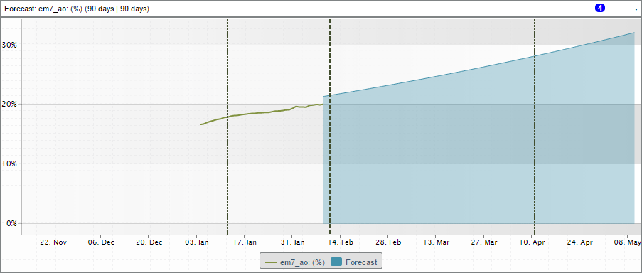
The Forecast widget displays a graph representing historical data for a specific device and set of metrics over a selected period of time as well as a forecast of those same metrics for a specified period of time in the future.
This description covers the latest version of this widget as shipped by ScienceLogic. This widget might have been modified on your SL1 system.
Custom > Tools > HTML Content
Allows you to include and execute HTML code from the Dashboards tab page. This widget allows you to include links to websites, include text from SOPs, or execute searches of other websites, directly from the Dashboards tab page.
Configuring the HTML Content Widget
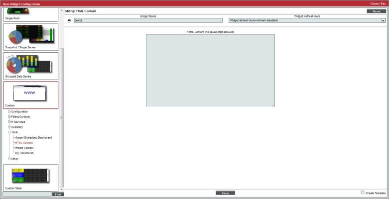
When you configure the HTML Content widget, you specify the HTML code to include in the widget, including formatting and links to websites, among other features.
- HTML Content. In this field, enter the HTML code you want SL1 to display in the widget. You can include links to other websites. You cannot include JavaScript.
Viewing the HTML Content Widget
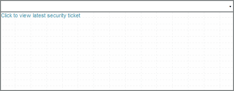
Depending on the HTML code you enter, your HTML Content widget could look similar to this:
This description covers the latest version of this widget as shipped by ScienceLogic. This widget might have been modified on your SL1 system.
Custom > Tools > iFrame Content
Allows you to display the content from a specified URI in a widget in the Dashboards tab page. When configuring an iFrame Content widget, you must enter a URI, and the widget will display the website.
Configuring the iFrame Content Widget
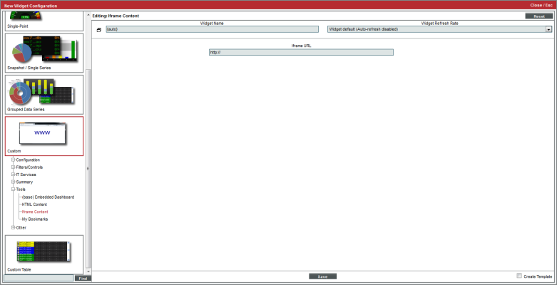
To configure the iFrame Content widget, enter the following:
- iFrame URL. Enter the URL or URI that you want displayed in the widget.
NOTE: In the Firefox and Chrome browsers, if your organization uses self-signed certificates, and you have not explicitly accepted those certificates, the URL or URI that you enter in the iFrame URL field will not load in the iFrame . As a work-around, you can first open the intended URI or URL in a separate tab in their browser, add an exception for the self-signed certificate, and then reload SL1's page.
Viewing the iFrame Content Widget
Depending on which URI you enter, your iFrame Content widget might look like this:
This description covers the latest version of this widget as shipped by ScienceLogic. This widget might have been modified on your SL1 system.
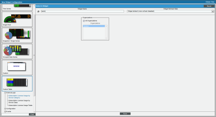
Custom Table> ScienceLogic > Subscription License Usage by Device Category
This widget displays subscription license usage by device category. It displays a column for Device Category, Device Count in that category, and an As of date column.
Configuring the Subscription Usage by Device Category Widget
To configure the widget, supply values in the following fields:
- Organizations. By default, the All Organizations checkbox is selected. If the All Organizations checkbox is unselected, select one or more organizations. The widget will contain subscription usage information only for the devices within the organizations you select.
This description covers the latest version of this widget as shipped by ScienceLogic. This widget might have been modified on your SL1 system.
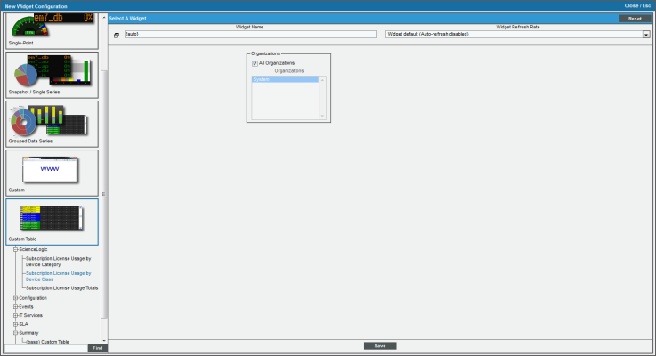
Custom Table > ScienceLogic > Subscription License Usage by Device Class
This widget displays subscription license usage by device class. It displays a column for Device Class, Device Count in that category, and an As of date column.
Configuring the Subscription Usage by Device Class Widget
To configure the widget, supply values in the following fields:
- Organizations. By default, the All Organizations checkbox is selected. If the All Organizations checkbox is unselected, select one or more organizations. The widget will contain subscription usage information only for the devices within the organizations you select.
This description covers the latest version of this widget as shipped by ScienceLogic. This widget might have been modified on your SL1 system.
Custom Table > ScienceLogic > Subscription License Usage Totals
This widget displays subscription license usage totals across all devices. It displays a column for License Type, Device Count in that category, and an As of date column.
There are no fields to configure the widget. Select the button and the license usage totals will be displayed in the widget.
This description covers the latest version of this widget as shipped by ScienceLogic. This widget might have been modified on your SL1 system.
Custom > ScienceLogic > Subscription License Reports Widget
This widget displays a report of subscription licenses in SL1.
There are no fields to configure the widget. Select the button and the license usage totals will be displayed in the widget.
This description covers the latest version of this widget as shipped by ScienceLogic. This widget might have been modified on your SL1 system.
IT Service Dashboards and Widgets
SL1 includes four IT Service widgets. These widgets are for use in IT Service Dashboards. IT Service Dashboards are not displayed in the tab, but instead are displayed in the IT Service Summary page for an IT Service.
For details on IT Service Dashboards and the IT Service widgets,
- IT Service Activity Log. Displays a list of all current and past alerts and events associated with an IT Service.
- IT Service Details. Displays the following information about an IT Service:
- Service Name
- Service Owner
- Service Visibility
- Maintenance State
- Service Health
- Service Availability
- Service Risk
- IT Service Problem Management. Displays the number of logs, active events, and active tickets associated with an IT Service.
- IT Service Vitals. Displays the current value for each Key Metric defined for an IT Service.
Custom > Tools > My Bookmarks
Displays a table that contains a list of bookmarks associated with your account.
Configuring the My Bookmarks Widget
There are no configurable options for the My Bookmarks widget.
Viewing the My Bookmarks Widget
If you have created bookmarks with your account, your My Bookmarks widget might look like this:
NOTE: To access a bookmark, click its name in the widget. You will automatically be directed to the bookmarked page in SL1.
This description covers the latest version of this widget as shipped by ScienceLogic. This widget might have been modified on your SL1 system.
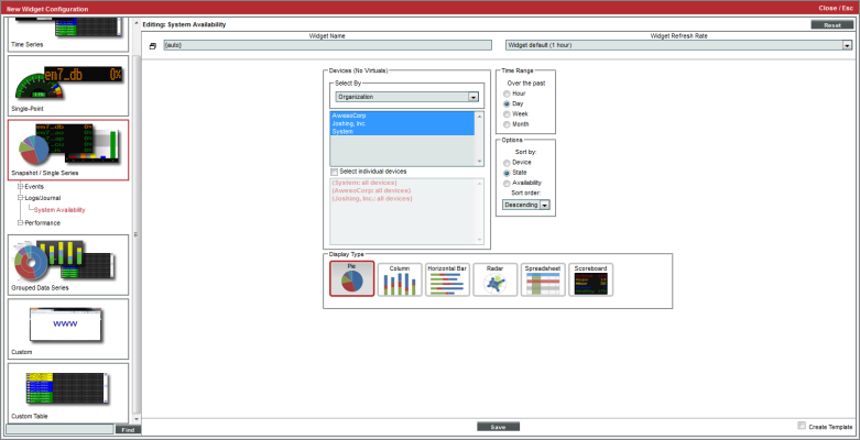
Snapshot/Single Series > Logs/Journal > System Availability
Displays current availability of one or more devices. Availability means the device's ability to accept connections and data from the network.
Configuring the System Availability Widget
To configure a System Availability widget, supply values in the following fields:
- Select by. Specify if you want to select devices by organization, category, or device group. Depending on your selection, the list below will be populated with devices by organization, device categories, or device groups. To select one, multiple, or all options, hold the <Ctrl> key.
- Select individual devices. Select this checkbox to select multiple or a single device. Devices are grouped by the parameters selected in the Select Device field. To select multiple devices, hold the <Ctrl> key.
- Time Range. Specify the time range for which you want to view availability data. Choices are the past:
- Hour. Display availability date for the last hour.
- Day. Display availability date for the last day.
- Week. Display availability date for the last week.
- Month. Display availability date for the last month.
- Sort by. Select the parameter for sorting the list of devices in the widget. Choices are:
- Device. Sort the list of devices by device name.
- State. Sort the list of devices by device state.
- Availability. Sort the list of devices by device availability.
- Sort order. Specifies whether you want to sort from lowest to highest (ascending) or highest to lowest (descending).
- Display Type. Select how you would like the widget to be displayed. Choices are:
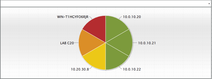
- Pie. Widget will be displayed in a pie graph. Displays a colored slice for each device. Each slice is labeled with device name and percent availability.
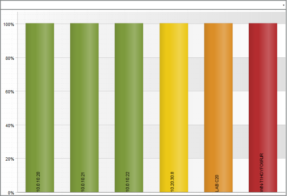
- Columns. Widget will be displayed in a bar graph. Displays percent availability on the y-axis. On the x-axis, displays each device in its own colored vertical bar.
- Horizontal Bar. Widget will be displayed in a horizontal bar graph. Displays percent availability on the x-axis. On the y-axis, displays each device in its own colored vertical bar.
- Radar. Displays a multi-pointed, color-coded polygon or circle. Users determine if the radar is a polygon or circle by selecting Arc or Line in the Grid Lines field. Each point on the polygon or circle represents an event. The number of event instances is measured by the concentric rings. The number value of each concentric ring increases from center to perimeter.
- Spreadsheet. Widget will be displayed as a spreadsheet. Displays each device in its own row. A column displays the availability for each device.
- Clicking on the device icon (
 ) displays the Device Summary page for the device.
 - Clicking on the availability value displays the System Availability report for the device.
- Scoreboard. For each selected device, displays the percent availability. Devices are listed alphabetically. Display is tally-style, in large format for easy viewing.
- Options. If you selected Column or Horizontal Bar in the Display Type field, you can further define the display in these fields.
- Chart minimum. You can accept the minimum value that SL1 determines, usually the lowest collected value or lowest calculated value (Automatic), or you can specify a minimum value (Fixed Value).
- Chart maximum. You can accept the maximum value that SL1 determines, usually the highest collected value or highest calculated value (Automatic), or you can specify a maximum value (Fixed Value).
- Threshold marker X. You can select Enabled and then enter a threshold value in this field. SL1 will then include a heavy line in the graph that indicates the threshold.
- Severity ranges. Select whether a low value (Increasing) or a high value (Decreasing) indicates a healthy state.
- Severity Slider. Use the sliders and/or supply values in the slider fields to define the range of values at which the metric is in a healthy, normal, minor, major, and critical state.
Viewing the System Availability Widget
For each device specified in the Widget Configuration page, the System Availability widget displays the name of the device, its state (either in text or with color-coding) and its availability in percent.
If you selected Pie in the Display Type field, your System Availability widget might look like this:
NOTE: Hover over a slice of the pie graph to view the device it represents, as well as its availability percent.
If you selected Column in the Display Type field, your System Availability widget might look like this:
This description covers the latest version of this widget as shipped by ScienceLogic. This widget might have been modified on your SL1 system.
Custom Table > Other > System Health Summary
For selected devices, displays the total number of devices at each severity level. The severity level for each device is determined by the active event on the device with the highest severity level.
Configuring the System Health Summary Widget
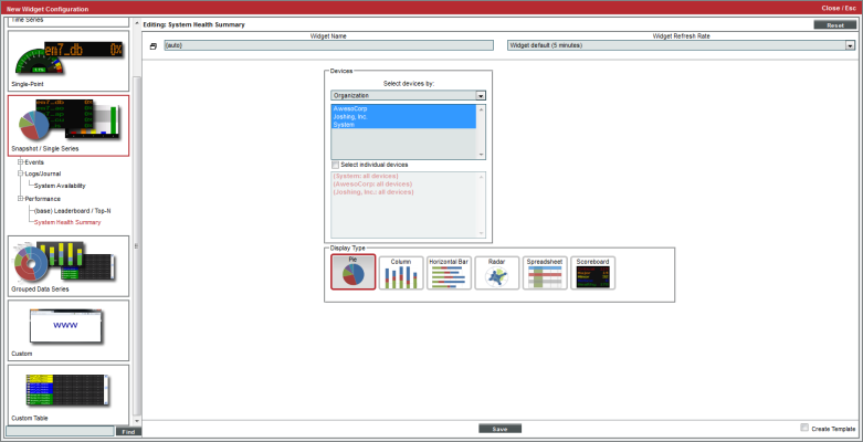
To configure a System Health Summary widget, supply values in the following fields:
- Select devices by. Specify if you want to select devices by organization, category, or device group. Depending on your selection, the list below will be populated with all devices by organization, device categories, or device groups. To select one, multiple, or all options, hold the <Ctrl> key.
- Select individual devices. Select this checkbox to select multiple or a single device. Devices are grouped by the parameters selected in the Select Device by field. To select multiple devices, hold the <Ctrl> key.
- Display Type. Select how you would like the widget to be displayed. Choices are:
- Pie. Widget will be displayed in a pie graph. Displays a colored slice for device status. Each slice is color-coded by severity.
- Columns. Widget will be displayed in a bar graph. Displays number of devices on the y-axis. On the x-axis, displays each device-health in its own colored vertical bar.
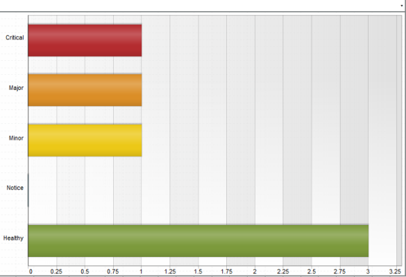
- Horizontal Bar. Widget will be displayed in a horizontal bar graph. Displays the number of devices on the x-axis. On the y-axis, displays each device-health in its own colored vertical bar.
- Radar. Displays a multi-pointed, color-coded polygon or circle. Users determine if the radar is a polygon or circle by selecting Arc or Line in the Grid Lines field. Each point on the polygon or circle represents an event. The number of event instances is measured by the concentric rings. The number value of each concentric ring increases from center to perimeter.
- Spreadsheet. Widget will be displayed as a spreadsheet. Clicking on the device name leads to the Device Summary page for that device. Each row contains the following columns:
- CPU Usage (in percent). Clicking on this value leads to the CPU Usage report for the device.
- Memory Usage (in percent). Clicking on this value leads to the Physical Memory Usage report for the device.
- Swap Usage (in percent). Clicking on this value leads to the Virtual Memory Usage report for the device.
- Availability (in percent). Clicking on this value leads to the System Availability report for the device.
- Latency (in milliseconds). Clicking on this value leads to the System Latency report for the device.
- Scoreboard. Displays each severity level and the number of devices (from the group of selected devices) that have that severity list Critical first, Healthy last, with a number (of devices) for each severity. Display is tally-style, in large format for each viewing.
- Options. If you selected Column or Horizontal Bar in the Display Type field, you can further define the display in these fields.
- Chart minimum. You can accept the minimum value that SL1 determines, usually the lowest collected value or lowest calculated value (Automatic), or you can specify a minimum value (Fixed Value).
- Chart maximum. You can accept the maximum value that SL1 determines, usually the highest collected value or highest calculated value (Automatic), or you can specify a maximum value (Fixed Value).
- Threshold marker X. You can select Enabled and then enter a threshold value in this field. SL1 will then include a heavy line in the graph that indicates the threshold.
- Severity ranges. Select whether a low value (Increasing) or a high value (Decreasing) indicates a healthy state.
- Severity Slider. Use the sliders and/or supply values in the slider fields to define the range of values at which the metric is in a healthy, normal, minor, major, and critical state.
Viewing the System Health Summary Widget
For each device you specified in the Widget Configuration page, the System Health Summary displays the number of devices with severities of critical, major, minor, notice, and healthy.
If you selected Horizontal Bar in the Display Type field, your System Health Summary widget might look like this:
NOTE: Each event on each selected device is represented by a bar in the graph. To view the event count for a single event, mouseover the bar for that event.
If you selected Spreadsheet in the Display Type field, your System Health Summary widget might look like this:
This description covers the latest version of this widget as shipped by ScienceLogic. This widget might have been modified on your SL1 system.
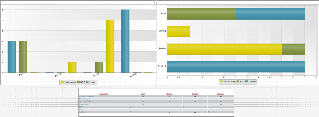
Grouped Data Series > Ticketing > Ticketing Summary
For a selected ticket property (organization, ticket queue, ticket state, ticket category, and assigned user), displays the number of tickets of each status (open, working, pending), or the number of tickets of each severity (healthy - critical), or the number of tickets in each state (defined by administrators).
Configuring the Ticketing Summary Widget
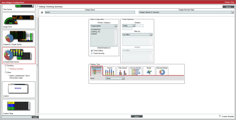
To configure the Ticket Summary widget, supply values in the following fields:
- Primary Category. Select the property for grouping tickets. Depending on your choice, you will be able to select one or multiple organizations, ticket queues, ticket states, ticket categories, or assigned users. Hold the <Ctrl> key to select multiple options. Choices are:
- Organization. Field will display a list of organizations in SL1. Select one or more organizations to include in the report. All tickets for the selected organization(s) will be included in the report.
- Ticket Queue. Field will display a list of ticket queues in SL1. Select one or more ticket queues to include in the report. All tickets for the selected ticket queue(s) will be included in the report.
- Ticket State. Field will display a list of ticket states in SL1. Select one or more ticket states to include in the report. All tickets for the selected ticket state(s) will be included in the report.
- Ticket Category. Field will display a list of ticket categories in SL1. Select one or more ticket categories to include in the report. All tickets for the select ticket categories will be included in the report.
- Assigned User. Field will display a list of assigned users in SL1. Select one or more assigned users to include in the report. All tickets for the assigned user organization(s) will be included in the report.
- Detail Breakdown. Select how you would like the widget to be detailed. Selections are:
- Ticket Status. Widget will show details on the status of each ticket in the widget. For each ticket that meets the criteria, the widget will display details about ticket status. For each selected Primary Category, displays the number of tickets of each status.
- Ticket Severity. Widget will show details on the ticket severity of each ticket in the widget. For each ticket that meets the criteria, the widget will display details about ticket severity. For each selected Primary Category, displays the number of tickets of each severity.
- Ticket State. If available, widget will display details on the ticket status of each ticket in the widget. For each ticket that meets the criteria, the widget will display details about ticket state. For each selected Primary Category, displays the number of tickets of each state.
- Timeline. Select the time period to display events for. The widget will display events from the selected time to the current time. Choices are:
- Today. The widget will display all selected tickets with matching parameters that occurred today.
- Yesterday. The widget will display all selected tickets with matching parameters that occurred yesterday.
- Last. Specify the amount of days, weeks, or months to begin the report. The maximum amount is 30 months.
- All.
- Filter by. You can filter the list of tickets by:
- No Filter. The widget will not be filtered. All tickets that meet the criteria will appear in the widget.
- Ticket Status. You can filter the widget to show tickets of one or more of the following statuses: Open, Working, Pending, Resolved.
- Ticket Severity. You can filter the widget to show tickets of one or more of the following severities: Healthy, Notice, Minor, Major, Critical.
- Ticket State. You can filter the widget to show specified ticket states, if available. Ticket states are defined by administrators in the Ticket States page (Registry > Ticketing > Custom States).
- And by. You can filter again, with the same parameters as described in the Filter by field above.
- Display Type. Select how you would like the widget to be displayed. Choices are:
- Spreadsheet. Widget will be displayed as a spreadsheet. Displays each Primary Category in its own row. Clicking on a primary category leads to the Ticket Console page, with only tickets from the selected category displayed. Each row contains the columns for each status or for each severity. Clicking on the column heading for the Primary Category sorts the list of tickets by Primary Category.
- Column. Widget will be displayed in a bar graph. Displays number of tickets on the y-axis. On the x-axis, displays each Primary Category in its own vertical bar. Each vertical bar is color-coded to represent ticket severity or labeled to represent ticket status.
- Flat Column. Widget will be displayed in a bar graph, with thin flat bars, and a key at the bottom of the graph showing what each bar represents. Displays number of tickets on the y-axis. On the x-axis, displays each Primary Category in its own vertical bar. Each vertical bar is narrow and color-coded to represent ticket severity or labeled to represent ticket status. Key at bottom displays color code for Primary Category.
- Horizontal Bar. Widget will be displayed in a horizontal bar graph. Displays number of tickets on the x-axis. On the y-axis, displays each Primary Category in its own vertical bar. Each vertical bar is color-coded to represent ticket severity or labeled to represent ticket status. Key at bottom displays color code for severity or state.
- Radar. Displays a multi-pointed, color-coded polygon or circle. Users determine if the radar is a polygon or circle by selecting Arc or Line in the Grid Lines field. Each point on the polygon or circle represents an event. The number of event instances is measured by the concentric rings. The number value of each concentric ring increases from center to perimeter.
- Stacked Radar. Displays a diamond-shaped , color-coded polygon. Each point on the polygon represents a each Primary Category. Number of tickets is measured by the concentric rings. The number value of each concentric ring increases from center to perimeter and is labeled from center to outer ring.
- Options. If you selected Column or Horizontal Bar in the Display Type field, you can further define the display in these fields.
- Chart minimum. You can accept the minimum value that SL1 determines, usually the lowest collected value or lowest calculated value (Automatic), or you can specify a minimum value (Fixed Value).
- Chart maximum. You can accept the maximum value that SL1 determines, usually the highest collected value or highest calculated value (Automatic), or you can specify a maximum value (Fixed Value).
- Threshold marker X. You can select Enabled and then enter a threshold value in this field. SL1 will then include a heavy line in the graph that indicates the threshold.
- Severity ranges. Select whether a low value (Increasing) or a high value (Decreasing) indicates a healthy state.
- Severity Slider. Use the sliders and/or supply values in the slider fields to define the range of values at which the metric is in a healthy, normal, minor, major, and critical state.
Viewing the Ticketing Summary Widget
For each ticket that meets the criteria you specified in the Widget Configuration page, the Ticketing Summary widget displays the Primary Category and the number of tickets of each status (open, working, pending, and resolved.)
If you selected Flat Column,Horizontal Bar and Spreadsheetin the Display Type field, your Ticketing Summary widgets might look like this:
NOTE: If you hover over a bar in the Flat Column or Horizontal Bar widgets, you can view the number of tickets associated with that bar.
This description covers the latest version of this widget as shipped by ScienceLogic. This widget might have been modified on your SL1 system.
VMware Dashboards and Widgets
SL1 includes the VMware Dashboards PowerPack. The VMware Dashboards PowerPack contains two VMware monitoring dashboards.
- VMware Host Performance. This dashboard monitors VMware servers.
- VMware vCentre Overview. This dashboard monitors individual virtual machines.
The VMware Dashboards PowerPack also includes a widget:
- VMware - Inventory Summary. The widget displays information on the following:
- vCenters
- Clusters
- Resource Pools
- Hosts
- VMs
- Total CPU Cores
- Total RAM
- Platform
NOTE: To support multi-tenancy, the VMware - Inventory Summary widget will display only information to which you have access (through your account type, organization memberships, and Access Keys).
For details on the VMware dashboards and widgets, see the
