The "Cisco: ACI Dashboards" PowerPack contains dashboards that present data related to different aspects of a Cisco ACI system.
The following sections describe each of these dashboards:
ACI Application Dashboard
The ACI Application Dashboard provides an overview of a selected Application Network Profile running on a Cisco ACI system.
The ACI Application Dashboard displays the following widgets:
- Context Quick Selector. This widget allows the user to set the timespan for the dashboard.
- SELECT AN APPLICATION. This widget allows the user to select an Application Network Profile running on the Cisco ACI system (from a list of applications) to display in the dashboard.
- Application Health Score (graph). This widget displays a line graph that depicts the average Health Score for the selected Application Network Profile over time.
- Application Health Score (gauge). This widget displays a gauge that depicts the average Health Score for the selected application. The gauge is updated every five minutes.
- Tenant Fault Counts by Type. This widget displays the 10 tenants with the most faults, by fault type. The table displays a row for each type and four columns, one for each fault severity: Critical faults, major faults, minor faults, and warning faults.
- Tenant Fault Counts by Domain. This widget displays the 10 tenants with the most faults, by fault domain. The table displays a row for each domain and four columns, one for each fault severity: Critical faults, major faults, minor faults, and warning faults.
- Endpoint Groups Health Score (Bottom 5). This widget displays a bar graph that depicts the five Endpoint Groups with the lowest ACI Health Score. Each bar represents an Endpoint Group and displays the average health score in percent.
- Virtual Machine CPU Usage (Top 5) (percent). This widget displays a bar graph that depicts the five VMWare virtual machines (that host EPGs) with the highest average CPU usage. Each bar represents a virtual machine and displays the average CPU usage in percent.
- Virtual Machine CPU Usage (Top 5) (mHz). This widget displays a bar graph that depicts the five VMWare virtual machines (that host EPGs) with the highest average CPU usage. Each bar represents a virtual machine and displays the average CPU usage in mHz.
- Virtual Machine Memory Usage (Top 5). This widget displays a bar graph that depicts the five VMWare virtual machines (that host EPGs) with the highest average memory usage. Each bar represents a virtual machine and displays the average memory usage in percent.
- Virtual Machine Network Usage (Top 5). This widget displays a bar graph that depicts the five VMWare virtual machines (that host EPGs) with the highest average network usage. Each bar represents a virtual machine and displays the average network usage in KB/second.
- Virtual Machine Disk Usage (Top 5). This widget displays a bar graph that depicts the five VMWare virtual machines (that host EPGs) with the highest average disk usage. Each bar represents a virtual machine and displays the average disk usage in KB/second.
ACI Health Dashboard
The ACI Health dashboard provides an overview of the health of the ACI system.
The ACI Health dashboard displays the following widgets:
- Context Quick Selector. This widget allows the user to set the timespan for the dashboard.
- Organization Selector. This widget allows the user to specify the organization(s) to include in the dashboard.
- Device Selector. This widget allows the user to specify the device(s) to include in the dashboard. If the user selects one or more values in the Organization Selector widget, only devices from the selected organization(s) appear in the Device Selector.
- Pod Health Score. This widget displays a gauge that depicts the average Health Score for the full system under an ACI pod. The gauge is updated every five minutes.
- Switch Utilization (Average interface Utilization). This widget displays a bar graph that depicts the 10 switches with the highest average interface utilization. Each bar represents a switch (spine or leaf) and displays the average interface usage in percent.
- Pod Health Score. This widget displays a line graph that depicts the average Health Score for the full system under an ACI pod. The graph displays health in percent over time.
- APIC CPU Utilization. This widget displays a line graph that depicts the average CPU usage for each APIC in the ACI system. The graph displays a line for each APIC. Each line displays average CPU usage in percent over time.
- Number of Authentications. This widget displays a line graph that depicts the number of successful authentications to the cluster that hosts the APIC(s). The line graph displays the number of successful authentications over time.
- Fault Counts by Type. This widget displays a line graph that depicts the type of faults that have occurred on the cluster that hosts the APIC(s). The graph displays a line for each fault severity (critical faults, major faults, minor faults, and warning faults). Each line displays the number of faults over time.
- APIC Memory Utilization. This widget displays a line graph that depicts the average memory usage for each APIC in the ACI system. The graph displays a line for each APIC. Each line displays average memory usage in percent over time.
- Fabric Switch Health Scores (Bottom 10). This widget displays a bar graph that depicts the 10 switches (both spines and leaf) with the lowest health scores. Each bar represents a switch and displays health in percent.
- Tenant Health Score (Bottom 10). This widget displays a bar graph that depicts the 10 tenants with the lowest health scores. Each bar represents a tenant and displays health in percent.
- Fault Counts by Type. This widget displays the 10 devices with the most faults, by fault type. The table displays a row for each type and four columns, one for each fault severity: Critical faults, major faults, minor faults, and warning faults.
- Fault Counts by Domain. This widget displays the 10 devices with the most faults, by fault domain. The table displays a row for each domain and four columns, one for each fault severity: Critical faults, major faults, minor faults, and warning faults.
ACI Leaf Health Dashboard
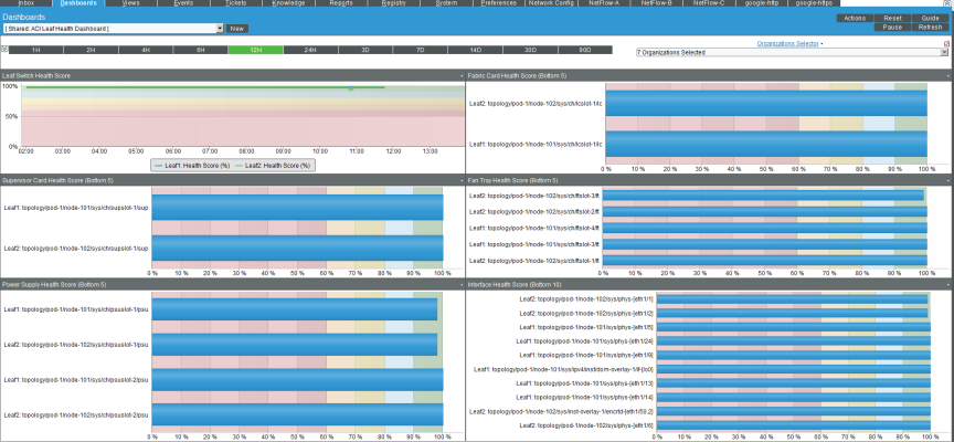
The ACI Leaf Health dashboard provides an overview of the health of each leaf and its components.
The ACI Leaf Health dashboard displays the following widgets:
- Context Quick Selector. This widget allows the user to set the timespan for the dashboard.
- Organization Selector. This widget allows the user to specify the organization(s) to include in the dashboard.
- Leaf Switch Health Score. This widget displays a line graph that depicts the Health Score for each leaf in the ACI system. The graph displays a line for each leaf switch. Each line displays health in percent over time.
- Fabric Card Health Score (Bottom 5). This widget displays a bar graph that depicts the five fabric cards (among all the leaf switches) with the lowest health scores. Each bar represents a fabric card and displays health in percent.
- Supervisor Card Health Score (Bottom 5). This widget displays a bar graph that depicts the five supervisor cards (among all the leaf switches) with the lowest health scores. Each bar represents a supervisor card and displays health in percent.
- Fan Tray Health Score (Bottom 5). This widget displays a bar graph that depicts the five fan trays (among all the leaf switches) with the lowest health scores. Each bar represents a fan tray and displays health in percent.
- Power Supply Health Score (Bottom 5). This widget displays a bar graph that depicts the five power supplies (among all the leaf switches) with the lowest health scores. Each bar represents a power supply and displays health in percent.
- Interface Health Score (Bottom 10). This widget displays a bar graph that depicts the 10 interfaces (among all the leaf switches) with the lowest health scores. Each bar represents an interface and displays health in percent.
ACI Overview Dashboard
The ACI Overview dashboard provides an overview of the status of the entire ACI system.
The ACI Health dashboard displays the following widgets:
- Context Quick Selector. This widget allows the user to set the timespan for the dashboard.
- Organization Selector. This widget allows the user to specify the organization(s) to include in the dashboard.
- Device Selector. This widget allows the user to specify the device(s) to include in the dashboard. If the user selects one or more values in the Organization Selector widget, only devices from the selected organization(s) appear in the Device Selector.
- Pod Health Score. This widget displays a gauge that depicts the average Health Score for the full system under an ACI pod. The gauge is updated every five minutes.
- Switch Utilization (Average interface Utilization). This widget displays a bar graph that depicts the 10 switches with the highest average interface utilization. Each bar represents a switch (spine or leaf) and displays the average interface usage in percent.
- Monitored Component Count. This widget displays a line graph that depicts the number of monitored components in the ACI system. The graph displays number of components over time.
- Tenant Health Score (Bottom 5). This widget displays a bar graph that depicts the five tenants with the lowest health scores. Each bar represents a tenant and displays health in percent.
- Endpoint Group Health Score (Bottom 5). This widget displays a bar graph that depicts the five endpoint groups with the lowest health scores. Each bar represents an endpoint group and displays health in percent.
- Fabric Switch Health Scores (Bottom 5). This widget displays a bar graph that depicts the five switches (both spines and leaf) with the lowest health scores. Each bar represents a switch and displays health in percent.
- APIC CPU Utilization. This widget displays a line graph that depicts the average CPU usage for each APIC in the ACI system. The graphs displays a line for each APIC. Each line displays average CPU usage in percent over time.
- Critical Fault Count. This widget displays a bar graph that depicts each part of the ACI system where a critical fault occurred. Each bar represents a component of the ACI system where a critical fault occurred and displays the number of critical faults.
- Major Fault Count. This widget displays a bar graph that depicts each part of the ACI system where a major fault occurred. Each bar represents a component of the ACI system where a major fault occurred and displays the number of major faults.
- Minor Fault Count. This widget displays a bar graph that depicts each part of the ACI system where a minor fault occurred. Each bar represents a component of the ACI system where a minor fault occurred and displays the number of minor faults.
- Warning Fault Count. This widget displays a bar graph that depicts each part of the ACI system where a warning fault occurred. Each bar represents a component of the ACI system where a warning fault occurred and displays the number of warning faults.
- Event Kiosk. This widget displays a list of all events associated with the ACI system. The interface is the same as that of the Events Console.
ACI Spine Health Dashboard
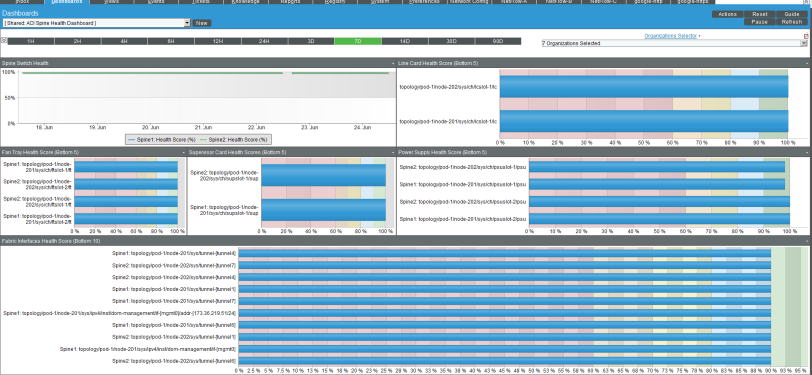
The ACI Spine Health dashboard provides an overview of the health of each spine and its components.
The ACI Spine Health dashboard displays the following widgets:
- Context Quick Selector. This widget allows the user to set the timespan for the dashboard.
- Organization Selector. This widget allows the user to specify the organization(s) to include in the dashboard.
- Spine Switch Health Score. This widget displays a line graph that depicts the Health Score for each spine in the ACI system. The graph displays a line for each spine switch. Each line displays health in percent over time.
- Line Card Health Score (Bottom 5). This widget displays a bar graph that depicts the five line cards (among all the spine switches) with the lowest health scores. Each bar represents a line card and displays health in percent.
- Fan Tray Health Score (Bottom 5). This widget displays a bar graph that depicts the five fan trays (among all the spine switches) with the lowest health scores. Each bar represents a fan tray and displays health in percent.
- Supervisor Card Health Score (Bottom 5). This widget displays a bar graph that depicts the five supervisor cards (among all the spine switches) with the lowest health scores. Each bar represents a supervisor card and displays health in percent.
- Power Supply Health Score (Bottom 5). This widget displays a bar graph that depicts the five power supplies (among all the spine switches) with the lowest health scores. Each bar represents a power supply and displays health in percent.
- Interface Health Score (Bottom 10). This widget displays a bar graph that depicts the 10 interfaces (among all the spine switches) with the lowest health scores. Each bar represents an interface and displays health in percent.
ACI Switch Dashboard
The ACI Switch dashboard provides an overview of the health of all the switches (spine and leaf) in the ACI system.
The ACI Switch dashboard displays the following widgets:
- Context Quick Selector. This widget allows the user to set the timespan for the dashboard.
- Organization Selector. This widget allows the user to specify the organization(s) to include in the dashboard.
- Device Selector. This widget allows the user to specify the device(s) to include in the dashboard. If the user selects one or more values in the Organization Selector widget, only devices from the selected organization(s) appear in the Device Selector.
- Custom Device Table. This widget displays a table that lists the spine switches and leaf switches in the ACI system. This widget allows the user to specify the switches to include in the dashboard.
- Health Score (Last 7 days). This widget displays a gauge that depicts the average Health Score for the previous seven days for the switch selected in the Custom Device Table widget. The gauge is updated every five minutes. You can view the health score for only one switch at a time.
- Fault Counts by Type. This widget displays a table that lists each switch and the type where faults occurred. The table displays a row for each switch/type and four columns, one for each fault severity: Critical faults, major faults, minor faults, and warning faults.
- Fault Counts by Domain. This widget displays a table that lists each switch and the domain where faults occurred. The table displays a row for each switch/domain and four columns, one for each fault severity: Critical faults, major faults, minor faults, and warning faults.
- Switch Total Fault Counts. This widget displays a bar graph that depicts each switch where a fault occurred, the severity of the fault, and the number of faults. Each bar represents a switch/fault severity and the number of times the fault occurred.
- . This widget displays a line graph that depicts the average CPU usage for each APIC in the ACI system. The graph displays a line for each switch. Each line displays the total number of faults over time.
- Critical Fault Count. This widget displays a bar graph that depicts the five components of a switch where the most critical faults occurred. Each bar represents a component of a switch where a critical fault occurred and displays the number of critical faults.
- Major Fault Count. This widget displays a bar graph that depicts the five components of a switch where the most major faults occurred. Each bar represents component of a switch where a major fault occurred and displays the number of major faults.
- Minor Fault Count. This widget displays a bar graph that depicts the five components of a switch where the most minor faults occurred. Each bar represents a component of a switch where a minor fault occurred and displays the number of minor faults.
- Warning Fault Count. This widget displays a bar graph that depicts the five components of a switch where the most warning faults occurred. Each bar represents component of a switch where a warning fault occurred and displays the number of warning faults.
ACI Switch Interface Dashboard
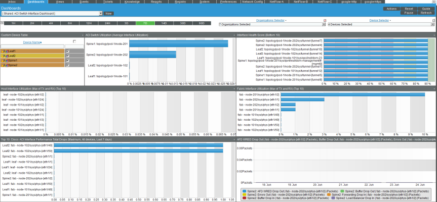
The ACI Switch Interface dashboard provides an overview of the status of the interfaces on all the switches (spine and leaf) in the ACI system.
The ACI Switch Interface dashboard displays the following widgets:
- Context Quick Selector. This widget allows the user to set the timespan for the dashboard.
- Organization Selector. This widget allows the user to specify the organization(s) to include in the dashboard.
- Device Selector. This widget allows the user to specify the device(s) to include in the dashboard. If the user selects one or more values in the Organization Selector widget, only devices from the selected organization(s) appear in the Device Selector.
- Custom Device Table. This widget displays a table that lists the spine switches and leaf switches in the ACI system. This widget allows the user to specify the switches to include in the dashboard.
- ACI Switch Utilization (Average Interface Utilization). This widget displays a bar graph that displays the 10 switch interfaces with the highest utilization. Each bar represents an interface and displays utilization in percent.
- Interface Health Score (Bottom 10). This widget displays a bar graph that displays the 10 switch interfaces with the lowest health scores. Each bar represents an interface and displays health in percent.
- Host Interface Utilization (Max of TX and RX) (Top 10). This widget displays a bar graph that displays the 10 host-facing switch interfaces with the highest utilization. Each bar represents an interface and displays utilization in percent.
- Fabric Interface Utilization (Max of TX and RX) (Top 10). This widget displays a bar graph that displays the 10 fabric-facing switch interfaces with the highest utilization. Each bar represents an interface and displays utilization in percent.
- Top 10: Cisco: ACI Interface Performance Total Drops (Maximum, All devices, Last <timespan>). This widget displays a bar graph. The bar graph displays the 10 switch interfaces with the highest number of drops over the timespan. Each bar represents an interface and displays the total number of drops for the timespan.
- Interface Drops and Errors (Top 5). This widget displays a line graph that depicts drops and errors over time. The graph includes a line for each type of drop or error: SFD WRED Drop Out, Buffer Drop Out, Errors Out, Forward Drop In, Buffer Drop In, and Load Balancer Drop In. Each line displays the number of drops or errors over time.
ACI Tenant Health Dashboard
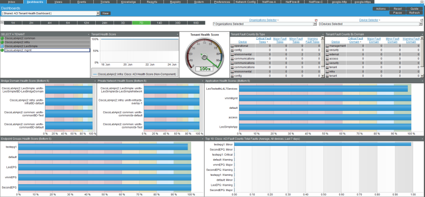
The ACI Tenant Health dashboard provides an overview of the status of a selected tenant in the ACI system.
The ACI Tenant Health dashboard displays the following widgets:
- Context Quick Selector. This widget allows the user to set the timespan for the dashboard.
- Organization Selector. This widget allows the user to specify the organization(s) to include in the dashboard.
- Device Selector. This widget allows the user to specify the device(s) to include in the dashboard. If the user selects one or more values in the Organization Selector widget, only devices from the selected organization(s) appear in the Device Selector.
- SELECT A TENANT. This widget displays a table that lists the tenants in the ACI system. This widget allows the user to specify the switches to include in the dashboard.
- Tenant Health Score (graph). This widget displays a line graph that depicts the average Health Score for one or more selected tenants over time. The graph includes a line for tenant. Each line displays health in percent over time.
- Tenant Health Score (gauge). This widget displays a gauge that depicts the average Health Score for one or more selected tenants. The gauge is updated every five minutes.
- Tenant Fault Counts by Type. This widget displays the 10 tenants with the most faults, by fault type. The table displays a row for each type and four columns, one for each fault severity: Critical faults, major faults, minor faults, and warning faults.
- Tenant Fault Counts by Domain. This widget displays the 10 tenants with the most faults, by fault domain.The table displays a row for each domain and four columns, one for each fault severity: Critical faults, major faults, minor faults, and warning faults.
- Bridge Domain Health Score (Bottom 5). This widget displays a bar graph that depicts the five bridge domains with the lowest ACI Health Score. Each bar represents a bridge domain and displays the average health score in percent.
- Private Network Health Score (Bottom 5). This widget displays a bar graph that depicts the five private networks with the lowest ACI Health Score. Each bar represents a private network and displays the average health score in percent.
- Application Health Score (Bottom 5). This widget displays a bar graph that depicts the five applications with the lowest ACI Health Score. Each bar represents an application and displays the average health score in percent.
- Endpoint Groups Health Score (Bottom 5). This widget displays a bar graph that depicts the five endpoint groups with the lowest ACI Health Score. Each bar represents an endpoint group and displays the average health score in percent.
- Top 10: Cisco: ACI Fault Counts Total Faults (Average, All devices, Last <timespan>). This widget displays a bar graph that depicts the ACI tenants with the highest number of total faults over the timespan. Each bar represents a tenant/fault severity and the number of times the fault occurred.


