This
Use the following menu options to navigate the SL1 user interface:
- To view a pop-out list of menu options, click the menu icon (
 ).
). - To view a page containing all of the menu options, click the Advanced menu icon (
 ).
).
Features of the Performance Tab
The tab of the Device Reports panel displays performance graphs for hardware, monitoring policies, and Dynamic Applications. From the Performance page, you can view the one or more of the following types of reports (among others). These reports are described in this section.
- System Vitals. Displays the device's availability, latency, overall CPU usage, overall memory usage, and overall virtual memory usage, all displayed on separate lines and graphed over time.
- System Availability. Displays the device's availability, graphed over time. Availability means the device's ability to accept connections and data from the network
- System Latency. Availability. Displays the device's latency, graphed over time. Latency means the amount of time it takes SL1 to communicate with the device.
- CPU Utilization. Displays the device's total CPU usage, in percentage. If a device contains multiple CPUs, the report displays the total combined CPU usage, in percent.
- Memory Utilization. This report displays total memory usage over time, in percent.
- Virtual Memory Utilization.This report displays total virtual memory usage over time, in percent.
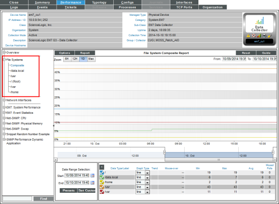
- File Systems. The File System reports display the amount of disk-space used, in percent, for a device. For each discovered file system on the device, SL1 generates a file system report. This report displays the file system usage, over time, in percent. For devices with multiple file systems, SL1 also generates a Composite report, which displays file system usage, over time, in percent, for each file system, but on a single graph.
NOTE: If you hide a file system in the Device Hardware page (
- Network Interfaces. For each discovered network interface on the device, SL1 generates five reports:
- Utilization, Bandwidth Usage, and Bandwidth Usage (Stacked), which display bandwidth usage over time
- Errors and Discards and Errors and Discards %, which display errors and discards over time
If an interface is configured for CBQoS and you have enabled the field Enable CBQoS Collection in the Behavior Settings page (System > Settings > Behavior), SL1 will display the collected CBQoS data in reports. For each CBQoS Policy and each class map under that policy, SL1 can generate reports on the following based on the CBQoS configuration:
- Class Maps
- Policing
- Sets
- Match Statements
- Queuing
- Sets
- Traffic Shaping
- WRED
- Domain Name Monitors. Displays the availability of the domain-name server and the specified record on that domain server over time, in percent. The report also displays the lookup time for each request (each time SL1 contacts the server).
- Email Round-Trip Monitors. Displays the number of milliseconds it takes to send a message to an external mail server and then receive a response message back from that external mail server.
- SOAP/XML Transaction Monitors. For each SOAP/XML transaction monitoring policy, displays multiple reports, including a report on the availability of the SOAP or XML server and specific content on the server. Also displays reports on page size, download speed, lookup time, connection time, and transaction time.
- System Process Monitors. The System Process reports displays availability of system processes. For each monitored system process, SL1 generates a process report. This report displays availability of that process, in percent. For devices with multiple monitored processes, SL1 also generates a Composite report, which displays availability of multiple processes over time, but on a single graph.
- TCP/IP Port Monitors. For each monitored port, displays availability of that port, in percent. Availability means the port's ability to accept connections and data from the network.
- Web Content Monitors. For each web content monitoring policy, displays multiple reports, including a report on the availability of the web server and specific content on the server. Also displays reports on page size, download speed, lookup time, connection time, and transaction time.
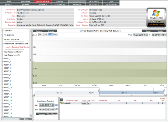
- Windows Service Monitors. For each monitored Windows Service, displays availability of that Windows service, in percent. Availability means whether the service is enabled and running.
- Collection Groups and Collection Labels. For each Collection Label assigned to a Dynamic Application to which the device subscribes, displays collected values for the aligned presentation object, over time.
The list of links in the Navigation Bar can also include links to reports (presentation objects) defined in the Dynamic Applicationsto which the device subscribes .
NOTE: Component devices that were discovered using component mapping in Dynamic Applications might display only reports defined in a Dynamic Application.
Viewing System Vitals for a Device
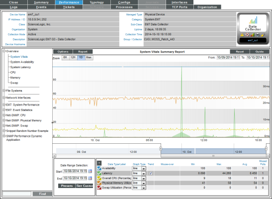
The System Vitals Summary Report displays multiple device-parameters in a single graph. The System Vitals Summary Report trends the following parameters:
- System Availability (Availability means the device's ability to accept connections and data from the network.)
- System Latency (Latency means the amount of time it takes SL1 to communicate with the device.)
- Overall CPU Usage
- Overall Physical Memory Usage
- Overall Swap Usage
The graph displays system availability, system latency, memory usage, virtual-memory usage, and CPU usage for the selected duration.
To view the System Vitals report for a device:
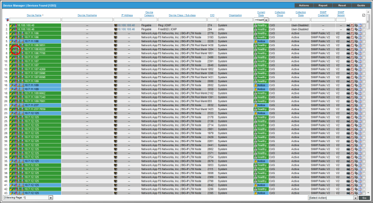
- Go to the Device Manager page (Devices > Device Manager).
- In the Device Manager page, find the device for which you want to view the vitals report. Select its bar graph icon (
 ).
).
- In the Device Reports panel, select the tab.
- In the tab, go to the NavBar (list of links in the left pane), expand the Overview link, and select System Vitals.
- The System Vitals report displays multiple device-parameters for the selected date and time range.
- The y-axis displays usage, in percent, to the left and actual value to the right.
- The x-axis displays time. The increments vary, depending upon the selected data type (from the menu) and the date range (from the Date Range Selection pane).
- Each parameter is represented by a color-coded line.
- Mousing over any point in any line displays the high, low, and average value at that time-point in the Data Table pane.
- You can use your mouse to scroll the report to the left and right.
- In a graph of normalized data, clicking on a data point zooms in on that time period and shows the non-normalized data.
- The menu in the upper left of the report displays a menu of options you can apply to data in the current report.
- The menu in the upper left of the report allows you to export and save the current data and graph as a report. Displays a list of formats for saving the report.
- The Data Table at the bottom of each report allows you to view details about each data point and view information about the entire report. The data table includes the following:
- Data Type/Label. For graphs that include multiple types of data on a single graph (for example, availability and latency), each data type has its own row in this table. This column displays the type of data and how it is color coded in the report. Clicking on the check mark toggles on and off the data in the report.
- Graph Type. For selected reports, allows you to specify how you want the data type to be represented in the report. Choices include candlestick, line, stepline, column, area, or stacked. For some reports, the graph type is static and you cannot select a graph type.
- Trend. Toggles on and off a trendline. The trendline shows a bi-directional weighted average, which "smooths" the data for easier consumption. This trending appears as a shaded area superimposed over the graph.
- Mouseover. When you mouseover the graph, this column displays the exact value for each data type at that time point on the graph.
- Min. The column displays the minimum value for the data type in the report.
- Max. This column displays the maximum value for the data type in the report.
- Avg. This column displays the average value for the data type in the report.
- Missed Polls. This column displays the number of times SL1 was unable to collect the data within the time span of the report.
Viewing Availability Reports for a Device
The System Availability report displays information about the device's availability. Availability means the device's ability to accept connections and data from the network.
During polling, a device has two possibly availability values:
- 100%. Device is up and running.
- 0%. Device is not accepting connections and data from the network.
By default, the method of discovery determines how the SL1 monitors availability for a device:
- If the SL1 agent is installed and creates a device record before the device is discovered as an SNMP or pingable device, availability is measured based on uptime data collected by the agent.
- If the device is discovered as an SNMP or pingable device before the agent is installed, availability is monitored with the method specified in the discovery session (SNMP, ICMP, or TCP).
For devices that SL1 discovers with the discovery tool (Devices > Add Devices button, or System > Manage > Classic Discovery in the classic SL1 user interface), SL1 determines availability by checking the status of the port specified in the Availability Port field in the Device Properties page. SL1 collects device-availability data every five minutes, as specified in the process "Data Collection: Availability" (in the Process Manager page).
For component devices that SL1 discovers with component mapping Dynamic Applications, SL1 determines availability by checking the status of a collection object.
For devices that SL1 discovers with the agent, SL1 collects uptime data from the agent every 5 minutes, and uses this value to determine device availability.
To view the System Availability report for a device:
- Go to the Device Manager page (Devices > Device Manager).
- In the Device Manager page, find the device for which you want to view the availability report. Click its bar graph icon (
 ).
).
- In the Device Reports panel, click the Performance tab.
- In the Performance tab, go to the NavBar (list of links in the left pane), expand the Overview link, and click System Availability.
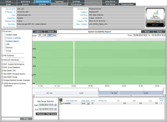
- The System Availability report displays system availability for the selected date and time range.
- The y-axis displays usage, in percent to the left.
- The x-axis displays time. The increments vary, depending upon the selected data type (from the menu) and the date range (from the Date Range Selection pane).
- Mousing over any point in any line displays (in the Data Table pane) the high, low, and average value at the selected time-point.
- You can use your mouse to scroll the report to the left and right.
- In a graph of normalized data, clicking on a data point zooms in on that time period and shows the non-normalized data.
- The menu in the upper left of the report displays a menu of options you can apply to data in the current report.
- The menu in the upper left of the report allows you to export and save the current data and graph as a report. Displays a list of formats for saving the report.
- The Data Table at the bottom of each report allows you to view details about each data point and view information about the entire report. The data table includes the following:
- Data Type/Label. For graphs that include multiple types of data on a single graph (for example, availability and latency), each data type has its own row in this table. This column displays the type of data and how it is color coded in the report. Clicking on the check mark toggles on and off the data in the report.
- Graph Type. For selected reports, allows you to specify how you want the data type to be represented in the report. Choices include candlestick, line, stepline, column, area, or stacked. For some reports, the graph type is static and you cannot select a graph type.
- Trend. Toggles on and off a trendline. The trendline shows a bi-directional weighted average, which "smooths" the data for easier consumption. This trending appears as a shaded area superimposed over the graph.
- Mouseover. When you mouse over the graph, this column displays the exact value for each data type at that time point on the graph.
- Min. The column displays the minimum value for the data type in the report.
- Max. This column displays the maximum value for the data type in the report.
- Avg. This column displays the average value for the data type in the report.
- Missed Polls. This column displays the number of times SL1 was unable to collect the data within the time span of the report.
Viewing Latency Reports for a Device
The System Latency report displays a graph with information about a single device's latency over time.
To view the System Latency report for a device:
- Go to the Device Manager page (Devices > Device Manager).
- In the Device Manager page, find the device for which you want to view the latency report. Select its bar graph icon (
 ).
).
- In the Device Reports panel, select the Performance tab.
- In the Performance tab, go to the NavBar (list of links in the left pane), expand the Overview link, and select System Latency.
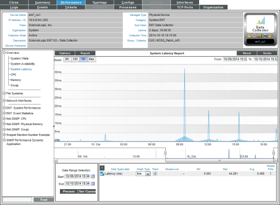
- The System Latency report displays system latency for the selected date and time range.
- The y-axis displays latency, in milliseconds, to the left.
- The x-axis displays time. The increments vary, depending upon the selected data type (from the menu) and the date range (from the Date Range Selection pane).
- Mousing over any point in any line displays the high, low, and average value at that time-point in the Data Table pane.
- You can use your mouse to scroll the report to the left and right.
- In a graph of normalized data, clicking on a data point zooms in on that time period and shows the non-normalized data.
- The menu in the upper left of the report displays a menu of options you can apply to data in the current report.
- The menu in the upper left of the report allows you to export and save the current data and graph as a report. Displays a list of formats for saving the report.
- The Data Table at the bottom of each report allows you to view details about each data point and view information about the entire report.The data table includes the following:
- Data Type/Label. For graphs that include multiple types of data on a single graph (for example, availability and latency), each data type has its own row in this table. This column displays the type of data and how it is color coded in the report. Clicking on the check mark toggles on and off the data in the report.
- Graph Type. For selected reports, allows you to specify how you want the data type to be represented in the report. Choices include candlestick, line, stepline, column, area, or stacked. For some reports, the graph type is static and you cannot select a graph type.
- Trend. Toggles on and off a trendline. The trendline shows a bi-directional weighted average, which "smooths" the data for easier consumption. This trending appears as a shaded area superimposed over the graph.
- Mouseover. When you mouseover the graph, this column displays the exact value for each data type at that time point on the graph.
- Min. The column displays the minimum value for the data type in the report.
- Max. This column displays the maximum value for the data type in the report.
- Avg. This column displays the average value for the data type in the report.
- Missed Polls. This column displays the number of times SL1 was unable to collect the data within the time span of the report.
Viewing a Report on CPU Usage for a Device
For each device for which SL1 discovered a CPU, you can view a CPU Utilization report.
The CPU Utilization report displays the device's total CPU usage, in percentage. If a device contains multiple CPUs, the report displays the total combined CPU usage, in percent.
To view the CPU Utilization report for a device:
- You can access the CPU Utilization report from two places:
- Go to the Device Manager page (Devices > Device Manager), find the device where the CPU resides, and select its bar graph icon (
 ).
).
- Go to the Device Hardware page (Devices > Hardware), filter by CPU, find the device where the CPU resides, and select its bar graph icon (
 ).
).
- When the Device Reports panel appears, click the Performance tab.
- In the Device Performance page, go to the NavBar (list of links in the left pane), expand the Overview link, and click CPU Utilization.
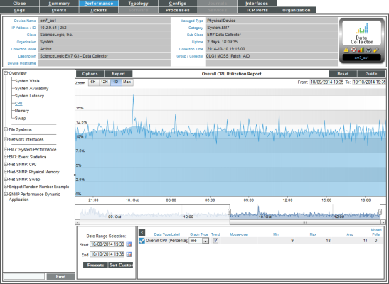
- The Overall CPU Utilization report displays total CPU usage and average CPU usage over time. If a device contains multiple CPUs, the report displays the total combined CPU usage, in percent, and the combined average CPU usage, in percent. The graph displays CPU usage for the selected date and time range.
- The y-axis displays usage, in percent to the left.
- The x-axis displays time. The increments vary, depending upon the selected data type (from the menu) and the date range (from the Date Range Selection pane).
- Mousing over any point in any line displays (in the Data Table pane) the high, low, and average value at the select time-point.
- You can use your mouse to scroll the report to the left and right.
- In a graph of normalized data, clicking on a data point zooms in on that time period and shows the non-normalized data.
- The menu in the upper left of the report displays a menu of options you can apply to data in the current report.
- The menu in the upper left of the report allows you to export and save the current data and graph as a report, and displays a list of formats for saving the report.
- The Data Table at the bottom of each report allows you to view details about each data point and view information about the entire report. The data table includes the following:
- Data Type/Label. For graphs that include multiple types of data on a single graph (for example, availability and latency), each data type has its own row in this table. This column displays the type of data and how it is color coded in the report. Clicking on the checkmark toggles on and off the data in the report.
- Graph Type. For selected reports, allows you to specify how you want the data type to be represented in the report. Choices include candlestick, line, stepline, column, area, or stacked. For some reports, the graph type is static and you cannot select a graph type.
- Trend. Toggles on and off a trendline. The trendline shows a bi-directional weighted average, which "smooths" the data for easier consumption. This trending appears as a shaded area superimposed over the graph.
- Mouseover. When you mouseover the graph, this column displays the exact value for each data type at that time point on the graph.
- Min. This column displays the minimum value for the data type in the report.
- Max. This column displays the maximum value for the data type in the report.
- Avg. This column displays the average value for the data type in the report.
- Missed Polls. This column displays the number of times SL1 was unable to collect the data within the time span of the report.
Changing the Dynamic Application Precedence Settings for CPU and Memory Utilization
SL1 collects CPU and memory utilization metrics using Dynamic Applications. If an SNMP device is monitored using the SL1 agent, multiple Dynamic Applications can collect CPU and memory utilization metrics. When multiple Dynamic Applications collect CPU and/or memory utilization for a device, SL1 evaluates precedence settings to determine which Dynamic Application will be used to represent CPU and memory utilization for that device.
By default, the precedence settings are configured so the Dynamic Applications that poll the device (using methods other than the agent) represent CPU and memory utilization for that device.
You can change the precedence settings so the Dynamic Applications that use data collected by the agent represent CPU and memory utilization:
- For all applicable devices discovered in the future
- Per-device
To change the precedence settings for all applicable devices discovered in the future:
- Go to the Collection Labels page (System > Manage > Collection Labels).
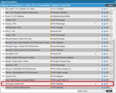
- The Collection Labels page includes entries for CPU Utilization and Memory Utilization. Select the icon in the Aligned Presentations column (
 ) for the utilization metric for which you want to adjust precedence. The Aligned Presentations page appears.
 - Locate the entry for the Host Agent: System Perf Dynamic Application. Select its checkbox.
- In the Select Action drop-down list, select 0 in the Change Precedence section.
- Click .
To change the precedence settings per-device:
- Go to the Collection Labels page (System > Manage > Collection Labels).
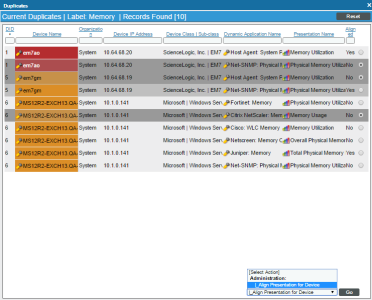
- The Collection Labels page includes entries for CPU Utilization and Memory Utilization. Select the icon in the Duplicates column (
 ) for the utilization metric for which you want to adjust precedence. The Current Duplicates page appears.
- The Current Duplicates page displays multiple rows for each device; each row specifies a device and Dynamic Application metric pair. For each group of rows for a device, use the radio button to the right of the page to select the Dynamic Application metric you want to use for that device.
- In the Select Action drop-down list, select Align Presentation for Device.
- Click .
Viewing a Report on Physical Memory Usage for a Device
You can view an Overall Memory Utilization report for each device for which SL1 has discovered physical memory. The Overall Memory Utilization Report displays total memory usage and average memory usage over time.
If an SNMP device is monitored using the SL1 agent, multiple Dynamic Applications can collect CPU and memory utilization metrics. When multiple Dynamic Applications collect CPU and/or memory utilization for a device, SL1 evaluates precedence settings to determine which Dynamic Application will be used to represent CPU and memory utilization for that device. By default, the precedence settings are configured so the Dynamic Applications that poll the device using methods other than the agent represent CPU and memory utilization for that device. However, you can change the precedence settings so the Dynamic Applications instead use data collected by the agent to represent CPU and memory utilization. For more information, see the section on Changing the Dynamic Application Precedence Settings for CPU and Memory Utilization.
To view the Overall Memory Utilization report for a device:
- You can access the Memory Utilization report from two places:
- Go to the Device Manager page (Devices > Device Manager), find the device where the memory resides, and select its bar graph icon (
 ).
).
- Go to the Device Hardware page (Devices > Hardware), filter by CPU, find the device where the memory resides, and select its bar graph icon (
 ).
).
- When the Device Reports panel appears, select the Performance tab.
- In the Device Performance page, go to the NavBar (list of links in the left pane), expand the Overview link, and select Memory Utilization
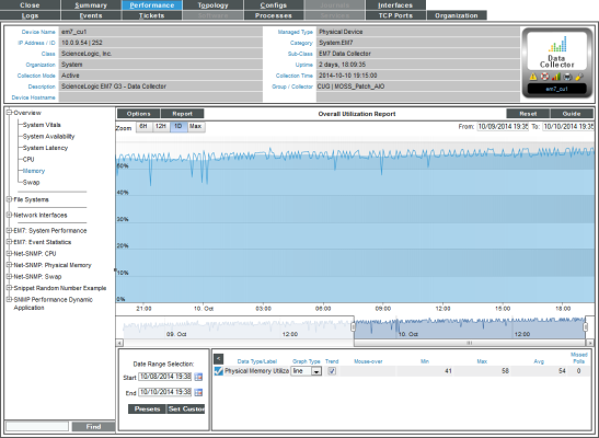
- The Overall Memory Utilization report displays total memory usage and average memory usage over time. The graph displays memory usage for the selected date and time range.
- The y-axis displays memory usage, in percent, to the left.
- The x-axis displays time. The increments vary, depending upon the selected data type (from the menu) and the date range (from the Date Range Selection pane).
- If the report includes both physical memory and virtual memory, each is represented by a color-coded stack and color-coded line on the graph.
- The line graph represents actual usage and the stack represents average usage.
- Mousing over any point in any line (in the Data Table pane) displays the high, low, and average value at the selected time-point.
- You can use your mouse to scroll the report to the left and right.
- In a graph of normalized data, clicking on a data point zooms in on that time period and shows the non-normalized data.
- The menu in the upper left of the report displays a menu of options you can apply to data in the current report.
- The menu in the upper left of the report allows you to export and save the current data and graph as a report, and displays a list of formats for saving the report.
- The Data Table at the bottom of each report allows you to view details about each data point and view information about the entire report. The data table includes the following:
- Data Type/Label. For graphs that include multiple types of data on a single graph (for example, availability and latency), each data type has its own row in this table. This column displays the type of data and how it is color coded in the report. Clicking on the checkmark toggles on and off the data in the report.
- Graph Type. For selected reports, allows you to specify how you want the data type to be represented in the report. Choices include candlestick, line, stepline, column, area, or stacked. For some reports, the graph type is static and you cannot select a graph type.
- Trend. Toggles on and off a trendline. The trendline shows a bi-directional weighted average, which "smooths" the data for easier consumption. This trending appears as a shaded area superimposed over the graph.
- Mouseover. When you mouseover the graph, this column displays the exact value for each data type at that time point on the graph.
- Min. The column displays the minimum value for the data type in the report.
- Max. This column displays the maximum value for the data type in the report.
- Avg. This column displays the average value for the data type in the report.
- Missed Polls. This column displays the number of times SL1 was unable to collect the data within the time span of the report.
Viewing a Report on Virtual Memory Usage for a Device
The Overall Virtual Memory Utilization Report displays total virtual memory usage and average virtual memory usage over time.
If an SNMP device is monitored using the SL1 agent, multiple Dynamic Applications can collect CPU and memory utilization metrics. When multiple Dynamic Applications collect CPU and/or memory utilization for a device, SL1 evaluates precedence settings to determine which Dynamic Application will be used to represent CPU and memory utilization for that device. By default, the precedence settings are configured so the Dynamic Applications that poll the device using methods other than the agent represent CPU and memory utilization for that device. However, you can change the precedence settings so the Dynamic Applications instead use data collected by the agent to represent CPU and memory utilization. For more information, see the section on Changing the Dynamic Application Precedence Settings for CPU and Memory Utilization.
To view the Overall Virtual Memory Utilization report for a device:
- You can access the Overall Virtual Memory Utilization report from two places:
- Go to the Device Manager page (Devices > Device Manager), find the device where the virtual memory resides, and select its bar graph icon (
 ).
). - Go to the Device Hardware page (Devices > Hardware), filter by CPU, find the device where the virtual memory resides, and select its bar graph icon (
 ).
).
- When the Device Reports panel appears, select the tab.
- In the Device Performance page, go to the NavBar (list of links in the left pane), expand the Overview link, and select Virtual Memory Utilization.
- The Overall Virtual Memory Utilization report displays total memory usage and average memory usage over time. The graph displays memory usage for the selected date and time range.
- The y-axis displays virtual memory usage, in percent, to the left.
- The x-axis displays time. The increments vary, depending upon the selected data type (from the menu) and the date range (from the Date Range Selection pane).
- Mousing over any point in any line displays the high, low, and average value at that time-point in the Data Table pane.
- You can use your mouse to scroll the report to the left and right.
- In a graph of normalized data, clicking on a data point zooms in on that time period and shows the non-normalized data.
- The menu in the upper left of the report displays a menu of options you can apply to data in the current report.
- The menu in the upper left of the report allows you to export and save the current data and graph as a report, and displays a list of formats for saving the report.
- The Data Table at the bottom of each report allows you to view details about each data point and view information about the entire report. The data table includes the following:
- Data Type/Label. For graphs that include multiple types of data on a single graph (for example, availability and latency), each data type has its own row in this table. This column displays the type of data and how it is color coded in the report. Clicking on the checkmark toggles on and off the data in the report.
- Graph Type. For selected reports, allows you to specify how you want the data type to be represented in the report. Choices include candlestick, line, stepline, column, area, or stacked. For some reports, the graph type is static and you cannot select a graph type.
- Trend. Toggles on and off a trendline. The trendline shows a bi-directional weighted average, which "smooths" the data for easier consumption. This trending appears as a shaded area superimposed over the graph.
- Mouseover. When you mouseover the graph, this column displays the exact value for each data type at that time point on the graph.
- Min. The column displays the minimum value for the data type in the report.
- Max. This column displays the maximum value for the data type in the report.
- Avg. This column displays the average value for the data type in the report.
- Missed Polls. This column displays the number of times SL1 was unable to collect the data within the time span of the report.
Viewing a Report on File System Usage for a Device
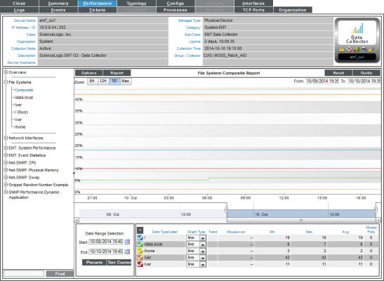
The File System reports display the amount of disk-space used, in percent, for a device. For each discovered file system on the device, SL1 generates a file system report. This report displays the file system usage, over time, in percent. For devices with multiple file systems, SL1 also generates a Composite report, which displays file system usage, over time, in percent, for each file system, but on a single graph.
NOTE: If you hide a file system in the Device Hardware page (Devices > Hardware), SL1 does not generate a File System Report for that file system.
To view the file-system reports for a device:
- You can access the File System reports from two places:
- Go to the Device Manager page (Devices > Device Manager), find the device where the file system resides, and select its bar graph icon (
 ).
). - Go to the Device Hardware page (Devices > Hardware), filter by CPU, find the device where the file system resides, and select its bar graph icon (
 ).
).
- When the Device Reports panel appears, select the Performance tab.
- In the Device Performance page, go to the NavBar (list of links in the left pane), and expand the File System Overview link.
- If a device has multiple file systems, you can select from two types of reports:
- Composite. Leads to the File System Composite Report, where you can view percent of disk-space used for all file systems on the device. Each file system is represented by a color-coded line.
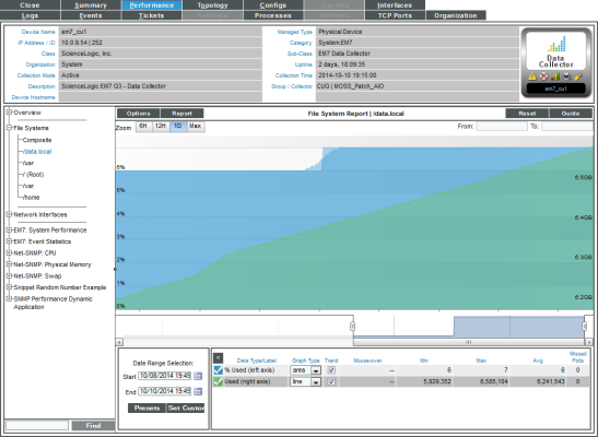
- File System Name. For a selected file system, the File system Report displays file system usage, over time, in percent.
- The File System Composite Report displays percent of disk-space used for all file systems on the device.
- The File System Composite Report displays the following:
- The File System Composite Report displays percent of disk-space used on the y-axis and time of day on the x-axis. The report displays data from the last 24 hours.
- The y-axis displays usage, in percent.
- The x-axis displays time. The increments vary, depending upon the selected data type (from the menu) and the date range (from the Date Range Selection pane).
- Each file system is represented by a color-coded line.
- Mousing over any point in any line displays (in the Data Table pane) the high, low, and average value on each file system at the selected time-point.
- You can use your mouse to scroll the report to the left and right.
- In a graph of normalized data, clicking on a data point zooms in on that time period and shows the non-normalized data.
- The File System Report displays file system usage, for a single file system, over time, in percent.
- The File System Report displays the following:
- The graph displays a color-coded line for percent usage and a color-coded line for amount used (in MBs).
- The y-axis displays usage, in percent to the left and actual amount used, in MB, to the right.
- The x-axis displays time. The increments vary, depending upon the selected data type (from the menu) and the date range (from the Date Range Selection pane).
- Each parameter is represented by a color-coded line.
- Mousing over any point in any line displays (in the Data Table pane) the high, low, and average value at the selected time-point.
- You can use your mouse to scroll the report to the left and right.
- In a graph of normalized data, clicking on a data point zooms in on that time period and shows the non-normalized data.
- In both types of file-system reports, the menu in the upper left of the report displays a menu of options you can apply to data in the current report.
- In both types of file-system reports, the menu in the upper left of the report allows you to export and save the current data and graph as a report, and displays a list of formats for saving the report.
- In both types of file-system reports, the Data Table at the bottom of each report allows you to view details about each data point and view overview information about the entire report.The data table includes the following:
- Data Type/Label. For graphs that include multiple types of data on a single graph (for example, availability and latency), each data type has its own row in this table. This column displays the type of data and how it is color coded in the report. Clicking on the checkmark toggles on and off the data in the report.
- Graph Type. For selected reports, allows you to specify how you want the data type to be represented in the report. Choices include candlestick, line, stepline, column, area, or stacked. For some reports, the graph type is static and you cannot select a graph type.
- Trend. Toggles on and off a trendline. The trendline shows a bi-directional weighted average, which "smooths" the data for easier consumption. This trending appears as a shaded area superimposed over the graph.
- Mouseover. When you mouseover the graph, this column displays the exact value for each data type at that time point on the graph.
- Min. The column displays the minimum value for the data type in the report.
- Max. This column displays the maximum value for the data type in the report.
- Avg. This column displays the average value for the data type in the report.
- Missed Polls. This column displays the number of times SL1 was unable to collect the data within the time span of the report.
Viewing Performance Report Graphs on Network Interfaces
For each network interface discovered on a device, SL1 generates five network interface performance report graphs. These five graphs display:
- Utilization
- Bandwidth Usage
- Bandwidth Usage (Stacked)
- Errors and Discards
- Errors and Discards %
If an interface is configured for CBQoS and you have enabled the field Enable CBQoS Collection in the Behavior Settings page (System > Settings > Behavior), SL1 will display the collected CBQoS data in performance report graphs. For each CBQoS Policy and each class map under that policy, SL1 can generate graphs on the following based on the CBQoS configuration:
- Class Maps
- Policing
- Sets
- Match Statements
- Queuing
- Sets
- Traffic Shaping
- WRED
Default Performance Graph Reports for Network Interfaces
To view the five default network interface performance report graphs for a device:
- You can access the network interface performance report graphs from two places:
- Go to the Device Manager page (Devices > Device Manager), find the device with the desired network interface, and click its bar graph icon (
 ).
). - Go to the Device Hardware page (Devices > Hardware), find the device with the desired network interface, and click its bar graph icon (
 ).
).
- When the Device Reports panel appears, click the Performance tab.
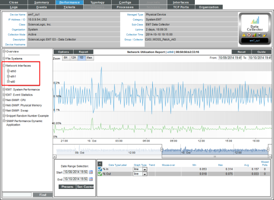
- In the Device Performance page, go to the NavBar (the list of links in the left pane), and expand the Network Interfaces link.
- When you expand a network interface, links to each network interface report appear under that interface. Each report is described in the sections below.
- In all of the network interface reports, the menu in the upper left of the report displays a menu of options you can apply to data in the current report.
- In all of the network interface reports, the menu in the upper left of the report enables you to export and save the current data and graph as a report, and displays a list of formats for saving the report.
- In all of the network interface reports, the Data Table at the bottom of each report enables you to view details about each data point and view overview information about the entire report. The data table includes the following:
- Data Type/Label. For graphs that include multiple types of data on a single graph (for example, availability and latency), each data type has its own row in this table. This column displays the type of data and how it is color-coded in the report. Clicking on the check mark toggles on and off the data in the report.
- Graph Type. For selected reports, allows you to specify how you want the data type to be represented in the report. Choices include candlestick, line, stepline, column, area, or stacked. For some reports, the graph type is static and you cannot select a graph type.
- Trend. Toggles on and off a trendline. The trendline shows a bi-directional weighted average, which "smooths" the data for easier consumption. This trending appears as a shaded area superimposed over the graph.
- Mouseover. When you mouse over the graph, this column displays the exact value for each data type at that time point on the graph.
- Min. The column displays the minimum value for the data type in the report.
- Max. This column displays the maximum value for the data type in the report.
- Avg. This column displays the average value for the data type in the report.
- Missed Polls. This column displays the number of times SL1 was unable to collect the data within the time span of the report.
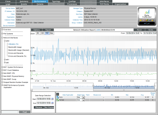
Network Utilization Report
The Network Utilization Report displays trends for the following parameters:
- Percentage of bandwidth used by inbound traffic to the device through the selected network interface
- Percentage of bandwidth used by outbound traffic from the device through the selected network interface
The Network Utilization Report displays a color-coded line for percentage in and a color-coded line for percentage out.
- The y-axis displays usage, in percent, to the left.
- The x-axis displays time. The increments vary, depending upon the selected data type (from the menu) and the date range (from the Date Range Selection pane).
- Mousing over any point in any line displays the high, low, and average value at that time point in the Data Table pane.
- You can use your mouse to scroll the report to the left and right.
- In a graph of normalized data, clicking on a data point zooms in on that time period and shows the non-normalized data.
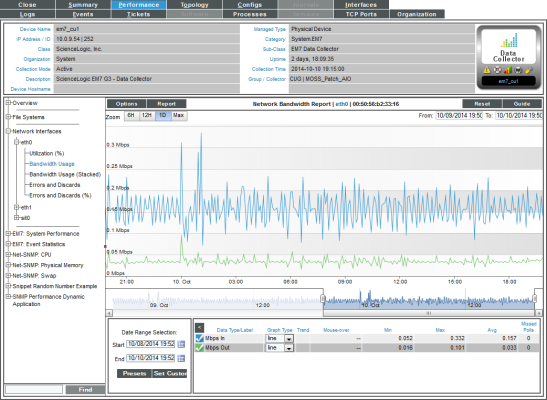
Network Bandwidth Usage Report
The Network Bandwidth Usage Report displays trends for the following parameters:
- Number of octets of data traveling into the device through the selected network interface
- Number of octets of data traveling out from the device through the selected network interface
The Network Bandwidth Usage Report graph displays a color-coded line for octets in and a color-coded line for octets out.
- The y-axis displays bandwidth usage, in octets.
- The x-axis displays time. The increments vary, depending upon the selected data type (from the menu) and the date range (from the Date Range Selection pane).
- Each parameter is represented by a color-coded line.
- Mousing over any point in any line displays the high, low, and average value at that time point in the Data Table pane.
- You can use your mouse to scroll the report to the left and right.
- In a graph of normalized data, clicking on a data point zooms in on that time period and shows the non-normalized data.
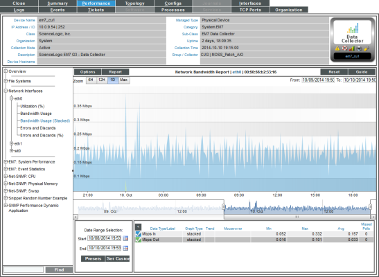
Network Bandwidth Usage Report (Stacked)
The Network Bandwidth Report (Stacked) displays trends for the following parameters:
- Number of octets of data traveling into the device through the selected network interface
- Number of octets of data traveling out from the device through the selected network interface
The Network Bandwidth Report (Stacked) graph displays a color-coded stack for octets in and a color-coded stack for octets out.
- The y-axis displays bandwidth usage, over time.
- The x-axis displays time. The increments vary, depending upon the selected data type (from the menu) and the date range (from the Date Range Selection pane).
- Each parameter is represented by a color-coded stack (similar to an area graph).
- Mousing over any point in a stack displays the high, low, and average value at that time point in the Data Table pane.
- You can use your mouse to scroll the report to the left and right.
- In a graph of normalized data, clicking on a data point zooms in on that time period and shows the non-normalized data.
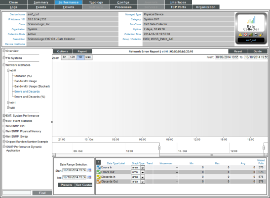
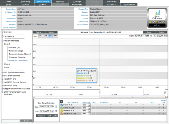
Network Error Report
The Network Error Report displays trends for the following parameters:
- Number of errors that occurred in data traveling into the device through the selected network interface
- Number of errors that occurred in data traveling out from the device through the selected network interface
- Number of discards that occurred in data traveling into the device through the selected network interface
- Number of discards that occurred in data traveling out from the device through the selected network interface
Packet errors occur when packets are lost due to hardware problems such as breaks in the network or faulty adapter hardware.
Discards occur when an interface receives more traffic than it can handle (either a very large message or many messages simultaneously). Discards can also occur when an interface has been specifically configured to discard. For example, a user might configure a router's interface to discard packets from a non-authorized IP.
The Network Error Report graph displays a color-coded line for errors in, errors out, discards in, and discards out.
- The y-axis displays number of errors and discards.
- The x-axis displays time. The increments vary, depending upon the selected data type (from the menu) and the date range (from the Date Range Selection pane).
- Each parameter is represented by a color-coded line.
- Mousing over any point in any line displays the high, low, and average value at that time point in the Data Table pane.
- You can use your mouse to scroll the report to the left and right.
- In a graph of normalized data, clicking on a data point zooms in on that time period and shows the non-normalized data.
Network Error Report (Percent)
The Network Error Report (%) displays trends for the following parameters:
- Percentage of errors that occurred in data traveling into the device through the selected network interface
- Percentage of errors that occurred in data traveling out from the device through the selected network interface
- Percentage of discards that occurred in data traveling into the device through the selected network interface
- Percentage of discards that occurred in data traveling out from the device through the selected network interface
Packet Errors occur when packets are lost due to hardware problems such as breaks in the network or faulty adapter hardware.
Discards occur when an interface receives more traffic than it can handle (either a very large message or many messages simultaneously). Discards can also occur when an interface has been specifically configured to discard. For example, a user might configure a router's interface to discard packets from a non-authorized IP.
The Network Error Report (%) graph displays a color-coded line for errors % in, errors % out, discards % in, and discards % out.
- The y-axis displays percentage of errors and discards.
- The x-axis displays time. The increments vary, depending upon the selected data type (from the menu) and the date range (from the Date Range Selection pane).
- Each parameter is represented by a color-coded line.
- Mousing over any point in any line displays the high, low, and average value at that time point in the Data Table pane.
- You can use your mouse to scroll the report to the left and right.
- In a graph of normalized data, clicking on a data point zooms in on that time period and shows the non-normalized data.
CBQoS Reports for Network Interfaces
To view the CBQoS reports for a network interface:
- You can access the network interface reports from two places:
- Go to the Device Manager page (Devices > Device Manager), find the device with the desired network interface, and click its bar graph icon (
 ).
). - Go to the Device Hardware page (Devices > Hardware), find the device with the desired network interface, and click its bar graph icon (
 ).
).
- When the Device Reports panel appears, click the Performance tab.
- In the Device Performance page, go to the NavBar (the list of links in the left pane), and expand the Network Interfaces link.
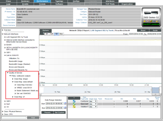
- When you expand a network interface for which CBQoS has been enabled, you will see an entry for Quality of Services. When you expand the Quality of Service link, you will see entries for the CBQoS report with a link to each CBQoS report. Each report is described below.
- In all of the network interface reports, the menu in the upper left of the report displays a menu of options you can apply to data in the current report.
- In all of the network interface reports, the menu in the upper left of the report enables you to export and save the current data and graph as a report, and displays a list of formats for saving the report.
- In all of the network interface reports, the Data Table at the bottom of each report enables you to view details about each data point and view overview information about the entire report. The data table includes the following:
- Data Type/Label. For graphs that include multiple types of data on a single graph (for example, availability and latency), each data type has its own row in this table. This column displays the type of data and how it is color coded in the report. Clicking on the check mark toggles on and off the data in the report.
- Graph Type. For selected reports, allows you to specify how you want the data type to be represented in the report. Choices include candlestick, line, stepline, column, area, or stacked. For some reports, the graph type is static and you cannot select a graph type.
- Trend. Toggles on and off a trendline. The trendline shows a bi-directional weighted average, which "smooths" the data for easier consumption. This trending appears as a shaded area superimposed over the graph.
- Mouseover. When you mouse over the graph, this column displays the exact value for each data type at that time point on the graph.
- Min. The column displays the minimum value for the data type in the report.
- Max. This column displays the maximum value for the data type in the report.
- Avg. This column displays the average value for the data type in the report.
- Missed Polls. This column displays the number of times SL1 was unable to collect the data within the time span of the report.
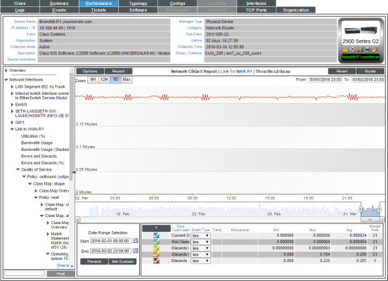
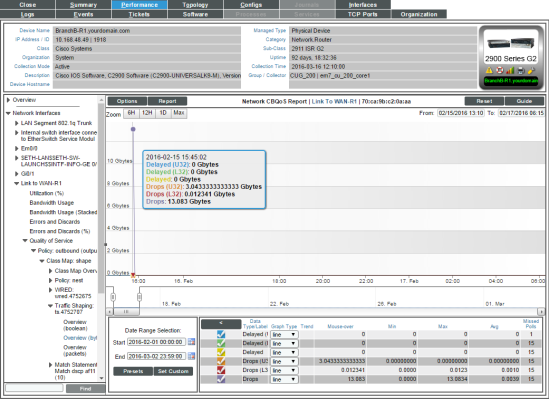
Class Map Overview
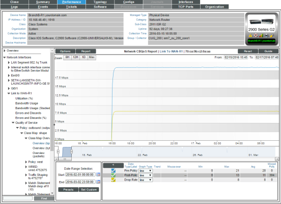
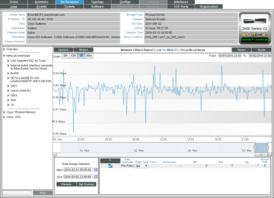
For the selected interface, the Class Map Overview Report displays trends for the following parameters:
- total interface utilization, in either % used (versus total available), bytes, bps, or packets, over time before applying the CBQoS policy
- total interface utilization, in either % used (versus total available), bytes, bps, or packets, over time after applying the CBQoS policy
- total dropped traffic, in either % used (versus total available), bytes, bps, or packets, over time for the class map
The graph displays a color-coded line for Pre-Policy, Post-Policy, and Dropped.
- The y-axis displays volume in either Mbytes, bps, or packets.
- The x-axis displays time. The increments vary, depending upon the selected data type (from the menu) and the date range (from the Date Range Selection pane).
- Mousing over any point in any line displays the Pre-Policy, Post-Policy, and Dropped value at that time point.
- You can use your mouse to scroll the report to the left and right.
Match Statements Overview
For the selected interface, the Match Statements Overview Report displays trends for the following parameters:
- total packets (in either bps, bytes, or packets) over time that match the U32 filter before the Match Statement is applied
- total packets (in either bps, bytes, or packets) over time that match the L32 filter before the Match Statement is applied
- total packets (in either bps, bytes, or packets) over time before the Match Statement is applied
The graph displays a color-coded line for Pre-Policy Inbound (U32), Pre-Policy Inbound (L32), and Pre-Policy Inbound.
- The y-axis displays volume in either Mbytes, bps, or packets.
- The x-axis displays time. The increments vary, depending upon the selected data type (from the menu) and the date range (from the Date Range Selection pane).
- Mousing over any point in any line displays the Conforming, Non-Conforming, and Violations values at that time-point.
- You can use your mouse to scroll the report to the left and right.
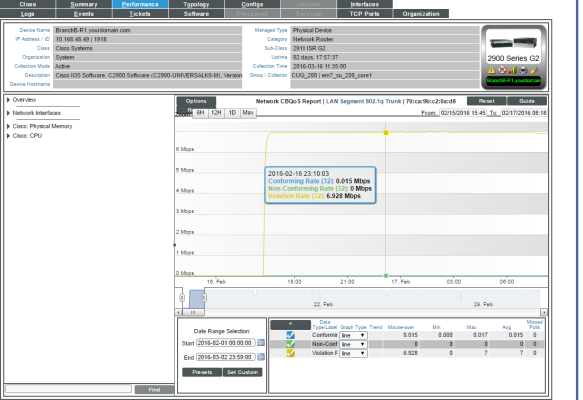
Policing Overview
For the selected interface, the Policing Overview Report displays trends for the following parameters:
- total traffic (in either bytes, bps, or packets) over time that conform to the policing policy
- total traffic (in either bytes, bps, or packets) over time that do not conform to the policing policy
- total traffic (in either bytes, bps, or packets) over time that violate the policing policy
The graph displays a color-coded line for Conforming, Non-Conforming, and Violations.
- The y-axis displays volume in either Mbytes, bps, or packets.
- The x-axis displays time. The increments vary, depending upon the selected data type (from the menu) and the date range (from the Date Range Selection pane).
- Mousing over any point in any line displays the Conforming, Non-Conforming, and Violations values at that time-point.
- You can use your mouse to scroll the report to the left and right.
Queueing Overview
For the selected interface, the Queuing Overview Report displays trends for the following parameters:
- total discarded traffic (in either bytes or bps) over time for the queuing policy
- queue depth (in either bytes or bps) over time for the queuing policy
NOTE: If a queue is marked as "priority" in CBQoS, the text Priority appears in parentheses next to the entry in the navbar.
The graph displays a line for total discarded traffic:
- The y-axis displays volume in either bytes or bps.
- The x-axis displays time. The increments vary, depending upon the selected data type (from the menu) and the date range (from the Date Range Selection pane).
- Mousing over any point in any line displays the number or discards at that time-point.
- You can use your mouse to scroll the report to the left and right.
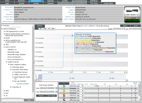
Set Overview
For the selected interface, the Set Overview Report displays trends for the following parameters:
- total traffic (in either bps, bytes, or packets) over time where the Discard Class field is marked by the Set policy
- total traffic (in either bps, bytes, or packets) over time where the DSCP field is marked by the Set policy
- total traffic (in either bps, bytes, or packets) over time where the DSCP Tunnel field is marked by the Set policy
- total traffic (in either bps, bytes, or packets) over time where the Frame Relay DE bit is marked by the Set policy
- total traffic (in either bps, bytes, or packets) over time where the Frame Relay FECN BECN bit is marked by the Set policy
- total traffic (in either bps, bytes, or packets) over time where the MPLS Experimental Implosion field is marked by the Set policy
- total traffic (in either bps, bytes, or packets) over time where the MPLS Experimental TopMost field is marked by the Set policy
- total traffic (in either bps, bytes, or packets) over time where the Precedence field is marked by the Set policy
- total traffic (in either bps, bytes, or packets) over time where the QoS Group field is marked by the Set policy
- total traffic (in either bps, bytes, or packets) over time where the SRP Priority field is marked by the Set policy
The graph displays a color-coded line for each of the metrics described above.
- The y-axis displays volume in either Mbytes, bps, or packets.
- The x-axis displays time. The increments vary, depending upon the selected data type (from the menu) and the date range (from the Date Range Selection pane).
- Mousing over any point in any line displays the values for each metric at that time-point.
- You can use your mouse to scroll the report to the left and right.
Traffic Shaping Overview
For the selected interface, the Traffic Shaping Overview Report for each traffic shaping policy includes two reports:
- Overview (boolean)
- Overview (in either byes or packets)
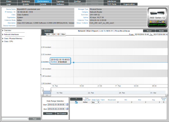
Overview (boolean)
For the selected interface, the Overview (boolean) report displays trends for the following parameters:
- Active. Specifies whether the traffic shaper is active over time for the traffic shaping policy. Possible values are "0" for "Not active" and "1" for "active". However, you might see values other than 1 or 0 in this report. If a report contains any other value, it is an average of multiple readings. For example, if during a five-minute interval, SL1 gathered five readings and during one of those readings, there was no traffic, so the traffic shaper was not active, the average would be 0.8 (1 + 1+ 1 + 1 + 0 = 4; 4/5 = 0.8).
The graph displays a color-coded line for each of the metrics (described previously):
- The y-axis displays volume in either Mbytes or packets.
- The x-axis displays time. The increments vary, depending upon the selected data type (from the menu) and the date range (from the Date Range Selection pane).
- Mousing over any point in any line displays a value for the metric described above at that time-point.
- You can use your mouse to scroll the report to the left and right.
Overview (in either bytes or packets)
For the selected interface, the Overview (bytes) and Overview (packets) reports display trends for the following parameters:
- Delayed packets (in either bytes or packets) over time that match the U32 filter for the traffic shaping policy
- Delayed packets (in either bytes or packets) over time that match the L32 filter for the traffic shaping policy
- Delayed packets (in either bytes or packets) over time for the traffic shaping policy
- Dropped packets (in either bytes or packets) over time that match the U32 filter for the traffic shaping policy
- Dropped packets (in either bytes or packets) over time that match the L32 filter for the traffic shaping policy
- Dropped packets (in either bytes or packets) over time for the traffic shaping policy
The graph displays a color-coded line for each of the metrics (described previously):
- The y-axis displays volume in either Mbytes or packets.
- The x-axis displays time. The increments vary, depending upon the selected data type (from the menu) and the date range (from the Date Range Selection pane).
- Mousing over any point in any line displays a value for each of the metrics described above at that time-point.
- You can use your mouse to scroll the report to the left and right.
WRED Overview
For the selected interface, the RED Overview report for each WRED policy includes two reports:
- Overview (in either bytes or packets)
- Overview (items)
Overview (in either bytes or packets)
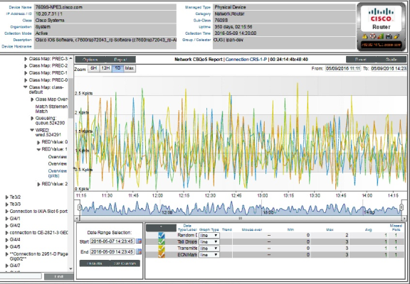
For the selected interface, the Overview (bytes) and Overview (packets) reports display trends for the following parameters:
- Random drops (in either bytes or packets) over time for the RED policy
- Random drops (in either bytes or packets) over time that match the U32 filter for the RED policy
- Random drops (in either bytes or packets) over time that match the L32 filter for the RED policy
- Tail drops (in either bytes or packets) over time for the RED policy
- Tail drops (in either bytes or packets) over time that match the U32 filter for the RED policy
- Tail drops (in either bytes or packets) over time that match the L32 filter for the RED policy
- Transmitted traffic (in either bytes or packets) over time that match the L32 filter for the RED policy
- Total packets (in either bytes or packets) over time where the ECN bit is marked by the RED policy
- Total packets (in either bytes or packets) over time that match the U32 filter and where the ECN bit is marked by the RED policy
The graph displays a color-coded line for each of the metrics described above:
- The y-axis displays volume in either Mbytes or packets.
- The x-axis displays time. The increments vary, depending upon the selected data type (from the menu) and the date range (from the Date Range Selection pane).
- Mousing over any point in any line displays a value for each of the metrics described above at that time-point.
- You can use your mouse to scroll the report to the left and right.
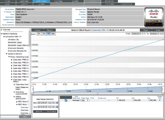
Overview (items)
For the selected interface, the Overview (items) report displays trends for the following parameters:
- Average Queue Size (in items) over time for each queue aligned with the RED policy.
The graph displays a color-coded line for each queue:
- The y-axis displays volume in items.
- The x-axis displays time. The increments vary, depending upon the selected data type (from the menu) and the date range (from the Date Range Selection pane).
- Mousing over any point in any line displays a value for average queue size at that time-point.
- You can use your mouse to scroll the report to the left and right.
Viewing Reports about DNS Servers and DNS Records for a Device
When you define a domain-name monitoring policy, SL1 automatically collects data associated with the policy. SL1 graphs that data in the Performance tab for the device associated with the policy.
There are two ways to navigate to the report for domain-name monitoring:
- From the Device Manager page (Devices > Device Manager):
- In the Device Manager page, find the device that is associated with the monitoring policy. Select the bar-graph icon (
 ) for the device.
 - In the Device Reports panel, select the Performance tab.
- In the left NavBar, expand Domain Name Monitors and select the policy for which you want to view the report.
Or:
- From the Domain Name Monitoring page (Registry > Monitors > Domain Name):
- In the Domain Name Monitoring page, find the domain-name policy for which you want to see a report.
- Select the bar graph icon in the Domain/Zone field(
 ).
).
- The Device Performance page appears, with the DNS Report displayed.
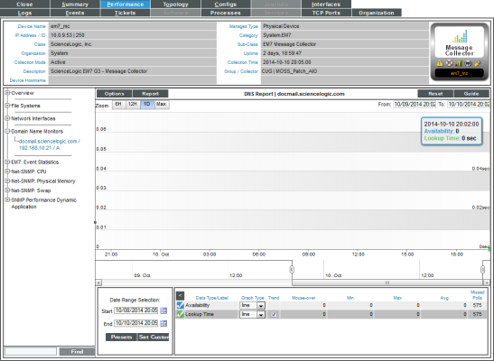
- The DNS Report displays multiple parameters in a single graph. The DNS Report trends the following parameters:
- Availability. Availability of the specified name server and of a specific record and specific content in that record. Availability is 100% for a poll if the name server responded, the lookup returned a record, and the result match specified in the policy did not generate an event. If availability is not 100% for a poll, availability is 0% for that poll.
- Lookup Time. The amount of time it took the DNS server to access the specified DNS record, search it, and return a result to SL1.
The graph displays a color-coded line for availability and for latency, for the selected duration.
- The y-axis displays availability, in percent to the left, and latency time, in milliseconds to the right.
- The x-axis displays time. The increments vary, depending upon the selected data type (from the menu) and the date range (from the Date Range Selection pane).
- Mousing over any point in any line displays the high, low, and average value at that time-point in the Data Table pane.
- You can use your mouse to scroll the report to the left and right.
- In a graph of normalized data, clicking on a data point zooms in on that time period and shows the non-normalized data.
Viewing Reports on an Email Round-Trip Monitoring Policy
When you define a policy to monitor Email round-trips, SL1 automatically collects data associated with the policy. SL1 graphs that data in the Performance tab for the device associated with the policy.
There are two ways to navigate to the report for Email round-trip monitoring:
- From the Device Manager page (Devices > Device Manager):
- In the Device Manager page, find the device that is associated with the monitoring policy. Select the bar graph icon (
 ) for the device.
 - In the Device Reports panel, select the Performance tab.
- In the NavBar, expand Email Round-Trip Monitors and select the policy for which you want to view the report.
Or:
- From the Email Round-Trip Monitoring page (Registry > Monitors > Email Round-Trip):
- In the Email Round-Trip Monitoring page, find the Email round-trip policy for which you want to see a report.
- Select its bar graph icon in the Policy Name field (
 ).
).
- The Device Performance page appears, with the Email Round-Trip Report displayed.
- The Email Round-Trip Report displays results from an Email round-trip policy. The report trends the following parameters:
- Availability. The availability of an Email server. Availability means whether SL1 received a reply Email from the Email server.
- Round-Trip Time. The amount of time it takes to send an Email message from SL1 to an external mail server and then back to SL1.
The graph displays the total time for the entire Email transaction from SL1 to the external server and back to SL1.
- The y-axis displays the speed of the entire Email transaction from SL1 to the external server and back to SL1, in seconds.
- The x-axis displays time. The increments vary, depending upon the selected data type (from the menu) and the date range (from the Date Range Selection pane).
- Mousing over any point in any line displays the high, low, and average value at that time-point in the Data Table pane.
- You can use your mouse to scroll the report to the left and right.
- In a graph of normalized data, clicking on a data point zooms in on that time period and shows the non-normalized data.
Viewing Reports on a SOAP or XML Transaction Policy
The Data Transaction Reports page display results from a SOAP/XML transaction policy. Each of these policies monitors a server-to-server transaction that uses HTTP and can post files or forms (for example, SOAP/XML or Email). SL1 sends a request and some data and then examines the result of the transaction and compares it to a specified expression match.
There are two ways to navigate to the reports for SOAP/XML Transactions policies:
- From the Device Manager page (Devices > Device Manager):
- In the Device Manager page, find the device that is associated with the monitoring policy. Select the bar graph icon (
 ) for the device.
 - In the Device Reports panel, select the Performance tab.
- In the NavBar, expand SOAP/XML Transaction Monitors and select the policy for which you want to view the report.
Or:
- From the SOAP/XML Transaction Monitoring page (Registry > Monitors > SOAP-XML Transactions):
- In the SOAP/XML Transaction Monitoring page, find the SOAP/XML transaction policy for which you want to see a report.
- Select its bar graph icon in the Policy Name field(
 ).
).
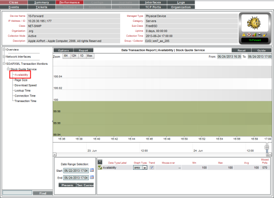
- The Device Performance page appears, with the Data Transaction Report | Availability report displayed.
- The Data Transaction Report | Availability report displays results from a SOAP/XML Transaction policy. The report trends the parameters described below. The Data Transaction Report | Availability report displays the availability of the external server and the availability of the specified data.
- The y-axis displays availability, in percent to the left.
- The x-axis displays time. The increments vary, depending upon the selected data type (from the menu) and the date range (from the Date Range Selection pane).
- Mousing over any point in any line displays the high, low, and average value at that time-point in the Data Table pane.
- You can use your mouse to scroll the report to the left and right.
- In a graph of normalized data, clicking on a data point zooms in on that time period and shows the non-normalized data.
- For each SOAP/XML Transaction policy, you can also view the following additional reports. To view them, select the appropriate entries in the NavBar:
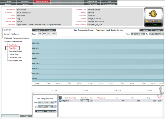
- Page Size. The Data Transaction Report | Page Size report displays information about the size of the page specified in the URL of the policy. The graph displays the page size of the specified URL for the selected duration.
- The y-axis displays size in kilobytes per second (Kb).
- The x-axis displays time. The increments vary, depending upon the selected data type (from the menu) and the date range (from the Date Range Selection pane).
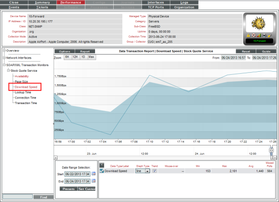
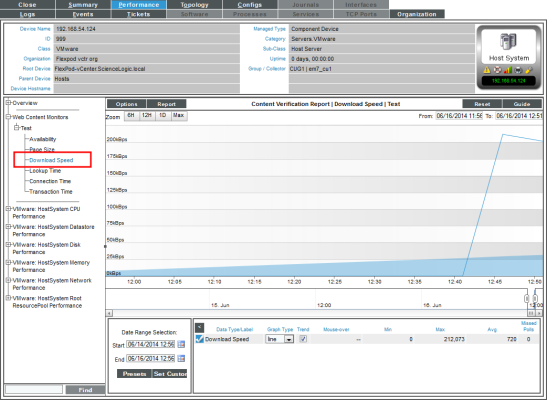
- Download Speed. The Data Transaction Report | Download Speed report displays the speed at which data was downloaded from the server (specified in the server policy) to SL1. The graph displays the speed at which data was downloaded from the specified server to SL1 for the selected duration.
- The y-axis displays the speed at which data was downloaded from the server to SL1, in (bits per second) Bps.
- The x-axis displays time. The increments vary, depending upon the selected data type (from the menu) and the date range (from the Date Range Selection pane).
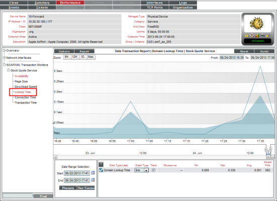
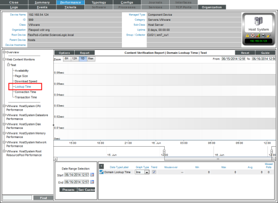
- Lookup Time. The Data Transaction Report | Domain Lookup Time report displays the speed at which your DNS system was able to resolve the name of the server in the server policy. The graph displays the speed at which your DNS system was able to resolve the name of the server in the policy for the specified duration.
- The y-axis displays the speed at which your DNS system was able to resolve the name of the server, in seconds.
- The x-axis displays time. The increments vary, depending upon the selected data type (from the menu) and the date range (from the Date Range Selection pane).
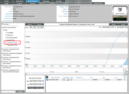
- Connection Time. The Data Transaction Report | Connection Time report displays the time it takes for SL1 to establish communication with the external server. In other words, the time it takes from the beginning of the HTTP request to the TCP/IP connection. The graph displays the speed at which SL1 was able to make a TCP/IP connection to the external server in the policy for the specified duration.
- The y-axis displays the speed at which SL1 was able to make a TCP/IP connection to the external server, in seconds.
- The y-axis displays the speed at which SL1 was able to make a TCP/IP connection to the external server, in seconds.
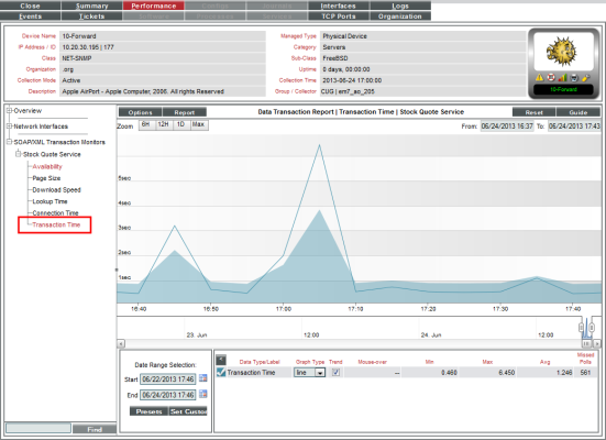
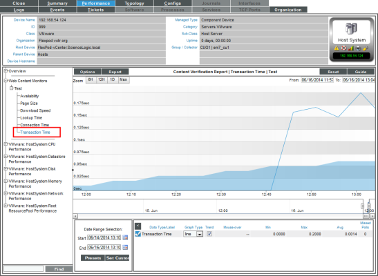
- Transaction Time. The Data Transaction Report | Transaction Time report displays the total time it took to make a connection to the external server, send the HTTP request, wait for the server to parse the request, receive the requested data from the server, and close the connection.The graph displays the total time for the entire transaction from SL1 to the external server and back to SL1 for the specified duration.
- The y-axis displays the speed of the entire transaction from SL1 to the external server and back to SL1, in seconds.
- The x-axis displays the speed of the entire transaction from SL1 to the external server and back to SL1, in seconds.
Viewing Availability Reports for a Single System Process on a Device
When you define a process monitoring policy, SL1 automatically collects data associated with the policy. SL1 graphs that data in the Performance tab for the device associated with the policy.
If the SL1 agent is installed on a device, data collected by the agent is used by default for process monitoring policies on that device. For more information about monitoring processes with the agent, see the
For policies that monitor system processes, SL1 generates one or more of the following reports:
- The Process Report displays the availability of a single monitored process on the device and also displays the number of instances of that process running on the device.
- The Process Availability Composite Report displays the availability of all monitored processes on the device.
Availability means the process is running.
During polling, a process has two possible availability values:
- 100%. Process is up and running.
- 0%. Process is not up and running.
However, you might see values other than 100 or 0 in an availability report. If a report contains any other percentage, it is an average of multiple readings. For example, if SL1 gathered five readings and during one of those readings, a process was unavailable, the average would be 80% (100 + 100 + 100 + 100 + 0 = 400; 400/5 = 80).
There are two ways to navigate to the reports for process monitoring:
- From the Device Manager page (Devices > Device Manager):
- In the Device Manager page, find the device that is associated with the monitoring policy. Select the bar graph icon (
 ) for the device.
 - In the Device Reports panel, select the Performance tab.
- In the NavBar, expand System Process Monitors and select the policy for which you want to view the report.
Or:
- From the System Process Monitoring page (Registry > Monitors > System Processes):
- In the System Process Monitoring page, find the system process policy for which you want to see a report.
- Select its bar graph icon in the Process Name field(
 ).
).
- The Device Performance page appears, with the Process Report displayed.
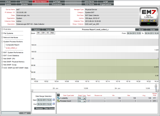
- The Process Report displays a color-coded line for the availability of the monitored process over time and another color-coded line that represents the number of instances of the process running on the device.
- The y-axis displays the availability of the process, in percent to the left and the number of processes to the right.
- The x-axis displays time. The increments vary, depending upon the selected data type (from the menu) and the date range (from the Date Range Selection pane).
- If you have defined monitoring polices for multiple processes on a single device, you can also view the Process Availability Composite Report.
- The Process Availability Composite Report displays the availability of all monitored processes on the device.
- The graph displays the availability of each monitored process. Each monitored process is represented with a color-coded line.
- The y-axis displays the availability of the process, in percent.
- The x-axis displays time. The increments vary, depending upon the selected data type (from the menu) and the date range (from the Date Range Selection pane).
Viewing Port Availability Reports for a Single Device
When you define a policy to monitor port availability, SL1 automatically collects data associated with the policy. SL1 graphs that data in the Performance tab for the device associated with the policy.
If the SL1 agent is installed on a device, data collected by the agent is used by default for policies that monitor port availability on that device.
The Port Availability Report displays the availability of a monitored port.
Availability means the port's ability to accept connections and data from the network. During polling, a port has two possible availability values:
- 100%. Port is up and running.
- 0%. Port is not accepting connections and data from the network.
However, you might see values other than 100 or 0 in an availability report. If a report contains any other percentage, it is an average of multiple readings. For example, if SL1 gathered five readings and during one of those readings, a port was unavailable, the average would be 80% (100 + 100 + 100 + 100 + 0 = 400; 400/5 = 80).
There are two ways to navigate to the reports for process monitoring:
- From the Device Manager page (Devices > Device Manager):
- In the Device Manager page, find the device that is associated with the monitoring policy. Click the bar graph icon (
 ) for the device.
 - In the Device Reports panel, click the Performance tab.
- In the NavBar, expand TCP/IP Port Monitors and select the policy for which you want to view the report.
Or:
- From the TCP/IP Port Monitoring page (Registry > Monitors > TCP-IP Ports):
- In the TCP/IP Port Monitoring page, find the port policy for which you want to see a report.
- Click its bar graph icon (
 ) in the Port Number field.
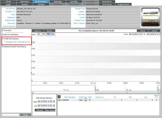
- The Device Performance page appears, with the Port Availability Report displayed:
- The Port Availability Report displays the availability of a single monitored port over time.
- The y-axis displays the availability of the port, in percent.
- The x-axis displays time. The increments vary, depending upon the selected data type (from the menu) and the date range (from the Date Range Selection pane).
Viewing Reports for a Web Content Policy
The Content Verification Reports display results from a Web Content policy. These reports display availability and other statistics about the website and its content.
Availability means whether or not the specified content was found on the website. During polling, a webserver has two possible availability values:
- 100%. Content was found.
- 0%. Content was not found.
However, you might see values other than 100 or 0 in the report. If a report contains any other percentage, it is an average of multiple readings. For example, if SL1 gathered five readings and during one of those readings, the specified content was not found, the average would be 80% (100 + 100 + 100 + 100 + 0 = 400; 400/5 = 80).
There are two ways to navigate to the reports for a web content policy:
- From the Device Manager page Devices > Device Manager):
- In the Device Manager page, find the device that is associated with the monitoring policy. Select the bar graph icon (
 ) for the device.
 - In the Device Reports panel, select the Performance tab.
- In the NavBar, expand Web Content Monitors and select the policy for which you want to view the report.
Or:
- From the Web Content Monitoring page (Registry > Monitors > Web Content):
- In the Web Content Monitoring page, find the policy for which you want to see a report.
- Select its bar graph icon in the Policy Name field (
 ).
).
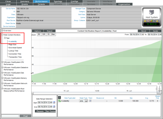
- The Device Performance page appears, with the Content Verification Report | Availability report displayed.
- The Content Verification Report | Availability report displays the availability of the specified content on the specified web-server for the selected duration.
- The y-axis displays availability, in percent to the left.
- The x-axis displays time. The increments vary, depending upon the selected data type (from the menu) and the date range (from the Date Range Selection pane).
- For each Web Content policy, you can also view the following additional reports. To view them select the entries in the NavBar:
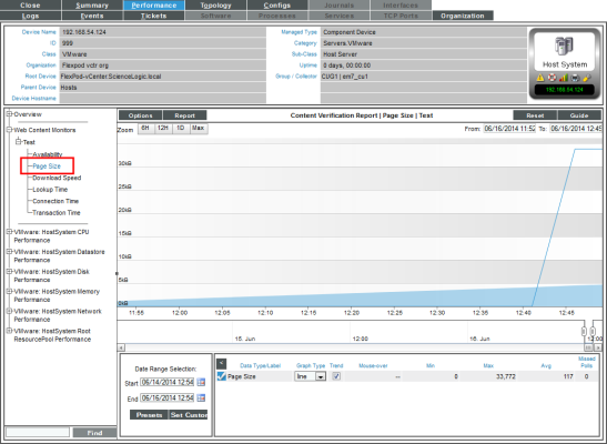
- Page Size. The Content Verification Report | Page Size report displays information about the size of the page specified in the URL of the policy. The graph displays the page size of the specified URL for the selected duration.
- The y-axis displays size in kilobytes (Kb).
- The x-axis displays time. The increments vary, depending upon the selected data type (from the menu) and the date range (from the Date Range Selection pane).
- Download Speed. The Content Verification Report | Download Speed report displays the speed at which data was downloaded from the website (specified in the policy) to SL1. The graph displays the speed at which data was downloaded from the specified website to SL1 for the selected duration.
- The y-axis displays the speed at which data was downloaded from the website to SL1, in bits per second (Bps).
- The x-axis displays time. The increments vary, depending upon the selected data type (from the menu) and the date range (from the Date Range Selection pane).
- Lookup Time. The Content Verification Report | Domain Lookup Time report displays the speed at which your DNS system was able to resolve the name of the website specified in the policy. The graph displays the speed at which your DNS system was able to resolve the name of the website for the specified duration.
- The y-axis displays the speed at which your DNS system was able to resolve the name of the website, in seconds.
- The x-axis displays time. The increments vary, depending upon the selected data type (from the menu) and the date range (from the Date Range Selection pane).
- Connection Time. The Content Verification Report | Connection Time report displays the time it takes for SL1 to establish communication with the external website. In other words, the time it takes from the beginning of the HTTP request to the TCP/IP connection. The graph displays the speed at which SL1 was able to make a TCP/IP connection to the external website for the specified duration.
- The y-axis displays the speed at which SL1 was able to make a TCP/IP connection to the external website, in seconds.
- The x-axis displays time. The increments vary, depending upon the selected data type (from the menu) and the date range (from the Date Range Selection pane).
- Transaction Time. The Content Verification Report | Transaction Time report displays the total time it took to make a connection to the external website, send the HTTP request, wait for the website to parse the request, receive the requested data from the website, and close the connection. The graph displays the total time for the entire transaction from SL1 to the external website and back to SL1 for the specified duration.
- The y-axis displays the speed of the entire transaction from SL1 to the external website and back to SL1, in seconds.
- The x-axis displays time. The increments vary, depending upon the selected data type (from the menu) and the date range (from the Date Range Selection pane).
Viewing Availability Reports for a Single Windows Service on a Device
When you define a Windows service -monitoring policy, SL1 automatically collects data associated with the policy. SL1 graphs that data in the Performance tab for the device associated with the policy.
For policies that monitor Windows service, SL1 generates the following report:
- The Service Report displays the availability of a single monitored Windows Service on the device
During polling, a service has two possible availability values:
- 100%. Service is up and running.
- 0%. Service is not up and running
However, you might see values other than 100 or 0 in an availability report. If a report contains any other percentage, it is an average of multiple readings. For example, if SL1 gathered five readings and during one of those readings, a service was unavailable, the average would be 80% (100 + 100 + 100 + 100 + 0 = 400; 400/5 = 80).
There are two ways to navigate to the reports for Windows Service monitoring:
- From the Device Manager page (Devices > Device Manager):
- In the Device Manager page, find the device that is associated with the monitoring policy. Select the bar graph icon (
 ) for the device.
 - In the Device Reports panel, select the Performance tab.
- In the NavBar, expand Windows Service Monitors and select the policy for which you want to view the report.
Or:
- From the Windows Service Monitoring page (Registry > Monitors > Windows Services):
- In the Windows Service Monitoring page, find the policy for which you want to see a report.
- Select its bar graph icon in the Windows Service name field(
 ).
).
- The Device Performance page appears, with the Service Report displayed.
- The Service Report displays a color-coded line for the availability of the monitored Windows service over time.
- The y-axis displays the availability of the service in percent to the left.
- The x-axis displays time. The increments vary, depending upon the selected data type (from the menu) and the date range (from the Date Range Selection pane).
