![]()
This
You can view default dashboards on the Dashboards page, which you can access by clicking the Dashboards icon (![]() ).
).
You can also view default dashboards for the classic Skylar One user interface on the Classic Dashboards page (Dashboards > Classic Dashboards, or the Dashboards tab in the classic user interface).
For more information, see the Classic Dashboards manual.
Use the following menu options to navigate the Skylar One user interface:
- To view a pop-out list of menu options, click the menu icon (
 ).
). - To view a page containing all of the menu options, click the Advanced menu icon (
 ).
).
Default Dashboards
This section describes the default dashboards that are available on the Dashboards page.
Home Dashboard
The Home dashboard displays graphical reports of recent events, devices, and services.
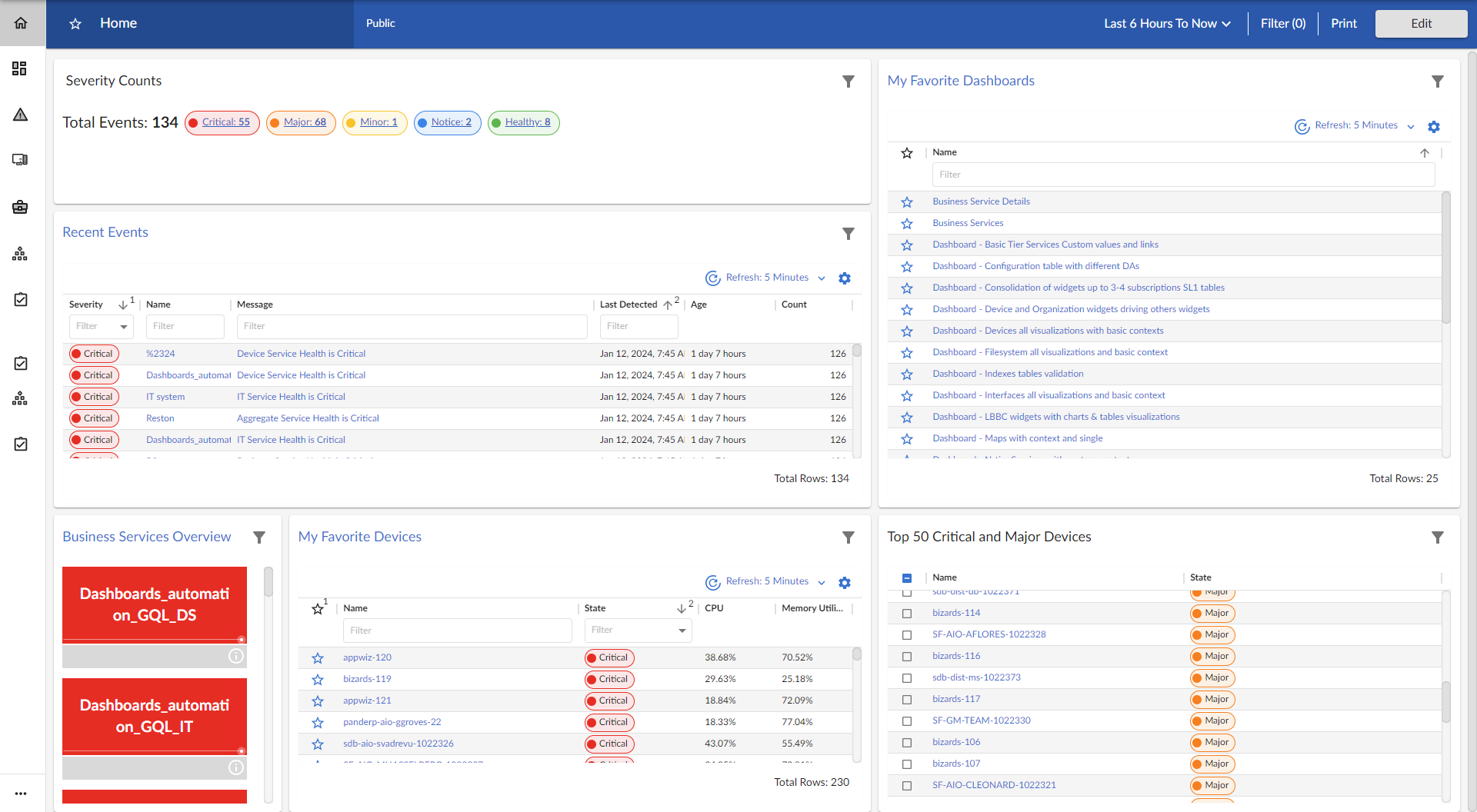
This dashboard includes the following widgets:
The widget types that are available are based on your system configuration.
- Devices. Displays data based on devices and Dynamic Applications.
- Device Components. Displays data about entities that run under the control of another device (in a parent-child relationship).
- File Systems. Displays data about disk-space used, in percent, for devices.
- Interfaces. Displays data about network interfaces.
- Skylar Automated RCA. Displays suggestions about potential system issues; you can click a suggestion to connect to the Skylar Automated RCA user interface for details.
- Services. Displays data about business services and the Health, Availability, and Risk data for those services.
- Dashboards. Displays a list of all available dashboards. This widget displays the same information as the Dashboards page.
- Events. Displays data about the events that exist for devices.
- Maps. Displays a map.
- Organizations. Displays data about organizations used to manage elements and user accounts in Skylar One.
- Agent Polled Data. Displays polled data about an agent. Requires the Skylar One Agent.
- Agent Processes. Displays data about agent processes. Requires the Skylar One Agent.
- Agent Logs. Displays agent log data. Requires the Skylar One Agent.
For more information about Dashboards, see
NOC Overview Dashboard
The NOC Overview dashboard displays a high-level overview of your Business Services and their current health statuses in a single-pane view:

This dashboard displays a series of color-coded tiles for each of your Business Services. The dashboard is updated in real time to reflect the most recent information about each service.
The dashboard displays services based on their health and availability status, ranging from "critical" displaying with a red background at the top of the dashboard to "healthy" displaying with a green background at the bottom. Services that become unavailable also display with a red background, similar to those with a "critical" health status. This color-coordinated hierarchy enables you to quickly see which services most require your attention.
Each tile includes the following information:
- The service's name and icon, if applicable
- A background color indicating the service's current health status
- A line chart indicating the service's health over the selected time period
Click a service tile to go to the Service Investigator page for that service, where you can view more information about the service and its health.
For more information about Business Services, see
Business Services Dashboard
The Business Services dashboard displays Availability, Health, and Risk data for all of your Business Services:

This dashboard includes the following widgets:
- Business Services. Displays a list of business services and their health, availability, and risk. Clicking the link icon (
 ) next to a service opens a Business Service Details dashboard for that service.
 - Business Service Details. Displays the health, availability, and risk in a line chart for the service you selected the Business Services widget.
Business Service Details Dashboard
The Business Service Details dashboard provides an overview of the services that belong to a specific business service:

This dashboard includes the following widgets:
- Service View. Displays health, availability, and risk icons for that service.
- Health Line Chart. Displays a line chart of the service's health, availability, and risk.
- Service Table. Display a table of services with a description, health, availability, and risk. Clicking the link icon () next to a service opens a Details dashboard for that service.
- Health Line Chart. Selecting a service from the IT Services widget will display a line chart of health, availability, and risk for that service.
IT Services
The IT Services dashboard displays Availability, Health, and Risk data for all of your IT Services:

This dashboard includes the following widgets:
- IT Services. Displays a list of IT services and their health, availability, and risk. Clicking the link icon () next to a service opens an IT Service Details dashboard for that service.
- IT Service Details. Displays the health, availability, and risk in a line chart for the service you selected the IT Services widget.
IT Service Details Dashboard
The IT Services dashboard provides an overview of the device services that belong to a specific IT service:

This dashboard includes the following widgets:
- Service View. Displays health, availability, and risk icons for that service.
- Health Line Chart. Displays a line chart of the service's health, availability, and risk in a line chart.
- Service Table. Displays a tile view of device services.
- Health Line Chart. Selecting a service from the Device Services widget will display a line chart of health, availability, and risk for that service.
Device Services Dashboard
The Device Services dashboard displays Availability, Health, and Risk data for all of your Business Services:

This dashboard includes the following widgets:
- Device Services. Displays a list of device services and their health, availability, and risk. Clicking the link icon () next to a service opens a Device Service Details dashboard for that service.
- Device Service Details. Displays the health, availability, and risk in a line chart for the service you selected the Device Services widget.
Device Service Details Dashboard
The Device Service Details dashboard provides an overview of the devices that belong to a specific device service:

This dashboard includes the following widgets:
- Service View. Displays health, availability, and risk icons for that service.
- Health Line Chart. Displays a line chart of the service's health, availability, and risk.
- Devices. Displays a table of devices with their state and CPU usage.
- CPU Line Chart. Selecting a device from the devices table will populate this line chart with that device's CPU and memory utilization percentage.
Server Dashboard
The Server Dashboard displays CPU usage, memory usage, disk usage, and other widgets related to servers:

This dashboard includes the following widgets:
- Server Leaderboard. Displays a table of servers and their status, average swap, average memory, and average CPU usage.
- CPU Usage. Displays the total amount of CPU currently being used, as a percentage of all available CPU.
- Memory Usage. Displays total memory usage over time, in percent.
- Disk Usage. Displays total disk usage over time, in percent.
- Swap. Displays the total amount of swap space currently being used, as a percentage of all available swap.
- Total Network Traffic. Displays the total traffic for all inbound and outbound interfaces for each selected server, in Megabytes.
- Latency. Displays latency for the device in milliseconds. Latency means the amount of time it takes Skylar One to communicate with the device.
- Availability. Availability means the device's ability to accept connections and data from the network. The possible values are "Available" and "Unavailable".