This  ).
).
You can also access additional dashboards created in the classic Skylar One (formerly SL1) user interface on the Classic Dashboards page (Dashboards > Classic Dashboards, or the Dashboards tab in the classic user interface).
For more information, see the Classic Dashboards manual.
Use the following menu options to navigate the Skylar One user interface:
- To view a pop-out list of menu options, click the menu icon (
 ).
). - To view a page containing all of the menu options, click the Advanced menu icon (
 ).
).
Creating a Dashboard
Skylar One includes several system default dashboards, but you can also create your own dashboards that are completely customized to your specific data visualization needs.
When you create a dashboard, you are defining a container that will display widgets. Each widget in a dashboard displays a report about data in Skylar One.
You must define a name for the dashboard, specify the space for one or more widgets, and determine the settings for those widgets.
To create a new dashboard in Skylar One:
- On the Dashboards page (), click the button. An empty dashboard page appears.
- Click the Name field at the top left corner of the page and type a name for the new dashboard. By default, the Name field displays your username and "Dashboard," such as "Jane Smith's Dashboard". Click the pencil icon (
 ) to save the name.
 - Create one or more widgets for your dashboard.
- Determine the dashboard's visibility settings.
- Click in the top right corner of the page.
Creating Dashboard Widgets
A dashboard is a container for one or more widgets that display reports about data in Skylar One. You can create widgets that are customized to display the exact data that you want to appear in your dashboard.
To create a dashboard widget:
- On the Dashboards page, click the button to create a new dashboard or click the name of an existing dashboard that you want to edit.
- If you are creating a new dashboard, click the button. If you are editing an existing dashboard, click the button and then click the button. The Create Widget page appears.
-
Select a widget type by clicking the relevant box. Your options include:
The widget types that are available are based on your system configuration.
-
Devices. Displays data based on devices and Dynamic Applications.
-
Device Components. Displays data about entities that run under the control of another device (in a parent-child relationship).
Because of the way data and relationships are used and presented in Device Component widgets, ScienceLogic recommends the following best practices when creating a Device Component widget:
- Using a Table visualization
- Selecting the Filter data specifically in this widget option and Filtering by parent device so that the widget returns the root level of the Device Component Map tree, based on the root level's Device Class
- Enabling the widget to drive a context of Type "Device Component" for other widgets
- Creating additional Device widgets that subscribe to that Device Component context, using additional filtering options as necessary to ensure the correct devices display in the widget
-
Device Groups. Displays data about your device groups in a table format. The table contains the following columns:
- Name. The name of the device group.
- Severity. The average health value of the devices in the device group. This field is represented by a color-coded severity icon that corresponds to a numerical value between 0 and 100.
- Device Count. The number of devices in the device group.
You can sort the table by Name and Severity, but you will not be able to sort the table by Device Count until a future AP2 release.
-
File Systems. Displays data about disk-space used, in percent, for devices.
-
Interfaces. Displays data about network interfaces.
-
Skylar Automated RCA. Displays suggestions about potential system issues; you can click a suggestion to connect to the Skylar Automated RCA user interface for details.
-
Services. Displays data about business services and the Health, Availability, and Risk data for those services.
This widget supports continuous scrolling, allowing you to view more entries than the previously limited display of 50 services in a single table. Additionally, you can sort and filter the data in this widget's table, as well as add or remove various properties such as service properties, organization properties, and service metrics. This table includes many of the same capabilities and features as other tables in Skylar One.
-
Dashboards. Displays a list of all available dashboards. This widget displays the same information as the Dashboards page.
-
Events. Displays data about the events that exist for devices.
-
Maps. Displays a map.
-
Organizations. Displays data about organizations used to manage elements and user accounts in Skylar One.
Organization widgets must use a Table visualization and are used to drive context to Device, Service, Event, File System, and Interface widgets.
-
Custom. Displays a user-interface-only visualization and renders any rich content or HTML that you input. The HTML Widget visualization option for this widget allows HTML content to be edited directly from a text editor.
Custom widgets that are using the HTML Widget visualization, can render any rich content or HTML that you input. To do so, click the tab, which subsequently opens the code view by default.
-
Agent Polled Data. Displays polled data about an agent. Requires the Skylar One Agent.
-
Agent Processes. Displays data about agent processes. Requires the Skylar One Agent.
-
Agent Logs. Displays agent log data. Requires the Skylar One Agent.
Agent widget type options appear only if you are using the Skylar One agent.
After you select the widget type, a new Create Widget page appears:

- Complete the fields on the page to customize the widget. For more information about each of the ways you can customize a widget, see the following sections:
- Selecting How the Widget Displays Data
- Adding Metrics and Properties to a Widget
- Specifying Which Items Will Appear in a Widget
As you make updates to the widget, your selections will be reflected in the Preview pane on the right side of the page.
- When you are finished customizing the widget, click the button to save the new widget. If this button is grayed out, review the settings on the page for errors or missing information in required fields.
- On the dashboard page, click .
- To add additional widgets to the dashboard, click the button under the main tab bar and repeat this procedure for each new widget.
NOTE: You can change a widget's title by clicking it while in edit mode. Alternatively, you can click the button ( ) on that widget to open the Edit Widget page, where you can configure which metrics and properties to display and how the data is displayed.
Selecting How the Widget Displays Data
On the Create Widget page, click the Select Visualization drop-down list to select how you want the widget to display data.
The visualization options that you can select vary by widget type; not all options appear for all widget types. If only one visualization option is available for the selected widget type, then that visualization option will be selected automatically.
Some widgets (such as leaderboard widgets) drive the data or "context" for other widgets in the dashboard, while other widgets receive the data or "context" from that driving widget. When a widget drives context for other widgets, that means you can select one or more items in the driving widget and it will determine the data that appears in the receiving widgets by displaying data only for the items selected. For more information, see the section on Specifying Which Items Appear in a Widget.
The available visualization options are discussed in the following sections:
- Bar Chart
- Configuration Table
- Forecast
- Gauge
- HTML Widget
- Leaderboard
- Leaderboard Bar Chart
- Leaderboard Tile
- Line Chart
- Map
- Number
- Pie Chart
- Root Cause Timeline
- Service View
- Services Overview
- Severity Counts
- Sunburst
- Table
- Tile
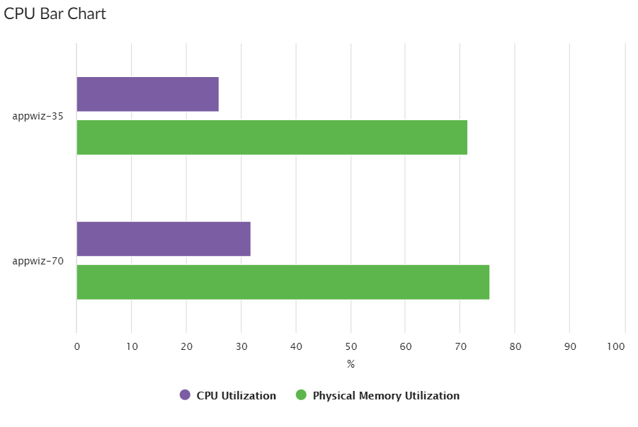
Bar Chart Visualizations
Bar Chart visualizations display one or more metrics as a colored vertical or horizontal bar or bars. The displayed values are the metric's latest collected value. Selecting a single item can drive data or "context" to other widgets:
If you select Bar Chart, complete the following fields:
- Title. Enter a title for the widget.
- Title links to another page. Use this toggle to transform the widget title to a link that redirects you to another page. Select either Dashboard or Advanced URL from the Link Type drop-down option that appears.
If you select Dashboard, use the Choose Dashboard link to open the Choose a Dashboard modal, select from the list of dashboards that appear in the modal, and then click .
If you select Advanced URL, enter the URL you want to link in the Link URL field that appears.
- Display Horizontal Bars. Select this toggle to display bars horizontally.
- Automatically manage chart features based on widget size. Select this toggle if you want the widget to dynamically hide the chart's features (labels and legends) when the size of the widget is adjusted. For more information, see the Resizing and Moving Widgets on a Dashboard section.
- Stack Options. Specify how you want to display data in a bar chart. Your options include no-stack (show each value as its own bar), normal (show all values in one bar), and percent.
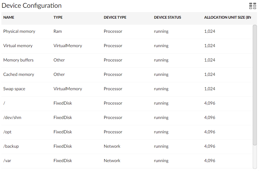
Configuration Table Visualizations
Configuration Table visualizations display configuration Dynamic Application data for a single device in a boxed set of rows and columns. A configuration table widget receives data or "context" from other widgets:
If you select Configuration Table, complete the following fields:
- Title. Enter a title for the widget.
- Title links to another page. Use this toggle to transform the widget title to a link that redirects you to another page. Select either Dashboard or Advanced URL from the Link Type drop-down option that appears.
If you select Dashboard, use the Choose Dashboard link to open the Choose a Dashboard modal, select from the list of dashboards that appear in the modal, and then click .
If you select Advanced URL, enter the URL you want to link in the Link URL field that appears.
- Automatically adjust row height based on widget height. Select this toggle if you want the widget to dynamically adjust the height of the rows in the table when the size of the widget is adjusted.
- Select Row Height. Select the relative height of the rows in the table. Choices are Small, Medium, or Large. This field appears only if the toggle is not selected in the Automatically adjust row height based on widget height field.
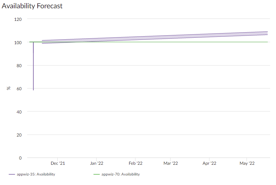
Forecast Visualizations
Forecast visualizations display projected forecast data for a specific object and collection metric using historical data and selected regression methods:
If you select Forecast, complete the following fields:
- Title. Enter a title for the widget.
- Title links to another page. Use this toggle to transform the widget title to a link that redirects you to another page. Select either Dashboard or Advanced URL from the Link Type drop-down option that appears.
If you select Dashboard, use the Choose Dashboard link to open the Choose a Dashboard modal, select from the list of dashboards that appear in the modal, and then click .
If you select Advanced URL, enter the URL you want to link in the Link URL field that appears.
- Automatically manage chart features based on widget size. Select this toggle if you want the widget to dynamically hide the chart's features (labels and legends) when the size of the widget is adjusted. For more information, see the Resizing and Moving Widgets on a Dashboard section.
- Automatically scale y-axis. Select this toggle to have the y-axis of a line chart automatically scale to fit the data. Toggling this off allows you to set a Maximum and Minimum value for the y-axis.
- Step line. Select this toggle to display the line chart in which the points are connected by horizontal and vertical line segments.
- Threshold Line. Specify a number that represents the threshold for a line chart.
- Regression List. Select the regression method or methods you want Skylar One to try when calculating the forecast data in a forecast widget. You can select multiple types of regression, and Skylar One will run all the regressions you selected and display the best two types of regression. ScienceLogic recommends that you select at least three regression methods to produce the most likely forecast. Skylar One will then determine which regression method(s) of those you have chosen will best model the forecast data. Options include:
- Average Regression. The forecast for future values is equal to the average of the historical data.
- Drift Regression. The forecast for future values increases or decreases based on the average change observed in historical data over time.
- Exponential Least Squares Regression. The forecast for future values is an exponential curve determined by the best fit between a set of data points.
- Least Squares Regression. The forecast for future values is a straight line determined by finding the best fit between a set of data points.
- Logarithmic Least Squares Regression. The forecast for future values is a logarithmic curve determined by the best fit between a set of data points.
- Naive Regression. The forecast for future values is the same as the last collected value.
- Null Regression. The forecast for future values is generated using random samples of collected data where some elements are constant.
- Seasonal Drift Regression. The forecast for future values increases or decreases based on the average change in historical data from the same season of the year (for example, same month of the previous year).
- Seasonal Weighted Regression. The forecast for future values is determined by finding the best fit between a set of data points, which have all been weighted to increase or decrease their influence, and adjusting based on historical data collected from the same season of the year (for example, same month of the previous year).
- Seasonal Naive Regression. The forecast for future values is the same as the last collected value from the same season of the year (for example, same month of the previous year).
- Minimize Skew Kurtosis. Select this toggle button to enable transformation of the source data into a normal distribution by compensating for skewness (lack of symmetry in the data set distribution) and kurtosis (heaviness or lightness of data outliers relative to a normal distribution) in the data, which makes the data easier to read. For example, you might select this toggle if you want to normalize the distribution of a data set that is asymmetrical or has a very high or low number of outliers.
- Source Window. Specify the number of days from which the widget will gather data for the forecast. The default is 60 days.
- Forecast Window. Specify the number of days of forecast data that you want the widget to display. The default is 180 days.
Gauge Visualizations
Gauge visualizations display a value for a single performance metric, using a gauge that looks like a speedometer. You can also select a "solid" gauge, which displays the metric value as a colored section of a half circle:
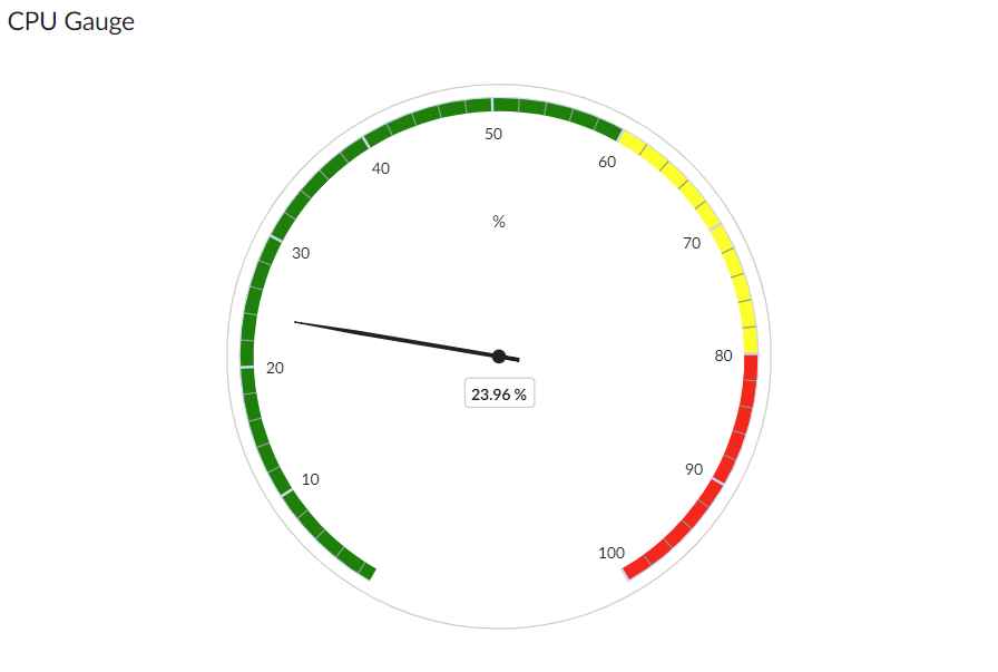
If you change the order of the Warning and Critical Thresholds, you can invert the gauge colors so that as numbers increase on the gauge, the numbers correspond with red/yellow/green instead of green/yellow/red.
NOTE: If you create a gauge widget and you select more than one item on the widget driving data or "context" to that widget, the gauge widget displays data for only the first item you selected in the driving widget.
If you select Gauge, complete the following fields:
- Title. Enter a title for the widget.
- Title links to another page. Use this toggle to transform the widget title to a link that redirects you to another page. Select either Dashboard or Advanced URL from the Link Type drop-down option that appears.
If you select Dashboard, use the Choose Dashboard link to open the Choose a Dashboard modal, select from the list of dashboards that appear in the modal, and then click .
If you select Advanced URL, enter the URL you want to link in the Link URL field that appears.
- Minimum Range. Specify the upper limit of a gauge. The default is 0.
- Maximum Range. Specify the upper limit of a gauge. The default is 100.
- Automatically manage chart features based on widget size. Select this toggle if you want the widget to dynamically hide the chart's features (labels and legends) when the size of the widget is adjusted. For more information, see the Resizing and Moving Widgets on a Dashboard section.
- Show as solid gauge. Select this toggle to display the gauge as a solid bar.
- Show plot bands. Select this toggle to show the plot bands on a gauge.
- Show unit. Select this toggle to display the current value on a gauge).
- Warning Threshold. Specify where you want the yellow warning portion of a gauge to start. The default is 60.
- Critical Threshold. Specify where you want the red critical portion of a gauge to start. The default is 80.
HTML Widget Visualizations
HTML Widget visualizations display a user-interface-only visualization and can render any rich content or HTML that you input. The HTML Widget visualization option for this widget allows HTML content to be edited directly from a text editor. To do so, click the tab, which subsequently opens the code view by default.
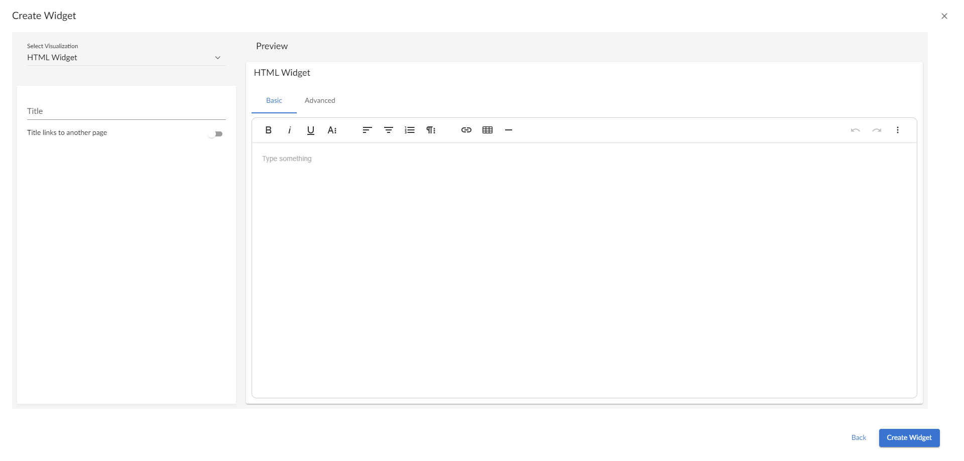
If you select HTML Widget, complete the following fields:
-
Title. Enter a title for the widget.
-
Title links to another page. Use this toggle to transform the widget title to a link that redirects you to another page. Select either Dashboard or Advanced URL from the Link Type drop-down option that appears.
-
If you select Dashboard, use the Choose Dashboard link to open the Choose a Dashboard modal, select from the list of dashboards that appear in the modal, and then click .
-
If you select Advanced URL, enter the URL you want to link in the Link URL field that appears.
-
Leaderboard Visualizations
Leaderboard visualizations display the objects with the highest or lowest values for a performance metric. The displayed values are the metric's average over the selected timespan. The leaderboard visualization option always drives data or "context" to other widgets, instead of receiving data or context:
You can use the Display zeroes toggle when editing a Top-N or Bottom-N widget to enable the widget to show or hide zero results.
If you select Leaderboard, complete the following fields:
-
Title. Enter a title for the widget.
-
Title links to another page. Use this toggle to transform the widget title to a link that redirects you to another page. Select either Dashboard or Advanced URL from the Link Type drop-down option that appears.
-
If you select Dashboard, use the Choose Dashboard link to open the Choose a Dashboard modal, select from the list of dashboards that appear in the modal, and then click .
-
If you select Advanced URL, enter the URL you want to link in the Link URL field that appears.
-
Display Unit Labels. Select this toggle to display relevant unit labels, such as "KB" or "%" along with the values in the widget.
-
Display Icon. Select this toggle to display the icon associated with each item in a table.
-
Items link to another page. Select this toggle to integrate third party tools with external linking. When you select this toggle, two additional fields will appear:
-
Link base URL. Specify the base URL to use.
For Device widgets using the Leaderboard or Table visualizations, you can link to any external or internal URL. You can also include variables to redirect your link to a specific path. All links will open in a new tab. The supported variables for Device widgets using the Leaderboard or Table visualizations are:
-
$id, which is the device ID.
-
$name, which is name of the device in camel case.
-
$ip, which is the device IP address.
For Interfaces widgets using the Leaderboard or Table visualizations, you can link to any external or internal URL. You can also include variables to redirect your link to a specific path. All links will open in a new tab. The supported variables for Interface widgets using the Leaderboard or Table visualizations are:
-
$id, which is the device ID.
-
$name, which is name of the device in camel case.
-
$ip, which is the device IP address.
-
$deviceIP, which is the IP address of the parent device.
-
$deviceName, which is the name of the parent device in camel case.
-
$index, which is the index of the interface.
-
$port, which is the interface port.
-
-
Link ToolTip. Enter an optional tooltip to display over the external link when moving your cursor over the text.
This toggle is only available when creating Device or Interfaces widgets using either Leaderboard or Table visualizations, or Service widgets.
-
-
Automatically adjust row height based on widget height. Select this toggle if you want the widget to dynamically adjust the height of the rows in the leaderboard when the size of the widget is adjusted.
The Title links to another page field does not support any variable substitutions.
In device, interface, and file system dashboards, you can create a Leaderboard widget that contains table columns for additional metrics. This enables you to view the top-N or bottom-N of a particular metric without calculating the top-N or bottom-N of the remaining metrics. To do so, when adding metrics to the widget, select Full timespan or Last poll in the Leaderboard From field for the top-N or bottom-N metric and select Off in the Leaderboard From field for the remaining metrics.
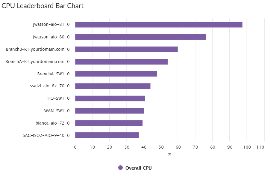
Leaderboard Bar Chart Visualizations
Leaderboard Bar Chart visualizations display a vertical or horizontal bar chart for the objects with the highest or lowest values for a performance metric. The displayed values are the metric's average over the selected timespan. Selecting a single bar can drive data or "context" to other widgets:
You can use the Display zeroes toggle when editing a Top-N or Bottom-N widget to enable the widget to show or hide zero results.
If you select Leaderboard Bar Chart, complete the following fields:
- Title. Enter a title for the widget.
- Title links to another page. Use this toggle to transform the widget title to a link that redirects you to another page. Select either Dashboard or Advanced URL from the Link Type drop-down option that appears.
If you select Dashboard, use the Choose Dashboard link to open the Choose a Dashboard modal, select from the list of dashboards that appear in the modal, and then click .
If you select Advanced URL, enter the URL you want to link in the Link URL field that appears.
- Display Horizontal Bars. Select this toggle to display the chart bars horizontally instead of vertically.
- Automatically manage chart features based on widget size. Select this toggle if you want the widget to dynamically hide the chart's features (labels and legends) when the size of the widget is adjusted. For more information, see the Resizing and Moving Widgets on a Dashboard section.
- Stack Options. Specify how you want to display data in a bar chart. Your options include no-stack (show each value as its own bar), normal (show all values in one bar), and percent .
- Customize Labels. For Device, File System, and Interface widgets only. Specify if you want to display only Device labels; only Device Index, File System, or Interface labels, depending on the widget type; or all labels in your bar chart.
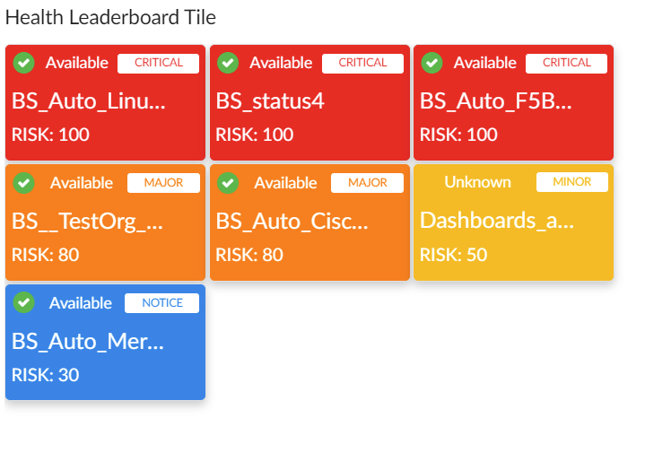
Leaderboard Tile Visualizations
Leaderboard Tile visualizations display tiles for the objects with the highest or lowest values for a status metric. You can use this widget to drive context to another widget, and you can select a service from this widget to go to its Service Investigator page (Service widget types only):
If you select Leaderboard Tile, complete the following fields:
-
Title. Enter a title for the widget.
-
Title links to another page. Use this toggle to transform the widget title to a link that redirects you to another page. Select either Dashboard or Advanced URL from the Link Type drop-down option that appears.
-
If you select Dashboard, use the Choose Dashboard link to open the Choose a Dashboard modal, select from the list of dashboards that appear in the modal, and then click .
-
If you select Advanced URL, enter the URL you want to link in the Link URL field that appears.
-
-
Color background for health. Select this toggle to make the entire tile color the current health of the service.
-
Show icon. Select this toggle to display an icon associated with the service.
-
Center icon. This option appears when Show icon is selected. Select this toggle to center the icon in the tile.
-
Automatically adjust tile size based on widget height. Select this toggle if you want the widget to dynamically adjust the height of the tiles in the widget when the size of the widget is adjusted.
-
Select tile size. This option appears when Automatically adjust tile size based on widget height is not selected. Select Compact for smaller tiles, or Full for larger tiles.
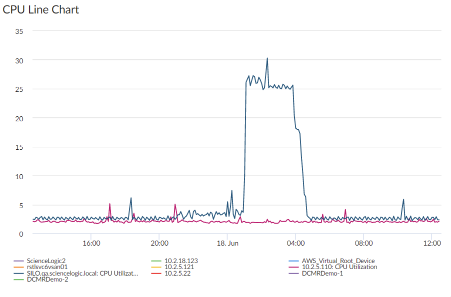
Line Chart Visualizations
Line Chart visualizations display data as a series of data points over time connected by straight line segments. This enables you to view changes over time for the specific item and metric. You can click on a point in time on the line chart to display the exact metric value collected for that time. You can also zoom in on a specific time period for a better view by clicking and dragging your mouse over that time period.
If you select Line Chart, complete the following fields:
- Title. Enter a title for the widget.
- Title links to another page. Use this toggle to transform the widget title to a link that redirects you to another page. Select either Dashboard or Advanced URL from the Link Type drop-down option that appears.
If you select Dashboard, use the Choose Dashboard link to open the Choose a Dashboard modal, select from the list of dashboards that appear in the modal, and then click .
If you select Advanced URL, enter the URL you want to link in the Link URL field that appears.
- Automatically manage chart features based on widget size. Select this toggle if you want the widget to dynamically hide the chart's features (labels and legends) when the size of the widget is adjusted. For more information, see the Resizing and Moving Widgets on a Dashboard section.
- Automatically scale y-axis. Select this toggle to have the y-axis of a Line Chart automatically scale to fit the data. Toggling this off allows you to set a Maximum and Minimum value for the y-axis.
- Step line. Select this toggle to display the line chart in which the points are connected by horizontal and vertical line segments.
- Area chart. Select this toggle to display the line chart as an area chart with the region beneath the line colored in.
- Stack Options.If Area Chart is enabled, you can specify how you want to display data in a line chart. Your options include no-stack (show each value as its own bar), normal (show all values in one bar), and percent .
- Threshold Line. Specify a number that represents the threshold for a line chart.
Map Visualizations
Map visualizations display a selected map:
If you select Map, complete the following field:
- Title. Enter a title for the map widget.
- Title links to another page. Use this toggle to transform the widget title to a link that redirects you to another page. Select either Dashboard or Advanced URL from the Link Type drop-down option that appears.
If you select Dashboard, use the Choose Dashboard link to open the Choose a Dashboard modal, select from the list of dashboards that appear in the modal, and then click .
If you select Advanced URL, enter the URL you want to link in the Link URL field that appears.
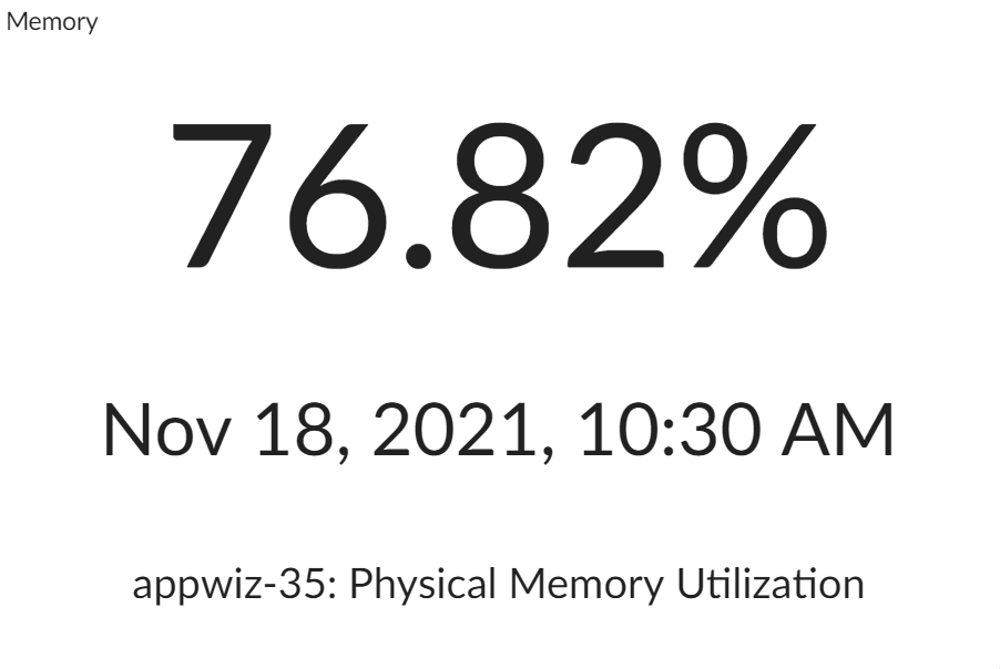
Number Visualizations
Number visualizations display data as a single number to highlight an important metric for a device or event. The size of the number and the related text that displays is based on the size of the widget, so increasing the widget size or screen size results in a larger font size. If multiple devices or events are selected, the number displays the average value for all selected items:
NOTE: If you create a number widget and you select more than one item on the widget driving data or "context" to that widget, the number widget displays data for only the first item you selected in the driving widget.
If you select Number, complete the following field:
- Title. Enter a title for the widget.
- Title links to another page. Use this toggle to transform the widget title to a link that redirects you to another page. Select either Dashboard or Advanced URL from the Link Type drop-down option that appears.
If you select Dashboard, use the Choose Dashboard link to open the Choose a Dashboard modal, select from the list of dashboards that appear in the modal, and then click .
If you select Advanced URL, enter the URL you want to link in the Link URL field that appears.
- Show the Unit. Select this toggle to display the relevant unit label, such as "KB" or "%" along with the value in the widget.
- Show the Label. Select this toggle to display the label with additional information below they number. If you select this toggle, the following additional fields also display:
- Show the Name. Select this toggle to display the selected entity name in the widget label.
- Show the Index. Select this toggle to display the index value for the selected metric in the widget label.
- Show the Metric. Select this toggle to display the name of the selected metric in the widget label.
- Show the Collection Time. Select this toggle to display the date and time at which the metric value was collected.
You can set the number of decimal places to display when creating a widget with Number visualizations. Alternatively, you can configure an existing one in the Limit Decimal Precision field.
Pie Chart Visualizations
Pie Chart visualizations display data metrics as a percentage of a whole:
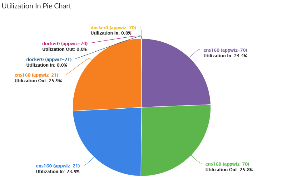
This visualization option is available only for Interface widgets.
If you select Pie Chart, complete the following fields:
- Title. Enter a title for the widget.
- Title links to another page. Use this toggle to transform the widget title to a link that redirects you to another page. Select either Dashboard or Advanced URL from the Link Type drop-down option that appears.
If you select Dashboard, use the Choose Dashboard link to open the Choose a Dashboard modal, select from the list of dashboards that appear in the modal, and then click .
If you select Advanced URL, enter the URL you want to link in the Link URL field that appears.
- Automatically manage chart features based on widget size. Select this toggle if you want the widget to dynamically hide the chart's features (labels and legends) when the size of the widget is adjusted. For more information, see the Resizing and Moving Widgets on a Dashboard section.
Root Cause Timeline Visualizations
For Skylar Automated RCA users, a Root Cause Timeline visualization is available on the Dashboards page in Skylar One. This widget visualization lets you see when the Skylar AI detects a possible or confirmed issue. When you hover over an icon for a suggestion or an alert in the widget, a pop-up displays a title and a word cloud that contains additional information about the likely root cause based on the relevant logs associated with the issue.
You can click the icon for a suggestion or an alert on the Root Cause Timeline visualization to go to the Skylar Automated RCA user interface, where you can access further details and perform optional customizations on the Root Cause Report page.
The Root Cause Timeline visualization is specific to Skylar Automated RCA widget types only.
If you selected Root Cause Timeline as the visualization, complete the following fields:
-
Title. Enter a title for the widget.
-
Skylar Automated RCA Connection ID. Enter the unique connection ID from Skylar Automated RCA, which you can find by creating a service connection between Skylar One and Skylar Automated RCA. The value appears on the Service Connections page (Manage > Service Connections) in the Skylar One user interface. For more information, see
-
Skylar Automated RCA Service Groups. Enter the name or names of the service groups in Skylar Automated RCA that you want to monitor with this widget. If you have more than one service group, separate the names with commas. If you want to view sample alerts for troubleshooting purposes, include the "integration_test" service group here. If you leave this field blank, the widget will include all of the service groups. Optional.
If you try the sample alert feature, make sure to add the special integration_test service group to this field.
For more information about using the Root Cause Timeline visualization with Skylar Automated RCA widget, see Using the Root Cause Timeline Widget.
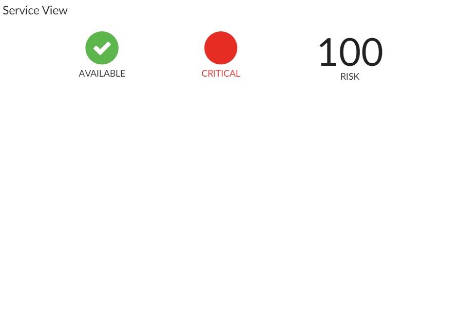
Service View Visualizations
Service View visualizations display a quick overview of Health, Availability, or Risk:
If you select Service View, complete the following fields:
- Title. Enter a title for the widget.
- Title links to another page. Use this toggle to transform the widget title to a link that redirects you to another page. Select either Dashboard or Advanced URL from the Link Type drop-down option that appears.
If you select Dashboard, use the Choose Dashboard link to open the Choose a Dashboard modal, select from the list of dashboards that appear in the modal, and then click .
If you select Advanced URL, enter the URL you want to link in the Link URL field that appears.
- Icon Size. Increase or decrease this value to adjust the size of the icons.
- Font Size. Increase or decrease this value to adjust the size of the text.
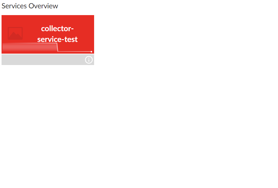
Services Overview Visualizations
Services Overview visualizations display tiles for each of your Business Services, color-coded to reflect the services' current health and availability status:
If you select Services Overview, complete the following fields:
- Title. Enter a title for the widget.
- Title links to another page. Use this toggle to transform the widget title to a link that redirects you to another page. Select either Dashboard or Advanced URL from the Link Type drop-down option that appears.
If you select Dashboard, use the Choose Dashboard link to open the Choose a Dashboard modal, select from the list of dashboards that appear in the modal, and then click .
If you select Advanced URL, enter the URL you want to link in the Link URL field that appears.
- Show icon. Select this toggle if you want the business service icon to appear on the tile.
- Display white background behind icon. Select this toggle if you want the business service icon to have a white background.
- Enable animated ping. Select this toggle if you want the ping line that represents the service's health to be animated.
Widgets that are using the Services Overview visualization display services based on their health and availability status, ranging from "critical" displaying with a red background at the top of the widget to "healthy" displaying with a green background at the bottom. Services that become unavailable also display with a red background, similar to those with a "critical" health status. This color-coordinated hierarchy enables you to quickly see which services most require your attention.
Services widgets using the Services Overview visualization sort services automatically by status in this order: Availability, Health, then Risk.
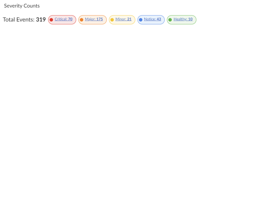
Severity Counts Visualizations
Severity Counts visualizations display the number of severities in events. This visualization option is onlyavailable if you are creating a widget and select . This visualization option does not require you to select anything from the Metrics & Properties column.
If you select Severity Counts, complete the following fields:
- Title. Enter a title for the widget.
- Title links to another page. Use this toggle to transform the widget title to a link that redirects you to another page. Select either Dashboard or Advanced URL from the Link Type drop-down option that appears.
If you select Dashboard, use the Choose Dashboard link to open the Choose a Dashboard modal, select from the list of dashboards that appear in the modal, and then click .
If you select Advanced URL, enter the URL you want to link in the Link URL field that appears.
- Show Total Events Count. Select this toggle if you want the widget to display the total number of events across all of your devices.
- Filter Severities. Filter which level of severity you want the widget to display.
Clicking on a severity count chip within a widget opens the Events page, where a table displays events filtered by that severity level. For example, clicking "Critical" opens the Events page with a table filtered to show only events classified as critical.
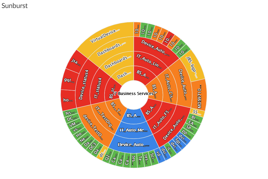
Sunburst Visualizations
Sunburst visualizations display Business Services in a Sunburst chart, so that you can see the status of Business Services, IT Services, Device Services, and (where relevant) devices in the different rings:
If you select Sunburst, complete the following fields:
- Title. Enter a title for the widget.
- Title links to another page. Use this toggle to transform the widget title to a link that redirects you to another page. Select either Dashboard or Advanced URL from the Link Type drop-down option that appears.
If you select Dashboard, use the Choose Dashboard link to open the Choose a Dashboard modal, select from the list of dashboards that appear in the modal, and then click .
If you select Advanced URL, enter the URL you want to link in the Link URL field that appears.
- Metric for slice color. Select the metric that you want the sunburst chart to represent. Choices are Availability, Health, Risk, or No Metric.
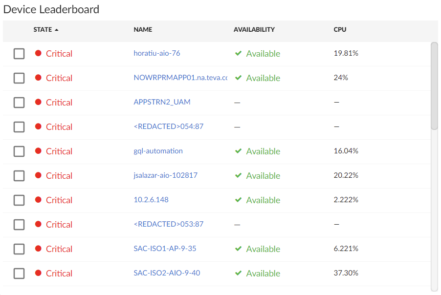
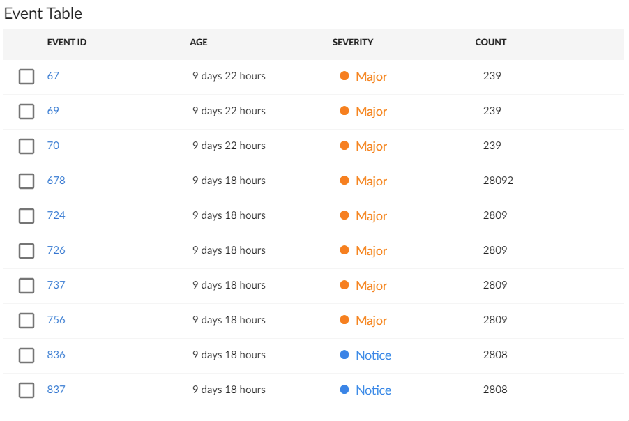
Table Visualizations
Table visualizations display data in a boxed set of rows and columns. A table widget can be used to drive data or "context" to other widgets. If you have an Event, Device, or Service table, selecting its name or ID takes you to its detail page:
If you select Table, complete the following fields:
-
Title. Enter a title for the widget.
-
Title links to another page. Use this toggle to transform the widget title to a link that redirects you to another page. Select either Dashboard or Advanced URL from the Link Type drop-down option that appears.
-
If you select Dashboard, use the Choose Dashboard link to open the Choose a Dashboard modal, select from the list of dashboards that appear in the modal, and then click .
-
If you select Advanced URL, enter the URL you want to link in the Link URL field that appears.
-
Display Unit Labels. Select this toggle to display relevant unit labels, such as "KB" or "%" along with the values in the widget.
-
Display Icon. Select this toggle to display the icon associated with each item in a table.
-
Items link to another page. Select this toggle to integrate third party tools with external linking. When you select this toggle, two additional fields will appear:
-
Link base URL. Specify the base URL to use.
For Device widgets using the Leaderboard or Table visualizations, you can link to any external or internal URL. You can also include variables to redirect your link to a specific path. All links will open in a new tab. The supported variables for Device widgets using the Leaderboard or Table visualizations are:
$id, which is the device ID.
$name, which is name of the device in camel case.
$ip, which is the device IP address.For Interfaces widgets using the Leaderboard or Table visualizations, you can link to any external or internal URL. You can also include variables to redirect your link to a specific path. All links will open in a new tab. The supported variables for Interface widgets using the Leaderboard or Table visualizations are:
$id, which is the IP address of the interface.
$name, which is name of the device in camel case.
$ip, which is the IP address of the interface that is not index 0.
$deviceIP, which is the IP address of the parent device.
$deviceName, which is the name of the parent device in camel case.
$index, which is the index of the interface.
$port, which is the interface port. -
Link ToolTip. Enter an option tooltip to display over the external link when moving your cursor over the text.
This toggle is only available when creating Device or Interface widgets using either Leaderboard or Table visualizations, or Service widgets.
-
-
Automatically adjust row height based on widget height. Select this toggle if you want the widget to dynamically adjust the height of the rows in the table when the size of the widget is adjusted.
-
Select Row Height. Select the relative height of the rows in the table. Choices are Small, Medium, or Large. This field appears only if the toggle is not selected in the Automatically adjust row height based on widget height field.
The Title links to another page field does not support any variable substitutions.
Interface widgets using the Table visualization option will display information in the footer, such as the total number of items in the table, as well as the total number of items selected or filtered from your search.
The time span filter does not impact the list of events that appears in Events table widgets.
You can have a fixed selection state on Interfaces widgets with Table visualizations if your account has a membership to an organization for which a Network Interface's emissary is set.
You can set the number of decimal places to display when creating a widget with Table visualizations. Alternatively, you can configure an existing one in the Limit Decimal Precision field.
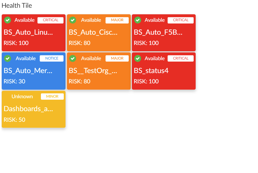
Tile Visualizations
Tile visualizations display Health, Availability, or Risk as a colored badge or a solid background depending on the metric:
If you select Tile, complete the following fields:
-
Title. Enter a title for the widget.
-
Title links to another page. Use this toggle to transform the widget title to a link that redirects you to another page. Select either Dashboard or Advanced URL from the Link Type drop-down option that appears.
-
If you select Dashboard, use the Choose Dashboard link to open the Choose a Dashboard modal, select from the list of dashboards that appear in the modal, and then click .
-
If you select Advanced URL, enter the URL you want to link in the Link URL field that appears.
-
-
Color Background for Health. Select this toggle to make the entire tile color the current health of the service.
-
Show icon. Select this toggle to display an icon associated with the service.
-
Center icon. This option appears when Show icon is selected. Select this toggle to center the icon in the tile.
-
Automatically adjust tile size based on widget height. Select this toggle if you want the widget to dynamically adjust the height of the tiles in the widget when the size of the widget is adjusted.
-
Select tile size. This option appears when Automatically adjust tile size based on widget height is not selected. Select Compact for smaller tiles, or Full for larger tiles.
Adding Metrics and Properties to a Widget
On the Create Widget page, you can specify the metrics and properties that you want to appear in your widget.
To add a metric type or property to a widget:
-
On the Create Widget page, click the Metrics & Properties label or click + Add New. A drop-down list displays a list of metric types and properties from which you can choose:

The metric types and properties that you can select are specific to the widget type you selected; not all options appear for all widget types.
-
Select a metric type. Your possible options include:

- Properties. These metrics contain basic device information, including ID, State, Severity, Name, Host Name, Interface ID, IP, Index, Index Label, Collector Group, Device Class, and Unavailable. Name, Host Name, and State are commonly used for Leaderboard widgets.
- Service Properties. These metrics contain basic service information, including Name, Description, and Type. (This option appears only for Service widget types.)
- Organization Properties. These metrics contain basic organization information, such as Company Name and contact information. (This option appears only for Services widgets.)
- Custom Attributes. These metrics contain any custom attributes you created in Skylar One. Custom attributes are name-value pairs that you can use to add custom descriptive fields to assets, devices, interfaces, themes, and vendors. For more information, see the see
- Vitals. These metrics contain the key metrics about a device, including CPU, Memory Utilization, Availability, Latency, and Swap.
- Collection Label. These metrics contain the available collection labels that you can use as metrics in the widget. Collection labels allow you to group and view data from multiple performance Dynamic Applications in a single widget.
- Dynamic Application metrics. These metrics contain the available Dynamic Applications that you can use as metrics in the widget, such as "AWS Custom Metrics" or "Cisco: BGP Peer Stats". This menu continually loads more Dynamic Applications as you scroll to the end of the list.
- Interface: These metrics contain information about discovered network interfaces on the device, including Bitrate In or Bitrate Out, Octets In or Octets Out, Utilization In or Utilization Out, Errors In or Errors Out, Packet Discards In or Packets Discard Out, Percent Errors In or Percent Errors Out, and Percent Discards In or Percent Discards Out. (This option appears only for Interface widget.)
- File System. These metrics contain information about the amount of disk space used, in percent. (This option appears only for File System widgets.)
- Service Metrics. These metrics contain metrics for the service's Health, Availability, and Risk. (This option appears only for Service widgets.)
- Polled Data. These metrics contain information about agent polled data and return with a timestamp.
To locate a specific metric, type a search term in the Search Metrics & Properties field to filter the list of categories. Once you navigate to a selected category, you can search the list of metrics within that category.
- When you select a metric type, a new menu appears with a list of metrics and properties that you can add to your widget. Select one or more metrics or properties from the menu and then click the back-arrow icon (
 ) to return to the main Metrics & Properties drop-down list.
To remove a metric from a widget, click the X next to the metric name under the Metrics & Properties drop-down list.
- When you are done selecting metrics, click the Metrics & Properties drop-down list to minimize it. The list of selected metrics appears under the Metrics & Properties field.
- To edit the settings for a specific metric, click the metric name or the forward-arrow icon (
 ) to access a menu for that metric. The forward-arrow icon will turn to a downward-arrow icon (
 ) and a list of settings will appear for that metric.
Not all metrics have these additional settings.
The possible metric settings include:
- Leaderboard From. Specify what timespan the dashboard should consider to determine the order in which metrics display on a leaderboard. (This option applies only to leaderboard and leaderboard bar chart widgets.) Select one of the following options:
- Full timespan. Calculates the top-N value over the entire selected timespan.
- Last poll. Calculates the current top-N values based off the last polling cycle.
- Off. Remove the metric from top-N requests but includes the last data point for the metric along with other metrics defined as top-N.
In device, interface, and file system dashboards, you can create a Leaderboard widget that contains table columns for additional metrics. This enables you to view the top-N or bottom-N of a particular metric without calculating the top-N or bottom-N of the remaining metrics. To do so, select Full timespan or Last poll in the Leaderboard From field for the top-N or bottom-N metric and select Off in the Leaderboard From field for the remaining metrics.
- Aggregation. Specify the method of aggregation (average, maximum, minimum) to display on the collected values for this metric.
- Analysis Time Range. Optionally, update the time frame displayed in this widget. (This option applies only to widgets using the Forecast visualization.).
- Count Type. You can choose from Top N to display the highest values for the selected metric, or Bottom N to display the lowest values for the selected metric. (This option applies only to widgets using the Leaderboard or Table visualizations.)
- Display Name. Type a name for this metric as you want it to display in the widget.
- Display Zeroes. Use this toggle when editing a Top-N or Bottom-N widget to enable the widget to show or hide zero results.
- Fetch Count. Type the number of devices that you want to view on the widget. (This option applies only to widgets using the Line Chart, Leaderboard, Leaderboard Bar Chart, Table, or Tile visualizations.).
- Indexes. Specify the index values that you want to be returned per device for this metric. Select one of the following options:
- First Index. Returns only the first index value for this metric.
- Last Index. Returns only the last index value for this metric.
- Multiple. Specify the number of index values that you want to be returned per device for this metric. You can also select the Advanced Filters option, which enables you to search for specific indexes by index value, name, or metric presentation.
NOTE: This option applies only to device widgets.
- Maximum Value. Specify the highest possible value to be displayed in the widget.
- Minimum Value. Specify the lowest possible value to be displayed in the widget.
- Rollup Frequency. Specify the frequency with which performance data is normalized (or "rolled up") for this metric. This is done so that dashboards with a longer timespan do not become difficult to view and to save storage space on the database. When Skylar One rolls up data, it groups it into larger sets and calculates the average value for the larger set. Select one of the following options:
- Auto. Calculates and displays the best data for the time span being viewed. When you select this option, time spans of 2 days or less will calculate and display raw data for the metric; time spans of more than 2 days to 45 days will calculate and display an average hourly value for the metric; and time spans of more than 45 days will calculate and display an average daily value for the metric.
- Raw. Calculates and displays raw data for the metric.
- Hourly. Calculates and displays an average hourly value for the metric.
- Daily. Calculates and displays an average daily value for the metric.
NOTE: Because normalization is required for leaderboards, Raw is not a selectable option for metrics that appear in widgets using Leaderboard or Leaderboard Bar Chart visualizations.
- Scale prefix. Select the metric prefix for metrics that are not percentage-based. Select one of the following options:
- milli (m). Thousandth
- micro (μ). Millionth
- Kilo (k). Thousand
- Mega (M). Million
- Giga (G). Billion
- Tera (T). Trillion
- Peta (P). Quadrillion
NOTE: This field is only available to widgets that are using one of the following widget visualization options: Bar Chart, Table, Line Chart, Number, Leaderboard, Leaderboard Bar Chart, and Forecast.
- Service Type. Select which kind of services you want to display in the widget. For most visualization types, you can select more than one service type. (This option applies only to Services widgets.)
- Show Devices. For sunburst widgets, specify whether you want devices to display on the outer ring of the sunburst chart. (This option applies only to Services widgets.)
- Type. Select a display type for this metric, such as heat for a heat map that displays the percentage of change over time, or label for a simple table. If you select heat map, you can also specify the minimum and maximum values for the table. Another example would be for an availability metric, where you can choose between label to show availability as a text label or state to show availability as a colored icon.
- Unit. Optionally, specify the unit for this widget, such as a percentage or a unit of time.
Specifying Which Items Will Appear in a Widget
On the Create Widget page, there are several ways in which you can specify how Skylar One should determine the items that will appear in your widget.
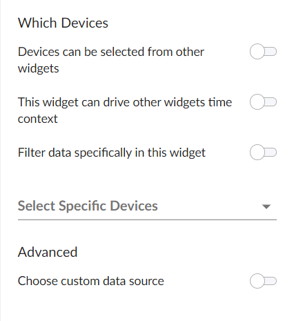
In the Which <Items> section (where <Items> corresponds with the widget type you created), you can:
- Determine if the widget will drive data (or "context") to another widget or receive data (or "context") from another widget
- Filter a specific set of data in the widget
- Select specific devices or services that you want to appear in the widget
- Select the custom data source you want to use
To specify which items will appear in a widget, you can select one of the following options, more than one of the options, or none of the options in the Which <Items> section of the Create Widget page:
- <Items> can be selected from other widgets. Select this option if you want this widget to receive and display data (or "context") based on what a user selects in another widget. This option is selected by default for these visualization types: line chart, number, gauge, and forecast. If you select this option, complete the following fields to define the widgets from which you want to receive data:
- Type. Select a widget type that will drive data or "context" to this widget. The default type is based on the current widget type. For example, if you want a Device widget to drive data to this widget, select Device.
- Which Set of Selections. From the drop-down list, select the item type that the user will select to drive the data ("context") to this widget. The default selection type is based on the widget type you selected in the Type field. For example, if you want the user to select one or more devices in another Device widget to drive the data that appears in this widget, select device.
- How Many Selections? Select the maximum number of items the user can select in the driving widget. For example, if you want the user to be able to select only one device at a time, select 1.
To add another widget from which this widget can receive data (or "context"), click the button and complete the Type, Which Set of Selections, and How Many Selections fields for that additional widget.
- This widget can drive other widgets. Select this option if you want this widget to drive data (or "context") to other widgets. This option is selected by default for these visualization types: leaderboard and table. If you select this option, complete the following fields to define the type of devices to which you want to drive data:
- Type. Select the widget type that will receive data or "context" from this widget. The default type is based on the current widget type. For example, if you want a Device widget to drive data to this widget, select Device.
- Which Set of Selections. Select an existing context label or click the plus icon (
 ) to type a context label for this widget if you want this widget to drive context to other widgets. The default context type is based on the widget type. Widgets that are using the Leaderboard Bar Chart visualization for events can have multiple contexts. Also, File System and Interface widgets can publish its file system or interface context as well as a secondary context of device.
 - How Many Selections? Select the maximum number of items the user can select in the driving widget. For example, if you want the user to be able to select only one device at a time, select 1.
- Auto Selection. Select the number items that are automatically selected in the widget that drives context to other widgets.
You can see where a receiving widget gets its data by clicking the Helper icon ( ) for that widget after you create the receiving widget.
- Filter data specifically in this widget. Select this option if you want to view a specific set of data in this widget. For example, you can create multiple leaderboard widgets in a dashboard that contain just the devices you want to view. If you select this option, complete one or both of the following fields to define the type of data you want to display in this widget:
- Filter By. Select the type of widget you want to use as a filter for this widget.
- Filter Criteria. Type a search term to filter this widget.
NOTE: Alternatively, you can access these display options by clicking the filter funnel icon the widgets on the Dashboards page. This icon allows you to view and select filters you can apply to the data that appears in the widget, similar to what you can do using the existing Advanced Editor filter options on the Edit Widget page. You can also see the number of filters applied to a widget in its header text.
- Select Specific <Items>. If you are creating a widget for devices or services, select the specific devices or services that you want to include in the widget. These devices or services will appear in addition to any devices or services that would appear based on context receiving/driving or filtering.
- Advanced.
- Choose custom data source. Toggling this on will display the Data Source drop-down. Select the custom data source you wish to use, if applicable. This option is for advanced users only. Options include Auto Mode or various metric types.
Configuring a Skylar Automated RCA Connection for the Root Cause Timeline Widget
For Skylar Automated RCA users, a Root Cause Timeline visualization is available on the Dashboards page in Skylar One. This widget visualization lets you see when the Skylar AI detects a possible or confirmed issue. When you hover over an icon for a suggestion or an alert in the widget, a pop-up displays a title and a word cloud that contains additional information about the likely root cause based on the relevant logs associated with the issue.
You can click the icon for a suggestion or an alert on the Root Cause Timeline visualization to go to the Skylar Automated RCA user interface, where you can access further details and perform optional customizations on the Root Cause Report page.
The Root Cause Timeline visualization is specific to Skylar Automated RCA widget types only.

Connecting Your Skylar Automated RCA Instance to the Root Cause Timeline Widget
To establish communication between Skylar Automated RCA and the Root Cause Timeline widget in Skylar One, you will need to create a service connection, which enables communication between Skylar One and Skylar Automated RCA.
This is a two-part process:
- Create an "Skylar One Enhanced (12.x)" integration in the Skylar Automated RCA user interface.
- Use the data from that integration to create the service connection in Skylar One.
Creating a Dashboard Widget Integration in Skylar Automated RCA
You will need credentials for logging in to Skylar Automated RCA to create the following integration.
To create an "Skylar One Enhanced (12.x)" integration in Skylar Automated RCA:
- Log in to your Skylar Automated RCA instance.
- Go to the Integrations & Collectors page (Settings (
 ) > Integrations & Collectors) and click the button in the ScienceLogic section. The Integrations dialog appears.
 - Click . The Create Integration dialog appears.
- On the tab, complete the following fields:
- Integration Name. Type a name for the widget.
- Deployment. Select the Skylar Automated RCA deployment that you want to monitor.
- Click . The Your Integration Info dialog appears, with a summary of the key values for the widget integration.
- Make a note of each value, as you will use all three values when creating the service connection in Skylar One. You can click each value to automatically copy that value.
- Click . The new integration is added to the ScienceLogic Integrations dialog.
Creating a Service Connection in Skylar One
After you create the ScienceLogic integration in Skylar Automated RCA, you will have the data you need to create the service connection in Skylar One.
To refer to this data in the Skylar Automated RCA user interface, go to the Integrations & Collectors page (Settings () > Integrations & Collectors) and click the button in the ScienceLogic section, and then click the edit icon ( ) for that integration. The Edit dialog displays all the relevant data you need for this procedure.
To create a Skylar Automated RCA (Zebrium) service connection in Skylar One:
- In Skylar One, go to the Service Connections page (Manage > Service Connections).
- Click Add Service Connection and select Skylar Automated RCA. The Create Skylar Automated RCA (Zebrium) Connection window appears.
- Complete the following fields:
- Name. Type a name for this new service connection.
- Access Token. Add the Access Token value from the Your Integration Info dialog or the Edit Integration dialog in the Skylar Automated RCA user interface. You can also access this information on the Access Tokens page (Settings () > Access Tokens) in the Skylar Automated RCA user interface.
- Skylar Automated RCA (Zebrium) Endpoint URL. Add the Endpoint URL value from the Your Integration Info dialog or the Edit Integration dialog. Skylar Automated RCA Cloud users can use the default value in this field, while Skylar Automated RCA On Prem users will need to add the URL of their on-premises Skylar Automated RCA instance.
- Skylar Automated RCA (Zebrium) Deployment ID. Add the Deployment ID value from the Your Integration Info dialog or the Edit Integration dialog.
- Share data with. Select the All Organizations toggle (turn it blue) to share this connection with all existing and newly created organizations. Alternately, you can deselect the All Organizations toggle (turn it gray) and select one or more organizations from the Selected Organizations drop-down to limit access to this connection to only those organizations.
- Click . The service connection is added to the Service Connections page.
You can also create a Skylar AI Engine service connection in Skylar One:
- In Skylar One, go to the Service Connections page (Manage > Service Connections).
- Click Add Service Connection and select Skylar AI Engine. The Create Skylar AI Engine Credential modal appears.
- Complete the following fields:
- Name. Type a name for this new service connection.
- API Key. Enter the unique identifier used to authenticate and authorize a user.
- Skylar AI Engine URL. Provide the URL at which the Skylar AI Engine can be found.
- Click . The service connection is added to the Service Connections page.
NOTE: When you create or edit a Skylar AI Engine service connection, a command-line interface (CLI) script will automatically run to manage Skylar configurations. This script generates configuration files and initiates the service that exports data to Skylar AI. In the past, you had to run this script manually.
Using the Root Cause Timeline Widget
The main section of the contains a time-based chart with different icons that represent the following Skylar Automated RCA elements:
- Suggestion (
 ). A yellow diamond represents a suggestion, or a potential problem found by the Skylar AI. When you click a yellow diamond, the RCA Report page for that suggestion opens in the Skylar Automated RCA user interface. On that page, you can choose to accept or reject that suggestion.
 - If you accept the suggestion, Skylar Automated RCA will create a rule for the settings for that suggestion in the future.
- If you reject the suggestion, Skylar Automated RCA will no longer show a suggestion with the same settings as that suggestion in the widget.
- Accepted Alert (
 ). A green circle represents an accepted alert, a suggestion that you or another Skylar Automated RCA user has accepted.
 - Custom Alert (
 ). A blue triangle represents a custom alert, which you or another user defined by writing a regular expression in Skylar Automated RCA that searches for a specific pattern.
When you hover over an icon in the chart, a pop-up window appears with date and time information about that specific suggestion or alert, along with a title and word cloud that contains suggestions and information about the likely root cause.

The also includes the following graphical elements:
-
Spike. A gray vertical line appears on the widget if there are too many suggestions or alerts to show for a specific time. You can click and drag on the spike to zoom in so you can see all of the suggestions for that specific time. Click to go back to the default view settings.

-
Log Lines timeline. Hover over this gray line to view a pop-up window that displays the number of log lines that have been ingested within this time interval.
-
Rare Events timeline. Hover over this red line to view a pop-up window that displays the number of events marked as rare, such as possible issues or problems, that have been ingested within this time interval. Rare events are often the most diagnostic anomalies in the logs.


Working with Suggestions in the Skylar Automated RCA User Interface
You can click the icon for a suggestion or an alert on the to go to the Skylar Automated RCA user interface, where you can access further details and perform optional customizations on the Root Cause Report page.
For more information about what you can do on the Root Cause Report page, see Root Cause Reports in the Skylar Automated RCA Product Documentation.
Sharing a Dashboard
By default a dashboard is private when you create it. You can make a dashboard public, which lets you share it with other users. On the Dashboards page, the Visibility column lists whether a dashboard is public, private, or shared with only specific organizations.
The data within each dashboard is limited using multi-tenancy restrictions to allow only users with proper permissions and organization memberships to view data. There are four scenarios for dashboard visibility:
- Private. Only the creator of the dashboard can view the dashboard.
- Public. All users can view the dashboard.
- Shared to the System Organization. Only administrator users can view the dashboard.
- Shared to Specified Organizations. Members of the specified organization or organizations can view the dashboard.

To change the visibility of a dashboard:
- Go to the Dashboards page and open the dashboard. Click the button on the main navigation bar.
- Next to the title of the dashboard, click the Visibility drop-down list and select one of the following:
- Private. The dashboard is visible to only the creator of the dashboard.
- Public. The dashboard is visible to all users.
- Specific Organizations. The dashboard will be shared only with organizations that you select. When you select Specific Organizations, a list of organizations appears. You can search for an organization, click Select All, or click None to deselect all organizations.
- If you are an Administrator user and want to share a dashboard with only the System organization, select System from the organization list.
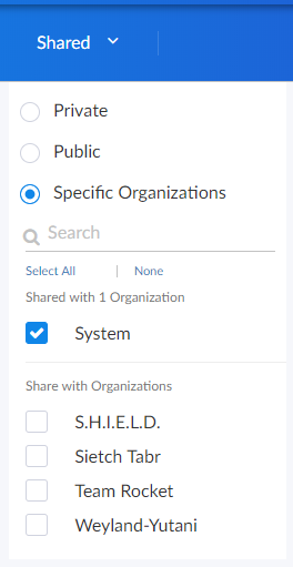
- If you have dashboards that you want to share with users in other organizations, but not with System, select the organization(s) from the list and deselect System.
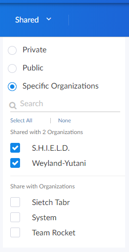
- After you set the visibility of your dashboard, click the button on the main navigation bar.
Editing a Dashboard
If you have the proper permissions, you can edit an existing dashboard by performing the following steps:
- Go to the Dashboards page and click the name of the dashboard you want to edit. The dashboard page appears.
- Click the button on the main navigation bar.
- Do one of the following:
- If you want to add a widget to the dashboard, click the button. For more information about creating widgets, see the section Creating Dashboard Widgets.
- If you want to edit an existing widget, click the button (
 ) on that widget and select Edit. The Edit page appears.
 - If you want to make a copy of an existing widget and then customize the new widget, click the button () and select Duplicate. The new widget appears at the bottom of the dashboard. You can then click the button () on that widget and select Edit to make changes to the widget.
- Make your changes to the widget, and then click the button when you are done.
- As needed, edit any other widgets on the dashboard.
- When you are done editing the dashboard, click the button on the main navigation bar.
Resizing and Moving Widgets on a Dashboard
To resize and move widgets on a dashboard:
- Go to the Dashboards page and click the name of the dashboard you want to edit. The dashboard page appears.
- Click the button on the main navigation bar.
- To resize a widget, click the resizing icon (
 ) at the bottom right-hand corner of the widget and drag the widget until it is the size you want. Widgets are based on a fractional grid of the dashboard screen size. You can snap the widget to 12 columns and 8 rows, which are proportional to the total size of the browser, and scale up or down as the browser does.

- To move a widget, click the header for that widget and drag the widget to its new location on the dashboard.
- Click the button when you are done resizing or moving widgets on the dashboard.
If you selected the Automatically manage chart features based on widget size toggle when creating the widget, the widget will dynamically show or hide features of the chart, such as axis labels or the legend, depending on the effective size of the widget on the screen.
For example, if the widget is 1/2 of the height and 1/4 of the width of the dashboard, the widget might display at 500 by 400 pixels when viewed in a large browser on a 1080-pixel screen. This feature will display all the surrounding information in the widget to the user when they have this much resolution to devote to the chart. However, if the same dashboard is viewed in a smaller resolution or screen, or the widget itself is resized to be a smaller fraction of the dashboard, features of the chart may automatically be hidden to maximize the amount of data that is displayed within the smaller panel.
Certain features are associated with widget height, such as table row height or horizontal axis labels, while other features are associated with widget width, such as vertical axis labels.
If you disable the Automatically manage chart features based on widget size toggle, you are presented with options to manually enable or disable each feature of each chart and table, and the size of the user's browser or widget display will not cause those features to appear or disappear.
Configuring a Dashboard URL
Configuring a Dashboard URL adds a link icon ( ) next to the service name in a Service Table that will take you to another dashboard or item related to that service. This feature lets you integrate third-party tools with Skylar One.
You can use a Dashboard URL with the following widget and visualization types:
- Service, device, or interface tables
- Device or interface leaderboards
To create an Advanced URL:
-
In the dashboard that contains the table where you want to create the Advanced URL, click the button.
-
In the table widget, click the icon (
) and select Edit. -
In the Edit page in the center Table column, click the toggle for Link to another page.
-
In the Link base URL field, construct the link you want to create with the desired attributes. Type a base URL for the related widget, using the following format: /dashboards/<service type>-service-details?harProviderId=$id where <service type> is business, IT, or device. For example, if you want to link to the Business Service Details dashboard, you would type the following:
/dashboards/business-service-details?harProviderId=$id
These settings add a link icon next to each Service in the Service Table. When a user clicks the link icon, the Business Service Details dashboard for that particular service appears:

NOTE: Relative URLs, such as item/services, will have the relative path for /dashboards prepended automatically: /dashboards/item/services

Supported attributes and rules include:
-
$id. Returns the item.id
-
$type. Returns the item.type, such as business-service or device-service
-
$name. Returns the item.name, such as my-device-name
-
$description. Returns the item.description
Attributes can be combined at will. If one of the attributes is undefined in the current item, no link will be created.
- Click when you are finished configuring your URL, then click the button in the dashboard page.
Deleting a Dashboard
You can delete any dashboard that you have created, as well as any other dashboard in Skylar One.
WARNING: If you delete a dashboard, that dashboard is deleted for all users.
To delete a dashboard:
- On the Dashboards page, click the button () for the dashboard you want to delete and select Delete.
- On the Delete Dashboard dialog, click the button to permanently remove the dashboard.