The Data Visualization component of Skylar Analytics contains dashboards and charts based on data gathered by Skylar AI and SL1. To display these dashboards and charts, Data Visualization uses a ScienceLogic-hosted instance of Apache Superset. The data for the dashboards and charts includes metrics for file systems, network interfaces, and all Dynamic Applications, with more metrics planned for future Skylar and SL1updates.
The dashboards and charts in the Data Visualization component of Skylar Analytics are not compatible with SL1 dashboards, widgets, or reports.
The optional Data Exploration component of Skylar Analytics enables third-party tools that use the Open Database Connectivity (ODBC) interface to access the metric data from Skylar AI. This component lets you use ODBC to export Skylar AI data to Tableau, Microsoft BI, and other business intelligence tools.
This chapter provides a general overview of how to view the charts, graphs, and other reports in the Skylar Analytics user interface, along with tips and best practices for users of SL1 and Skylar AI.
What is Data Visualization?
Before the initial release of Skylar Analytics, SL1 stored data in a proprietary format that was not easily exported to other third-party applications for further research and insight. Skylar Analytics takes the data gathered by SL1 and Skylar AI, normalizes it, and makes it available in standard ODBC database format.
The data originates from SL1 data collectors, undergoes processing, and is then simultaneously transmitted to Skylar using the API. This data is stored in Skylar Analytics as datasets, which are curated representations of the data in your database gathered by Dynamic Application presentation objects in SL1. You can use the data in a dataset to populate dashboards and charts in Skylar Analytics. For more information, see Working with Datasets in Data Visualization.
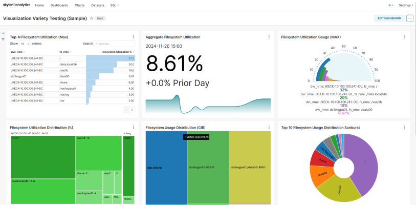
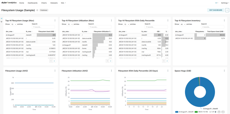
ScienceLogic hosts an instance of Apache Superset as an option for Data Visualization that lets you explore and view your data using business intelligence (BI) dashboards. Below is an example of one of the default dashboards in Skylar Analytics:
For more information, see Viewing Dashboards and Charts in Data Visualization.
You can also use the Data Visualization component with your existing BI tools for your company that support ODBC; this option is called Data Exploration. For more information, see Data Exploration: Exporting Data from Skylar AI.
Because ScienceLogic does not own the underlying framework for the Data Visualization and Data Exploration components, ScienceLogic is not responsible for maintaining or updating documentation for third-party open-source software, including Apache Superset. For a list of the most current and accurate information, see Additional Resources for Skylar Analytics.
Working with Datasets in Data Visualization
The data imported from SL1 is stored in Skylar Analytics as datasets, which are curated representations of the data in gathered by the Dynamic Application presentation objects from a PowerPack in SL1. A presentation object for a Dynamic Application defines how SL1 uses the collected data to define and generate graphs.
You can use the data in a dataset to populate dashboards and charts in Skylar Analytics.
Components of a Dataset
In Skylar Analytics, each set of Dynamic Applications from a PowerPack is represented by three datasets:
- One performance dataset. In Skylar Analytics, these datasets use the naming convention of "Metric<PowerPackName>", such as "MetricMSWinSvr" for the "Microsoft: Windows Server" PowerPack.
- Two configuration datasets:
The "Current" dataset contains only the last recorded configuration change. You will typically use this dataset to quickly retrieve configuration details (unless you need to retrieve historical configuration changes).
In Skylar Analytics, these datasets use the naming convention of "Conf<PowerPackName>Current", such as "ConfMSWinSvrCurrent" for the "Microsoft: Windows Server" PowerPack.
The other dataset contains configuration Dynamic Applications that have timestamps for each configuration snapshot takein by SL1. This dataset uses the naming convention of "Conf<PowerPackName>", such as "ConfMSWinSvr".
You do not need to know the name of the Dynamic Application or the Dynamic Application structure to select data from one of these datasets. You just need to know the name of the PowerPack.
For database query purposes, tables in Skylar Analytics are abbreviated to be as short as possible. For example, "Microsoft" is shortened to "MS", "Windows" is "Win", and "Server" is "Svr". This results in the name "MSWinSvr". For more information about the abbreviations used for the metric names, see Mapping SL1 Dynamic Application Object Names to Skylar Columns.
Viewing the List of Datasets
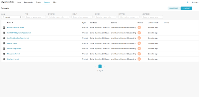
You can view a list of the datasets in Skylar Analytics on the Datasets page:
You can filter the list of datasets by typing some or all of a dataset name in the Name field at top left.
Clicking the name of a dataset on the Datasets page takes you to the Charts page, where you can create a chart based on the columns (metrics) in that dataset. For more information, see Creating and Customizing Dashboards and Charts.
Viewing the Contents of a Dataset
To view the contents of a dataset:
-
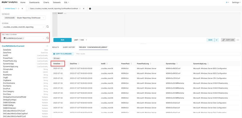
In the Skylar Analytics user interface, go to the SQL Lab page (SQL > SQL Lab):
-
In the See Table Schema field, type the name of the dataset and press . A list of metrics from that dataset are added below that field, and a preview of the table is displayed in a table to the right of that column. Each row in the preview table at the right reflects a set of data representing all of the presentation objects in the PowerPack, along with the device information.
In the preview table, you can check to make sure that this dataset contains the data you need. You can also see how current the data is by checking the timestamp in the DataDate column.
Viewing Dashboards and Charts in Data Visualization
The Data Visualization component of Skylar Analytics contains dashboards and charts based on data gathered by Skylar AI and SL1.
A dashboard in Skylar Analytics is similar to a dashboard in SL1, in that they both contain a number of graphical "widgets" that display data in a variety of ways, such as pie charts, line graphs, maps, bar charts, and other visualizations. A chart in Skylar Analytics works much like a "widget" in SL1, in that a chart in Skylar Analytics is a building block that makes up a dashboard, and a dashboard can contain many charts.
The dashboards and charts in the Data Visualization component of Skylar Analytics are not compatible with SL1 dashboards, widgets, or reports.
Unlike dashboards in SL1, a dashboard in Skylar Analytics is used only for laying out the various charts that make up that dashboard. You can use charts to customize the data. One significant difference is that a chart, when modified, impacts all dashboards using that chart definition.
As a best practice, you should make a copy of a chart if you want to modify that chart for different analyses on different dashboards.
Logging In to the Data Visualization Component
To log in to the Data Visualization component of Skylar Analytics:
-
From SL1, go to the Skylar AI page (
 ) and click the button for Skylar Data Visualization. The Skylar AI login page appears.
If you know the URL of your Skylar AI system, you can go to that location instead of using SL1.
-
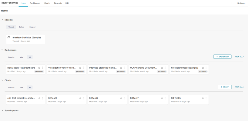
Click Analytics and, if needed, type in your user name and password. The Home page for the Data Visualization component of Skylar Analytics appears:
The Home page contains links to the dashboards and charts that you have used the most, including those that you have marked as favorites (
 ). You can create a dashboard or a chart from this page, and you can view all dashboards or charts by clicking the corresponding View All link.
 -
Click a dashboard or chart from the Home page, or click the tab or the tab to view a list of all dashboards or charts.
To return to the Skylar AI login page, click the Skylar Analytics icon at top left.
-
For more information about viewing existing dashboards, see Viewing Skylar Analytics Dashboards.
-
For more information about creating or customizing dashboards, see Creating and Customizing Dashboards and Charts.
Default Skylar Analytics Dashboards
Skylar Analytics includes a set of default dashboards created by ScienceLogic that you can use to view data. You can also customize these dashboards as needed.
Each default dashboard has the word "(Sample)" or "(Skylar)" at the end of its name to show that it is a ScienceLogic dashboard, and also to remind you to duplicate any of these dashboards or charts if you wish to make modifications. They are also owned by the System Administrator ("SA") user. These SA-owned dashboards and charts might be updated by ScienceLogic periodically.
The tab for Skylar Analytics contains the following default dashboards:
-
Filesystem Overview + Exploration (Sample).
- Displays 95th percentile data, file system utilization distribution (as a percentage and Gigibit or GiB), and "Space Hogs" (the devices using the most file system space).
- You can click a device name on the "Space Hogs" pie chart to display chart details specifically for that device.
- Also includes the tab, which displays additional file system charts for all devices or selected devices from the tab.
-
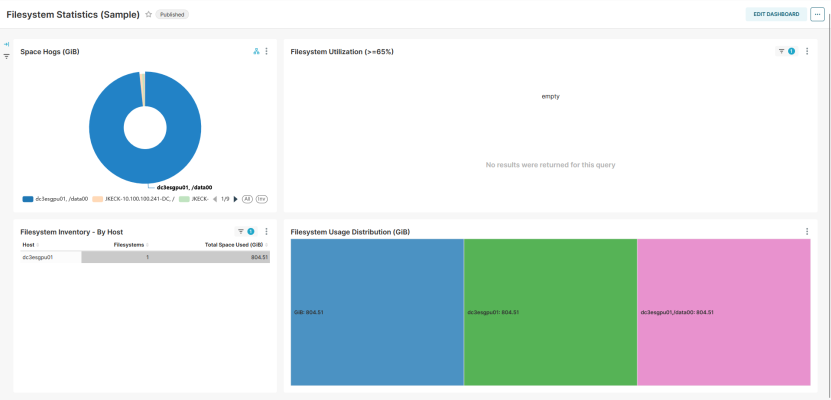
Filesystem Statistics (Sample). Displays a pie chart of "Space Hogs" (the devices using the most file system space), file system utilization as a percentage, file system inventory by host, and file system usage distribution.
-
Filesystem Usage (Sample).
- Displays a set of file system usage, utilization, 95th percentile and Top-N inventory charts for all devices, including a pie chart of "Space Hogs" (the devices using the most file system space).
- You can click a device name on the "Space Hogs" pie chart to display chart details specifically for that device.
-
Interface Statistics (Sample). Displays interface traffic in a variety of charts, including active hosts, active interfaces, dropped packets, and 95th percentile for the last 30 days (as a percentage and MIBPs).
-
Most Significant Resource Changes (Sample).
- Displays devices with the highest delta of file system usage, along with average file system usage, Top-N interface usage delta, and interface traffic in the past seven days.
- You can click a device name on the "Top-N Filesystem Usage" or the "Top-N Interface Usage" tables to display chart details specifically for that device.
Viewing Skylar Analytics Dashboards
You can use the following tips to get more data from your Skylar Analytics dashboards:
-
You can hover over a graphical element in a chart, such as a piece of a pie chart or a colored metric in a tree map, to view a pop-up with more information about that element.
-
If a dashboard is editable, you can click to make changes to the dashboard and the charts that make up the dashboard. For more information, see Creating and Customizing Dashboards and Charts.
-
For most dashboards, you can click a single device or item in the first chart at the top left of the Dashboard page (or any "Top-N" chart types) to view data specific to just that device. Click the device a second time to clear the filter. For more information, see Adding Contextual Cross-filtering to a Dashboard.
The following image displays a dashboard with a device selected in the "Space Hogs" graph that forces the other graphs to only display data for that device:
When viewing a dashboard, you can click the ellipsis button (![]() ) at the top right of the Dashboard page to open a menu with the following dashboard options:
) at the top right of the Dashboard page to open a menu with the following dashboard options:
- Refresh dashboard. Updates all of the charts in the dashboard to account for any changes you might have made.
- Enter fullscreen. Displays the browser window containing the dashboard display as full screen. Select Exit fullscreen from the menu to return to the previous setting.
- Save as. If a dashboard is editable, lets you save a copy of the dashboard, with the option of overwriting the existing dashboard or changing the name to make a new dashboard (if you have appropriate permissions).
- Download. Lets you export the dashboard as a PDF or download the dashboard as an image.
- Share. Lets you copy a link to the chart to the clipboard of your computer, and also lets you share a link to a chart using email.
- Set auto-refresh interval. Lets you choose how often you want Skylar Analytics to update the data for the dashboard. The default is Don't refresh.
On a Dashboard page, you can also click the vertical ellipsis button (![]() ) at the top right of a chart on the dashboard to open a menu with the following chart options:
) at the top right of a chart on the dashboard to open a menu with the following chart options:
- Enter fullscreen. Displays the browser window containing just this chart display as full screen. Click the Exit fullscreen icon (
 ) or select Exit fullscreen from the menu to return to the previous setting.
 - Edit chart. Opens the Edit Chart page so you can add metrics, edit queries, and make other updates to this chart. Click to keep your changes (if you have appropriate permissions).
- Cross-filtering scoping. Lets you add cross-filtering, where you apply a data element from a chart (like a table row or a slice from a pie chart) and then apply it as a filter across all eligible charts in the dashboard. For more information, see Adding Contextual Cross-filtering to a Dashboard.
- View query. Displays the SQL query for that chart. You can use this option to determine which data from the dataset is being used in this chart, and how the data is being used.
- View as table. Displays the chart in table format.
- Drill to detail. Displays all the data that makes up a chart.
- Share. Lets you copy a shareable chart link to your system's clipboard, or launches your system's default email client and composes a new message featuring the chart URL.
- Download. Lets you export the chart to .CSV or Excel, or you can download the chart as an image.
Creating and Customizing Dashboards and Charts
You can create a new dashboard in Skylar Analytics, or you can customize any of the default dashboards and save them with a new name. You can also create and customize the charts that make up the various dashboards.
To optimize dashboard speed, you should always try to use the smallest table needed for the dashboard.
Creating a Dashboard
To create a dashboard:
-
Log in to the Skylar AI user interface and click Analytics. The Home page for Skylar Analytics Data Visualization appears.
-
In the Dashboards section of the Home page, click the button. An Untitled Dashboard page appears.
-
Triple-click in the [untitled dashboard] field at the top right and type a name for the new dashboard. If you are using a shared system, you might want to add your initials to the end of the name.
-
Click in the upper right corner of the page.
-
Click .
-
If there are existing charts that you want to add to this dashboard, click and drag each chart from the tab on the right and drag the chart onto the dashboard. Click when you are done, and click again to keep editing.
If you want to see only the charts that you have created, check Show only my charts. If you want to see charts by all users, clear this option.
-
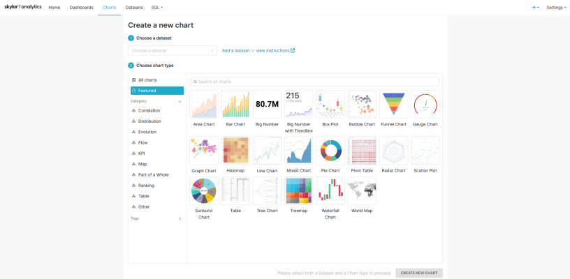
If you have not yet created any charts, or no charts exist on your system from other users, click . The Create a new chart window appears:
-
In the Choose a Dataset field, click to choose a dataset with the data you want to view in your new dashboard. In Skylar Analytics, a dataset contains a set of related metrics pulled from Dynamic Applications in SL1, such as server reports or SL1 business service statistics.
A dataset that has "Current" at the end of its name contains the latest updated configuration data collected for that dataset. A dataset that has "Statistics" at the end of its name includes the time series metric data.
For this overview, we will select the BusinessServiceStatistics dataset, which contains data about SL1 business services.
-
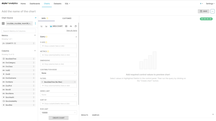
Select a chart type from the Choose chart type section and click . For this overview, we will select Area Chart. A new chart window appears:
In the first column, the Chart Source field displays the dataset you selected (for this overview, it is the BusinessServiceStatistics chart source). Below that field, you can access the metrics and columns that you can add to the chart. You can drag a metric or column from the first column into the second column to add it to the chart.
In the second column, you can select which data will appear in the chart, and how the data will be displayed in the chart. The large section to the right displays a preview of the chart as you build it after you click the button to run the query.
-
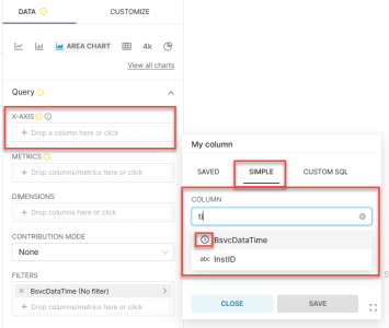
For example, with an Area Chart type, you could define the X-axis of the chart to display a time range by clicking in the X-axis field in the Query section. A modal appears:
-
On the tab of the modal, click the Column field to get a list of data. You can pre-filter the data by typing a column name or label, such as "time".
-
Select a column with a calendar icon (
 ) next to it to display a time range on the X-axis, such as BsvcDataTime from the BusinessServiceStatistic chart source, and click .
For more information about the abbreviations used for the metric names, see Mapping SL1 Dynamic Application Object Names to Skylar Columns.
-
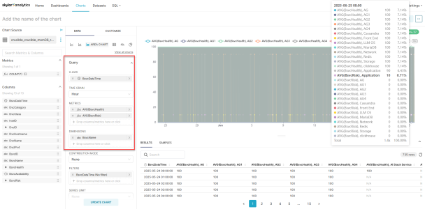
To set the granularity of the time frame to a shorter time frame, click in the Time Grain field and select Hour instead of the default of Day.
-
Next, select the metrics you want to visualize in the chart by clicking in the Metrics field and clicking the tab. You can also drag a metric from the first column and drop it on this field.
For this overview, we will select BsvcHealth (business service health) in the Column field and AVG in the Aggregate field. We will also select BsvcRisk (business service risk) in the Column field and AVG in the Aggregate field. These settings will show the average values for business service health and risk over time.
In the Column field on the tab, type % to filter the list down to Utilization or Percentages.
-
Click to save the metrics.
-
To see a preview of the chart so far, click the button or the click here link in the large section to the right. You will need to do this every time you make a change if you want to see the latest preview.
-
You can use the Dimensions field to add descriptive elements to the chart that help users understand the data being visualized. For example, for line charts and area charts, the dimensions will appear in the legends and mouseover text. For tables, dimensions represent the columns to display.
For this overview, we will add BsvcName (business service name) to the Dimensions field. Click the button to see an updated preview:
The chart legend displays the average health and average risk in the legend at the top, and also in the columns at the bottom of the section. If you mouse over a line in the chart, you can see the specific data for those values.
-
In the Filters field, you can edit the existing filter by clicking on it and specifying what data to display on the new chart. The filter currently has no specific filter set right now.
For this overview, click on BsvcDataTime in the Filters field and then click in the Time Range field. An Edit time range modal appears.
-
In the Range Type field, select a range, such as Last, as in Last day, Last week, and so on.
-
Select the Last week option and click .
-
Click the button to review your updates.
-
To finish the chart, be sure to give it a name in the top right of the window, and then click the button.
-
In the Save chart modal, click . The new chart is added to your dashboard.
-
Continue adding charts to the dashboard as needed.
-
When your dashboard is complete, click the button at top left to publish it. The button changes from to .
For more information, see Creating Your First Dashboard and registering a new table in the Superset documentation.
Adding Contextual Cross-filtering to a Dashboard
You can add contextual cross-filtering (also called "context") to the widgets to create an interactive dashboard in Skylar Analytics. When you do, you can click on a device in one widget to make another widget in the dashboard display data specific to that device.
For this process, we will use the chart and the dashboard that we created in the previous procedure and add a new chart to that dashboard as an example.
Adding context to a dashboard:
-
Select the dashboard from the Dashboards page. You can also hover over the dashboard and click the Edit icon (
 ) in the Actions column.
 -
Click . The and tabs appear on the right.
-
On the tab, click . The Create a new chart window appears.
-
In the Choose a Dataset field, click to choose a dataset with the data you want to view in your new dashboard.
A dataset that has "Current" at the end of its name contains the latest updated configuration data collected for that dataset. A dataset that has "Statistics" at the end of its name includes the time series metric data.
Because the other chart we just created used the BusinessServiceStatistics dataset, select the BusinessServiceCurrent dataset as a complement to the first chart.
-
Select a chart type of Table, which will make it easy for users of the dashboard to select a business service to view more information.
-
Click . A new chart window appears.
-
Click and drag the BsvcName column onto the Dimensions field on the tab. This will add a list of business services as the first column in the new table.
You can also click in the Dimensions field on the tab, go to the Column field on the tab, and then select BsvcName.
-
Click and drag the DvcName column onto the Dimensions field, under BsvcName. This will add device names as the second column in the new table.
Because you are not using this chart to display metrics, you do not need to add any values to the Metrics field.
-
Click . The chart displays in the preview area.
-
Click to save the metrics. The Save chart modal appears.
-
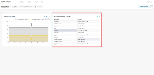
As needed, add a name and select a dashboard for the chart, and then click . The new chart is added to your dashboard, to the right of the first dashboard:
-
Typically, you would want to place the chart that drives the "context" (or the contextual cross-filtering) first, so click to enter Edit mode again.
-
Click and drag the next chart to the left of the first chart until a vertical rectangle appears. Drop the new chart onto that rectangle.
While the dashboard is in Edit mode, you can also resize a chart by hovering over a corner and then dragging the arrows to change the size.
-
Click .
-
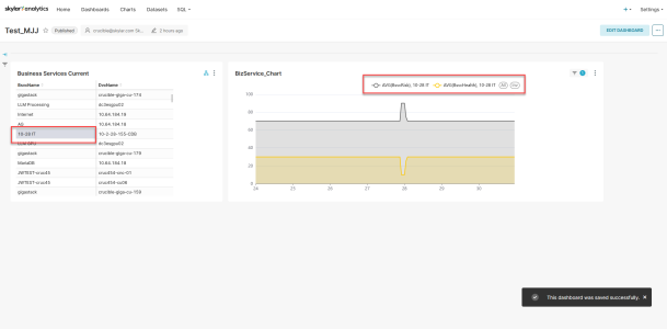
When you select a business service or a device in the first chart, the second chart updates with only the data for the selected item:
If the second chart displays "No results were returned for this query", you might need to click the vertical ellipsis icon (
 ) for the second chart and select Edit chart to address the issue.
Customizing a Dashboard
To customize a dashboard:
-
Select the dashboard from the Dashboards page. You can also hover over the dashboard and click the Edit icon (
 ) in the Actions column.
 -
On the Dashboard page, click . The and tabs appear.
-
If there are existing charts that you want to add to this dashboard, click and drag each chart from the tab on the right and drag the chart onto the dashboard. Click when you are done, and click again to keep editing.
If you want to see only the charts that you have created, check Show only my charts. If you want to see charts by all users, clear this option.
-
If you want to add extra elements to your dashboard, like a header, additional text, a divider, or other items, drag and drop the items onto the dashboard from the tab. Click when you are done, and click again to keep editing.
-
To edit a chart in the dashboard, click the vertical ellipsis button (
 ) at the top right of the chart on the dashboard and select Edit chart. For more information, see steps 8-21 in the "To create a dashboard" procedure.
 -
When you are done updating the dashboard, you might need to click and rename the dashboard if the dashboard was created by ScienceLogic, with the word "(Sample)" or "(Skylar)" at the end of the name.
On the Dashboards tab in Skylar Analytics, the "Visualization Variety Testing (Sample)" dashboard contains a variety of chart visualizations related to file system utilization, including a table, a "big number" with a line graph, a gauge, a set of tree maps, and a sunburst map. You can use this dashboard to see how these different types of charts might work for your data.
Icons for Chart Metrics
Each data type includes a small icon that conveys its type:
- abc: Text data
- #: Numeric value data
 : The time column for the data source
- ƒ(x): Function used for metrics
Customizing the Default Column Names for Charts
You can customize the default column names that Skylar Analytics created for the charts in your dashboards to make the names more useful for your users. You can rename columns by using the Label and Description parameters in a dataset.
Do not edit the columns at the chart or dashboard level in Skylar Analytics, as doing so will break the contextual cross-filtering. Instead, edit the columns at the dataset level, as discussed in the following procedure. Also, make sure that the icon to the left of the renamed column is abc and not ƒ(x), because string values can drive context, but functions cannot drive context.
To customize default column names:
-
In Skylar Analytics, open to the chart in Edit mode and make a note of the dataset name in the Chart Source field. The dataset name is at the very end of the chart source name, such as "BusinessServiceCurrent".
-
Go to the Datasets page and locate that dataset.
-
Hover over the dataset and click the Edit icon (
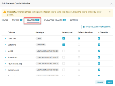
 ) in the Actions column. The Edit Dataset dialog appears:
 You must be the dataset owner to edit a dataset.
-
Click the tab to view all of the columns in that dataset.
-
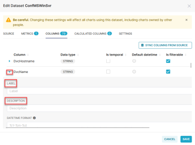
Locate the column you want to rename and click the expand icon (
 ) next to the current column name:
 -
In the Label field, type the new column name you want to display in all charts that use this dataset.
-
In the Description field, type a short description of the column. This text, along with the Label text, appears when you hover over that column in the Columns section when you are editing the chart.
-
Click . A confirmation message appears to remind you that these edits will affect all charts that use this dataset.
-
Click . The column label and description are updated for all charts that use this dataset.
-
Repeat steps 5-9 for any other column names that you want to rename.
Data Exploration: Exporting Data to Skylar AI from Third-party Tools
You can use the optional Data Exploration component of Skylar Analytics to enable Open Database Connectivity (ODBC) to connect Skylar AI data with third-party tools like Grafana, Power BI, Tableau, Cognos, Crystal Reports, SAP, Excel, and other business intelligence applications. When the tool is connected using ODBC, you can export data from Skylar Analytics to that third-party tool.
You can also import data from third-party tools, such as billing data, environmental data, or service level objectives (SLOs), and then use that data in Skylar AI.
Data Exploration with ODBC lets you view Skylar AI data alongside other business sources, offering a holistic perspective on your operations.
Configuring Data Exploration with Power BI
This section covers how to set up an ODBC connection for Skylar Analytics so you can use it with Power BI for data visualization. Other business intelligence applications will use a similar process to integrate with Skylar Analytics.
For an example of how you can connect DBeaver, another business intelligence tool, to Skylar Analytics, see the following video: BYO Tool and Data: Connect via ODBC and Import Data.
To install and configure the ODBC connection:
-
Go to the ClickHouse ODBC driver releases page at https://github.com/ClickHouse/clickhouse-odbc/releases.
-
Download the relevant version for your operating system.
-
Open the ODBC Data Source Administrator application.
-
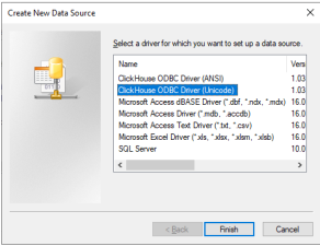
On the tab, click . The Create New Data Source dialog appears:
-
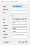
Select ClickHouse ODBC (Unicode) and click . The Create data source for Clickhouse dialog appears:
-
Complete the following fields with ODBC connection details from the ScienceLogic Site Reliability Engineering (SRE) team:
- Name: Add a name to identify this connection. This will be used later in the BI tools.
- Host: Specify the host URL, provided by SRE.
- Port: 443.
- Database: Leave blank.
- SSLMode: Type the word "require".
- User: dataviz
- Password: Specify the password, provided by SRE.
To connect your BI tool, such as the Power BI Desktop:
-
Launch the Power BI Desktop and click .
-
Click Get data from another source, select Other, and then select ODBC.
-
Click .
-
In the pop-up window, click the drop-down menu and select the ODBC connection you just created in the previous procedure.
-
Click .
-
If prompted, re-enter your username and password, and then click .
-
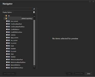
After you are connected, a menu will appear displaying available datasets, which you can use to create dashboards in your BI tool:
To import data and create a dashboard with Skylar AI data in Power BI:
When selecting datasets to import, choose only the necessary tables to optimize performance. The following procedure creates a sample dashboard in Power BI.
-
On the Home screen of the Power BI Desktop, click .
-
Select a Line Chart as an example.
-
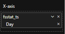
To configure the X-Axis, expand the fsstattab dataset from the right-hand Data Column.
-
Drag fsstat_ts (Timestamp) to the X-Axis in the Visualizations panel.
-
Remove the options for Year, Quarter, and Month, keeping only Day:
-
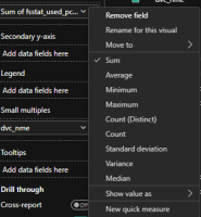
To configure the Y-Axis, drag fsstat_used_pct_psec (Used Percentage Per Second) to the Y-Axis.
-
To customize the data fields, click the drop-down arrow next to the selected data field. You can rename the field or modify how the value is calculated:
-
Continue adding additional charts and visuals as needed to finish up your dashboard.
Additional Resources for Skylar Analytics (Apache Superset Training)
This section has been provided as an independent study guide to help you identify and develop basic knowledge and skills to build data visualizations within Skylar Analytics user interface.
The following videos from ScienceLogic cover some of the key features of Data Visualization and Exploration:
- How to create your first Dashboard
- How to add cross-filtering to a Dashboard
- Datasets Overview
- Tips & Tricks: Friendly Column Names
- BYO Tool and Data: Connect via ODBC and Import Data
- How to connect PowerBI to Skylar AI via ODBC
- BYO Data - writable schema, Joins and Views!
Apache Superset-related documentation: https://superset.apache.org/docs/intro
ScienceLogic recommends the following resources for a deeper understanding of Apache Superset:
- https://www.udemy.com/course/apache-superset-for-data-engineers-hands-on/
- https://www.youtube.com/watch?v=znnmco3eK-M&list=PLzRV_ObjEwmNhRjhMNcvcDP7ZDjOXtodd
- https://superset.apache.org/community
Because ScienceLogic does not own the underlying framework for the Data Visualization and Data Exploration components, ScienceLogic is not responsible for maintaining or updating documentation for third-party open-source software, including Apache Superset.
