In SL1, device maps show the relationships between devices in a network. Although SL1 includes maps of different types of device relationships (for example, devices grouped by organization, devices grouped by layer-2 topology, devices grouped by CDP topology, devices groups by LLDP topology), each map uses a similar set of buttons, tools, and icons. Before reading about the different types of maps, it is helpful to understand the functions of the map pages.
This chapter is relevant to the classic user interface of SL1 only. For more information about using Classic Maps in the SL1 user interface, see
Use the following menu options to navigate the SL1 user interface:
- To view a pop-out list of menu options, click the menu icon (
 ).
). - To view a page containing all of the menu options, click the Advanced menu icon (
 ).
).
Buttons, Tools, and Icons (Classic User Interface Only)
Each device map, topology map, and virtual infrastructure map displays buttons, tools, and icons that are displayed in the left of the map page. The buttons, tools, and icons in the Views pages are:
- Reset. Resets the default display. Any unsaved changes are removed.
- Kiosk. Spawns a new page, where the map appears in full-screen. This display model is helpful in NOC environments.
- Lock Icon. Toggles on and off the display of the menu at the left of the pane and the menu at the top of the pane. When the lock icon appears in white, the menu is "locked" and will continue to be displayed in the pane. When the lock icon appears in gray, the menu is displayed only when you are working in the menu. To make the hidden menu appear again, mouse over the border where the menu resides.

- Filter icon. Toggles on and off the display of the Node Filters checkboxes. These checkboxes allow you to filter the nodes included in a map based on whether a device or connection is managed or unmanaged in SL1, whether the node is part of a device group, the status of the device (healthy, notice, minor, major, critical), or the device category assigned to the device.
- Arrange Map. Specifies the format style for the map. Choices are: Tree, Radical Tree, Grid, and Random.
- Link Length Slider. Slider bar that allows you to dynamically adjust the length of all links in the Radial view or Tree view of a map.
- Take Screenshot. Saves the current display as a .png file to the local computer.
- Zoom bar. Magnifies and contracts the map.
- Fit. Adjusts the zoom to fit the entire map within the pane.
- Center. Centers the map in the middle of the pane without changing the zoom.

- Edit: Nodes. Displays a menu at the top of the pane that allows you to edit the display of nodes in the map.
- Edit: Shapes. Displays a menu at the top of the pane that allows you to add hand-drawn shapes on the map. The menu allows you to select shapes, drag-and-drop points, line thickness, fills, transparency, and colors. You can also delete shapes that were previously added to the map.
- Edit: Text. Displays a menu at the top of the pane that allows you to add text to the map and format the text. You can also delete text that was previously added to the map.
- Edit: Images. Displays a menu at the top of the pane that allows you to import and format an image. You can include the image in the map or use the image as the background of the map. You can also delete an image that was previously added to the map.
- Edit: Save. Saves changes to the map.
- Edit: Revert. Ignores all changes and returns to the last saved version of the map.
- Layers: Nodes. Toggles the display of devices in the map.
- Layers: Links. Toggles the display of links in the map.
- Layers: Shapes. Toggles the display of hand-drawn shapes in the map.
- Layers: Text. Toggles the display of manually entered text in the map.
- Layers: Images. Toggles the display of imported images in the map.
These buttons, tools, and icons can be used to customize device and help you create your own maps. The next section will provide more detail on how to use these buttons, tools and icons.
Customizing the Display of a Map
You can customize maps to more easily manage your devices and display only the maps that best fit your needs.
You can edit and customize device maps, as well as Layer-2 maps, CDP maps, LLDP maps, and Layer-3 maps. You can also create your own customized map.
There are three ways to customize a map:
- The options in the Arrange Map drop-down menu.
- In the map page, you can edit the layout of nodes by selecting the Edit: button and using the drag-and-drop editing features.
- Using the Zoom, Edit and Layers tools to the left of the pane.
NOTE: You can also customize Layer-2 maps, CDP maps, LLDP maps and Layer 3-maps by creating, editing and deleting links. To learn more about links, see Topology Maps.
Arranging the Map
The Arrange Map drop-down menu allows you to specify the layout for the map. Your choices are:
- Tree. Arranges devices in a tree structure, with the root as the top-level network device (usually a switch or router).

- Radial Tree. Arranges devices in a circle around the top-level network device (usually a switch or router).

- Random. Arranges devices in a random pattern.

- Grid. Arranges devices in rows and columns. The top-level network device (usually a switch or router) appears in the upper left.

Link Length
If you arrange a map in the Tree view or Radial view, you can use the Link Length slider to dynamically change the length of all links in the map.
Sliding the slider to the left decreases the link length.:

Sliding the slider to the right increases the link length:

Drag-and-Drop Editing
Each device in the maps page is an individual node that can be placed in different areas of the map while retaining its link to other devices. You can drag-and-drop nodes to reposition them on the map to make viewing and managing devices easier. You can use drag-and-drop editing in the following ways:
- You can move the entire map around the pane by clicking in any spot in the background, holding down the left mouse key and dragging the mouse. The map will be dragged around by the spot you initially clicked on.
- You can use your mouse to select and move nodes within a map. To edit and move nodes around the map, first enter Nodes mode by selecting the Edit: button. In Nodes mode:
- To select a node, left-mouse click on it.
- To select multiple nodes, hold down the <Shift> key and left-mouse click on each node.
- To select a node and all nodes that are relatives of that node, double click on a node. The relatives of a node include all nodes that connect the node to the root node of the map (e.g. the parent of the node, the parent of the parent, etc) and all subordinate nodes (e.g. the children of the node, the children of the children, etc).
- To select a node and all subordinate nodes, hold down the <Shift> key and double click on a node.
- To select and box multiple adjacent nodes, hold down the <Shift> key, hold down the left mouse key, place the cursor on a spot on the background of the map, and drag the mouse to outline nodes in a box. You can then move these nodes around the screen as a group.
- To reposition the nodes on the map, hold down the left mouse button and drag the node to its new position. Release the mouse button to "drop" the nodes.
- To save the new node positions, select the Edit: button.
- To toggle on and off drag-and-drop editing, select the Edit: button.
- To return the nodes to their previous positions, select the button.
For example, SL1 might map a device group in a tree view in the following format:

Using the Edit: button, you can rearrange the devices to look similar to the following format:

Zoom Buttons
The zoom slider allows you to zoom in (expand) and zoom out (contract) on the currently displayed map. Moving the slider up increases the size of the map; moving the slider down decreases the size of the map. The zoom slider's behavior changes under the following conditions:
- If nothing in the map is selected, SL1 zooms from the center of the pane.
- If a device is selected, SL1 center zooms on the selected device.
- If a group of devices are selected, SL1 center zooms on the selected group.

The following buttons appear under the Zoom slider:
- . Adjusts the zoom to fit the entire map within the pane.


- . Centers the map in the middle of the pane. Does not change the zoom.


Edit Buttons
The Edit buttons toggle on and off menus in the top of the pane. These menus allow you to edit the currently displayed map.
- The button saves changes to the map.
- The button ignores changes to the map and returns to the last saved version.
Nodes
Along with enabling drag-and-drop editing, the button also toggles the display of the Nodes menu at the top of the pane.
The Nodes menu includes the following:
- Export Selected. Creates a new device group containing the selected devices, which allows you to quickly create a Customized Map. When selected, a small dialog box appears, asking you to enter the name for the new device group. Enter a name and select the button.
- Scale. For the selected icons, increases or decreases size.
- Alpha. For the selected icons, mixes background color with node color; much like increasing or decreasing opacity/transparency.


- Arrange. Reflects the settings you chose in the Arrange Map field. You cannot edit this layout in the Nodes menu.
- Sort. Reflects the settings you chose in the Arrange Map field. You cannot edit this layout in the Nodes menu.
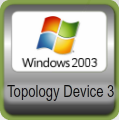
- Display. Specifies how device icons will appear in the map. If you select a single icon, the settings in this field affect only the selected icon. If you don't select an icon, the settings in this field affect all device icons in the map. Your choices are:
- Extended. The device icon displays the icon associated with the device class, the name of the device category, the device name, and additional icons that allow you to view events on the device (
 ), create a ticket about the device (
 ), view the Device Summary page (
 ), print a report about the device (
 ), or view the Device Properties page (
 ).
).
- Simple. The device icon displays the icon associated with the device class, the name of the device category, and the device name.
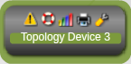
- Compact. The device icon displays the device name, and additional icons that allow you to view events on the device (), create a ticket about the device (), view the Device Summary page (), print a report about the device (), or view the Device Properties () page.
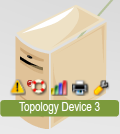
- Category. The device icon displays the device name and the icon associated with the device category for the device. The device icon also includes additional icons that allow you to view events on the device, create a ticket about the device, view the Device Summary page, print a report about the device, or view the Device Properties page.
- Bullet. The device icon displays the device name and a circle that is color-coded based on the device state.
Shapes
The button toggles the display of the Shapes menu at the top of the pane. The Shapes menu allows you to add manually-drawn shapes to a map.
When you place a shape or line on the map, SL1 automatically puts the shape or line behind the node icons and links on the map.
NOTE: Shapes zoom and pan (move) with the map.
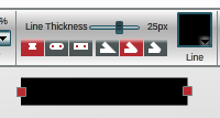
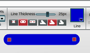
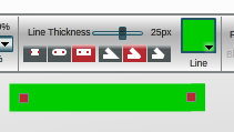
The Shapes menu includes the following:

- Line. Select this icon to draw a line. Click with the left-mouse button to place the end of the line, and then hold down the left-mouse button and drag to draw the line.

- Rectangle. Select this icon to draw a rectangle. Click with the left-mouse button to place a corner, and then hold down the left-mouse button and drag to draw the rectangle.

- Ellipse. Select this icon to draw an ellipse. Click with the left-mouse button to place a corner, and then hold down the left-mouse button and drag to draw the ellipse.

- Polygon. Select this icon to draw a polygon. Click with the left-mouse button to place the first corner of the polygon, and then click with the left-mouse button to place the second corner. A line is drawn between the first and second corners. Continue adding corners by clicking with the left mouse button. To complete the polygon, click with the left-mouse button on the first corner.

- Cloud. Select this icon to draw a cloud. Click with the left mouse button to place the center of the cloud, and then hold down the left-mouse button to draw to increase or decrease the size and dimensions of the cloud.

- Polygon curve. Increases or decrease the curve of each connecting line in a polygon.

- Delete. Deletes the selected shape.
- Shape Opacity. Increases or decreases the shape's transparency/opacity.
- Scale Lines. When zooming in and out, specifies whether lines should increase and decrease relative to the map or relative to the pane.
- Line Thickness. Increases and decreases the shape's line thickness.

- Drag Handle icons. For lines, these three icons affect the selected line. You can use the icons to determine if the ends of the line will be squared with drag handles on border, if the ends will be rounded with drag handles within the line, or if the ends will be squared with drag handles within the line.
- Corner icons. For shapes, these three icons affect the shape of the corners. You can use the icons to determine if corners will be right-angles, rounded, or snipped.
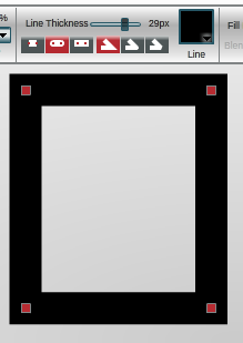
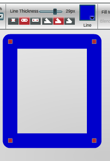
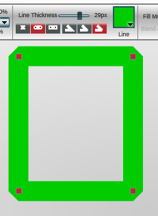
- Line. Allows you to select a color for the line. For shapes, allows you to select a color for the border lines.

- Fill Mode. Specifies how you want to fill shapes. Choices are:
- Flat Color. Shape is filled with a single color, specified in Fill 1.
- Linear Blend. Shape is filled with a blend of two colors, Fill 1 and Fill 2. You can specify the angle of the blend in the Blend Angle field.
- Radial Bland. Shape is filled with a blend of two colors. Fill 1 fills the center. Fill 2 fills the edges.
- Blend Angle. If you selected Linear Blend in the Fill Mode field, specifies the angle where the blending occurs.
- Fill 1. Allows you to select the first color to use as a fill.
- Fill 2. Allows you to select the second color to use as a fill.

- To select a shape, left-mouse click on one of its lines (but not the handles). The shape will glow when selected and the handles will turn red.
- To change the size or shape of a shape, left-mouse click on its handles (dots in each corner or at each end), hold down the left-mouse button, and drag.
- To move a shape, left-mouse click on a line (but not the handles), hold down the left-mouse button, and drag.
Text
The button toggles the display of the Text menu at the top of the pane. The Text menu allows you to add text to a map.
When you place text in a map, SL1 automatically puts the text in front of or over the node icons and links on the map.
NOTE: Text zooms and pans (moves) with the map.
The Text menu includes the following:
- Add. Adds a text box, where you can enter text. You can enter text in the bottom pane of the text box.

- To select a text box, left-mouse click in the pane labeled "Text Block".
- To position the text box, left-mouse click in the pane labeled "Text Block", hold down the mouse button, and drag the text box.
- To resize the text box, left-mouse click on the lower-right corner, hold down the mouse button, and drag.
- To close the text box without saving, left-mouse click on the "x" in the upper right.
NOTE: The Text Block box always appears around the text when in Text mode.
- Delete. Deletes the text box from the map.
- B/I/U. You can toggle on and off text style (bold, italic, or underline) using these buttons. The selected text and all subsequent text will use the selected style (bold, italic, or underline) until the button is toggled again. When a style is active, the button is red. When a style has been toggled off, the button is black.

- Sans Serif/Serif/Monospace. The selected text and all subsequent text will use the selected font.

- Justify (left/centered/right/justified). You can toggle on and off text justification for all text in a paragraph or line of text. The selected text and all subsequent text will use the selected justification until the justification is toggled again. When a justification is active, its button is red. When a justification has been toggled off, its button is black.

- Font Size. The selected text and all subsequent text will use the selected font size from the drop-down list.

- Color. The selected text and all subsequent text will use the selected color.

- Scale. Increases or decreases the size of the text box and the text in the text box.
- Opacity. Increases and decreases the transparency/opacity of the text.

Images
The button toggles the display of the Images menu at the top of the pane. The Images menu allows you to add an imported image to a map.
When you place an image in the map, SL1 automatically puts the image behind the node icons and links on the map.
NOTE: Images zoom and pan (move) with the map.
NOTE: ScienceLogic recommends you upload images to SL1 when possible. Images inserted by supplying a URL will stretch when resized, regardless of the behavior specified in the Resize Behavior field.
The Images menu includes the following options:
- Add. Displays the Image Selection modal page. In this page you can manually enter the URL of an image to use, browse your local computer to locate an image to upload, or select from images already loaded onto the SL1 system.


When the image is added to the map, the image is surrounded by an image box:
- To select an image, left-mouse click in the pane labeled with the image name.
- To position the image box, left-mouse click in the pane labeled with the image name, hold down the mouse button, and drag the text box.
- To resize the image box, left-mouse click on the lower-right corner, hold down the mouse button, and drag.
- To close the image box without saving, left-mouse click on the "x" in the upper right.
- Delete. Deletes the selected image.
- Scale. Increases or decreases the size of the image box and the image.
- Alpha. Increases or decreases the transparency/opacity of an image.

- Resize Behavior. Specifies whether resizing the image will stretch the image or tile the image.
- Border Color. Select a border color for the image.
- Border Weight. Increases or decreases the line weight of the border.
- Border Opacity. Increases or decreases the transparency/opacity of the border.
Layers
The Layers checkboxes allow you to select the items to include in the currently displayed map. By default, all the checkboxes are selected, meaning that all items will appear in the map. You can select or unselect one or more of the checkboxes.
To save your selections in the Layers checkboxes, select the Edit: button.
- Nodes. Toggles the display of devices in the map.
- Links. Toggles the display of links in the map.
- Shapes. Toggles the display of hand-drawn shapes in the map (drawn with Edit: ).
- Text. Toggles the display of manually entered text in the map.
- Images. Toggles the display of imported images in the map.
